
SVG in React is a great combination to work with, as React's component-based architecture is easier to integrate scalable vector graphics into web applications.
With React's declarative approach, you can easily manipulate and animate SVG elements, making them responsive and interactive. React's virtual DOM efficiently updates SVG components, optimizing performance even when dealing with complex graphics.
Integrating SVG icons using tools like SVGR webpack ensures streamlined workflows and better scalability across projects. Additionally, embedding SVGs directly into CSS or HTML using data URIs can reduce HTTP requests and improve loading times.
With the ability to inline SVG directly into JSX, this let developers to keep your code clean and SEO-friendly. Additionally, React's ecosystem offers numerous libraries and tools for working with SVG, further streamlining development processes.
Table of Content
What is SVG?
SVG (Scalable Vector Graphics) is a versatile image format that allows for high-quality graphics that can be scaled to any size without losing clarity. It's lightweight, making websites load faster, and offers easy manipulation with CSS and JavaScript for dynamic effects.
SVGs are accessible, customizable, and seamlessly integrated into React components, making them an excellent choice for creating visually appealing and responsive web content.
What is React?
React is a JavaScript library used for building user interfaces in web applications. It allows developers to create reusable UI components that efficiently update and render in response to user interactions.
With its component-based architecture and virtual DOM, React enables developers to build complex UIs with ease while maintaining high performance. React's popularity stems from its declarative syntax, efficient rendering, and strong community support, making it a top choice for modern web development.
Why use React and SVG?
- Small File Size: SVGs are usually tiny compared to other image formats, which means your website loads faster and your users get to see your content quicker.
- Manipulability: You can shape SVG in React however you want! With just a bit of CSS and JavaScript, you can make them animate or even change color based on what your users do.
- Accessibility: SVGs are inclusive, as you can add notes to anyone so that everyone, including people using screen readers, can understand what they're all about. This way, your website becomes a welcoming place for everyone.
- Customizability: You can design SVGs in React exactly how you want, using programs easily. This means you have total control over your graphics.
- Integration with JSX: You can easily integrate SVG code right into your React components, making it simple to include them in your website. Whether you are importing SVGs or using inline SVG, React makes it super easy to work with them.
5 Ways to Use SVG in React
There are 5 ways to add SVG into React, whereas we will go from the easier method to the complex methods.
#1 Using <img> tag as SVG in React
This <img> tag for static SVGs is the foremost common and easiest way to use SVG (Scalable Vector Graphics) files into every web applications, including those built with React.
You can directly embed SVG images within your JSX code, treating them as regular image resources. Here's how you can use the <img> tag for static SVGs in a React component:
import React from 'react';
import svgImage from './images/logo-rb-full.svg';

const MyComponent = () => {
  return (
    <div>
      <img src={svgImage} alt="SVG" />
    </div>
  );
};

export default MyComponent;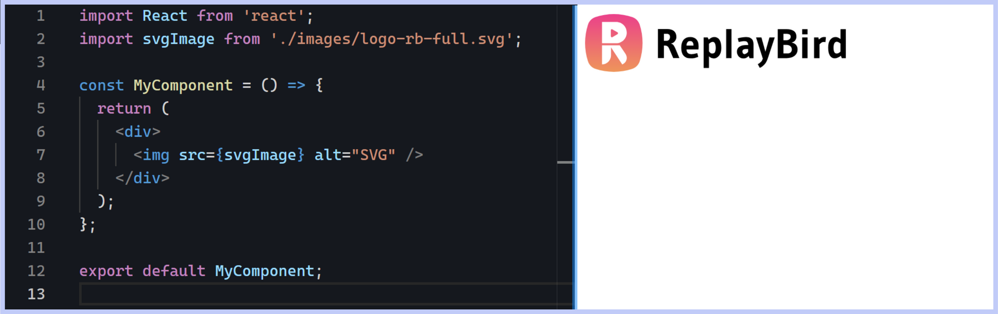
However, there are some limitations to using the <img> tag for SVGs:
- No direct DOM access: SVG images loaded via the
<img>tag are treated as external resources, and you cannot directly access or manipulate their internal SVG DOM elements from within the React component. - Style restrictions: Styling SVG images using CSS may be limited when using the
<img>tag, as styles applied to the SVG's document object model (DOM) will not affect the rendered image. - Interactivity limitations: SVG images loaded via the
<img>tag do not support interactivity such as event handling or animation directly within the SVG content.
Although the <img> tag has some limitations, it is still a solid choice for showcasing static SVG images in React apps, especially if you're all about keeping things simple across different browsers.
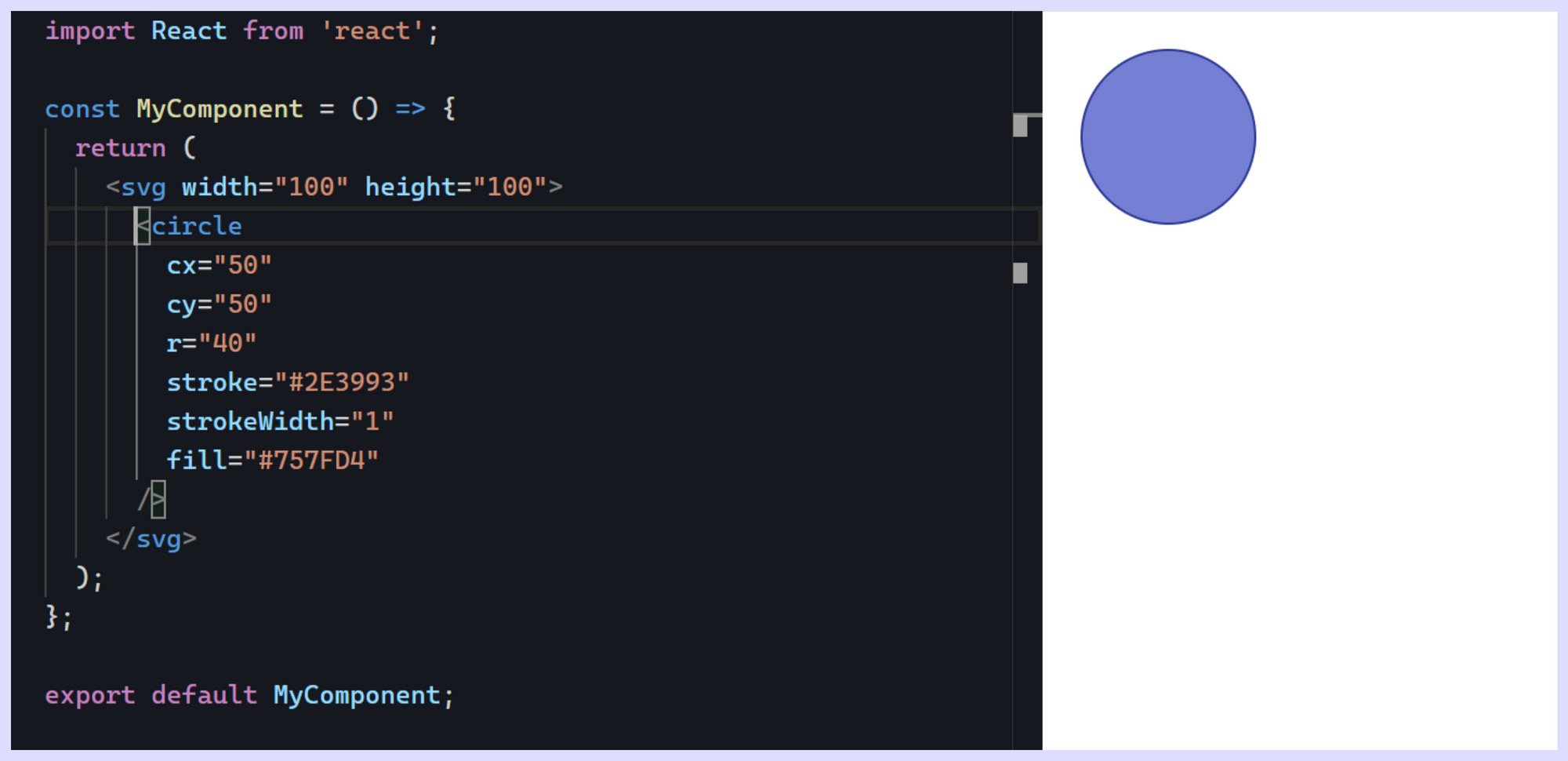
#2 <svg> element
Now comes the real authentic SVG (Scalable Vector Graphics) directly into React components using the <svg> element offers a flexible and powerful way to display vector graphics within web applications.
Unlike the <img> tag, which treats SVGs as external image files, using the <svg> element, <svg> tag let a easier integration of SVG content directly into JSX, providing developers with control and customization over the displayed graphics.
import React from 'react';

const MyComponent = () => {
  return (
    <svg width="100" height="100">
      <circle cx="50" cy="50" r="40" stroke="#2E3993" strokeWidth="1" fill="#757FD4" />
    </svg>
  );
}

export default MyComponent;
In the above code, we have a React component named MyComponent that demonstrates how to use the <svg> element within JSX. Inside the MyComponent, JSX code is used to define an SVG element. Within this SVG element, a circle element is defined with attributes specifying its position, size, stroke, and fill properties.
But this is just a basic example of how to draw an image in with <svg> tag, but we will now look into a bigger SVG image such as an SVG icon, which will be traced out with a <path> tag.
import React from 'react';

const MyComponent = () => {
  return (
    <svg
      xmlns="http://www.w3.org/2000/svg"
      width="512"
      height="512"
      viewBox="0 0 512 512"
    >
      <title>SVGicons-v5-p</title>
      <path
        d="M461.81,53.81a4.4,4.4,0,0,0-3.3-3.39c-54.38-13.3-180,34.09-248.13,102.17a294.9,294.9,0,0,0-33.09,39.08c-21-1.9-42-.3-59.88,7.5-50.49,22.2-65.18,80.18-69.28,105.07a9,9,0,0,0,9.8,10.4l81.07-8.9a180.29,180.29,0,0,0,1.1,18.3,18.15,18.15,0,0,0,5.3,11.09l31.39,31.39a18.15,18.15,0,0,0,11.1,5.3,179.91,179.91,0,0,0,18.19,1.1l-8.89,81a9,9,0,0,0,10.39,9.79c24.9-4,83-18.69,105.07-69.17,7.8-17.9,9.4-38.79,7.6-59.69a293.91,293.91,0,0,0,39.19-33.09C427.82,233.76,474.91,110.9,461.81,53.81ZM298.66,213.67a42.7,42.7,0,1,1,60.38,0A42.65,42.65,0,0,1,298.66,213.67Z"
        style={{
          fill: 'none',
          stroke: '#000',
          strokeLinecap: 'round',
          strokeLinejoin: 'round',
          strokeWidth: '32px',
        }}
      />
      <path
        d="M109.64,352a45.06,45.06,0,0,0-26.35,12.84C65.67,382.52,64,448,64,448s65.52-1.67,83.15-19.31A44.73,44.73,0,0,0,160,402.32"
        style={{
          fill: 'none',
          stroke: '#000',
          strokeLinecap: 'round',
          strokeLinejoin: 'round',
          strokeWidth: '32px',
        }}
      />
    </svg>
  );
};

export default MyComponent;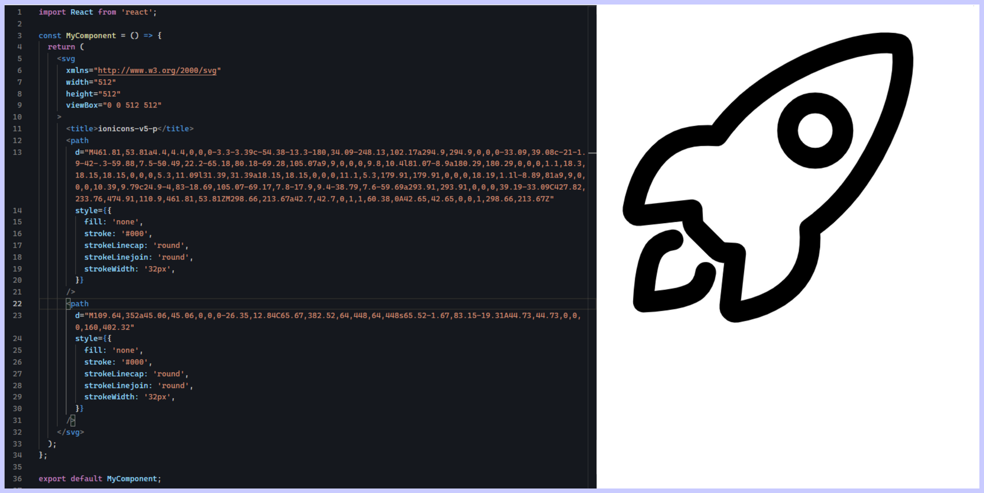
We have added the following to creat SVG that are actual SVG icons, you can get SVG element code from some free svg code generator
1. SVG Element: Inside the JSX, an <svg> element is used to define the SVG graphic. The <svg> element is the container for SVG graphics and can specify attributes like xmlns, width, height, and viewBox.
<xmlns>: Specifies the XML namespace for the SVG document.<width>and<height>: Determine the dimensions of the SVG viewport.<viewBox>: Defines the coordinate system and aspect ratio of the SVG graphic.
2. Path Elements: Inside the <svg> element, one or more <path> elements are used to define the shapes and lines of the SVG graphic. Each <path> element specifies a d attribute, which contains a series of commands and coordinates that describe the path of the shape.
<d>: Represents the path data, including commands like<M>(move to),<C>(curve), and<L>(line), followed by coordinates.
3. Inline Styles: The <path> elements also include inline styles using the style attribute. These styles define the appearance of the SVG paths, including stroke color, stroke width, and stroke linecap/join.
#3 SVG with React Component
Best part is you can even use SVG as a component in React which involves creating a dedicated React component that renders SVG code directly within JSX. This method makes using SVG in React more modular and reusable.
Let's dive into the example, just as usual create your React component named MySvgComponent to input all the styling and , which encapsulates React SVG markup representing a green ellipse oval.
import React from 'react';

const MySVGComponent = () => {
  return (
    <svg viewBox="0 0 400 200">
      <ellipse cx="100" cy="50" rx="100" ry="50" fill="#00b982" />
    </svg>
  );
};

export default MySVGComponent;Now within this component's render function, the React SVG element is returned into our app.js file, specifying attributes such as width, height, and circle properties like position, radius, stroke color, stroke width, and fill color.
import React from 'react';
import MySVGComponent from './component';

const MyComponent = () => {
  return (
    <div>
      <h1>SVG from Component</h1>
      <MySVGComponent />
    </div>
  );
};

export default MyComponent;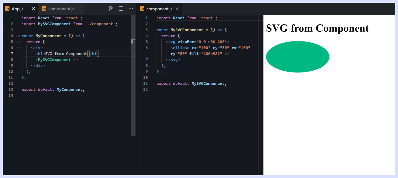
#4 SVG in React with Data URL
First step in using SVG as a Data URL, you need to convert SVG files into a Base64-encoded string and embedding them directly into the HTML or CSS code of a web page.
This makes SVG in React more convenient without relying on external files, making it useful for small-scale projects or when minimizing external dependencies is desired.
To use SVG as a Data URL in a React project, developers can follow these steps:
- Convert SVG to Data URL: Use an online tool or a build process to convert SVG files into Data URLs. This involves encoding the SVG content as Base64 and prepending it with the appropriate data type and encoding information.
- Embed SVG in JSX: In the React component, embed the SVG Data URL directly within JSX using the
imgtag or as a background image in adivorspanelement. - Apply Styling: If necessary, apply styling to the SVG element using inline styles or CSS classes to control its appearance and behavior.
Here's an example of using an SVG in React component as a Data URL:
import React from 'react';

// Assuming svgString contains your SVG content
const svgString = `<svg width="203" height="45" viewBox="0 0 203 45" fill="none" xmlns="http://www.w3.org/2000/svg"><path d="M2.25735 8.05868C3.15297 5.30896 5.30896 3.15297 8.05868 2.25735V2.25735C17.2993 -0.75245 27.2566 -0.75245 36.4972 2.25735V2.25735C39.247 3.15297 41.4029 5.30896 42.2986 8.05868V8.05868C45.3084 17.2993 45.3084 27.2566 42.2986 36.4972V36.4972C41.4029 39.247 39.247 41.4029 36.4972 42.2986V42.2986C27.2566 45.3084 17.2993 45.3084 8.05868 42.2986V42.2986C5.30896 41.4029 3.15297 39.247 2.25735 36.4972V36.4972C-0.75245 27.2566 -0.75245 17.2993 2.25735 8.05868V8.05868Z" fill="url(#paint0_linear)"/><path fill-rule="evenodd" clip-rule="evenodd" d="M20.0889 31.8688V25.7313L28.8067 38.8849C32.21 37.4613 33.3552 33.695 31.3061 30.6648L26.8473 24.0714H13.105V38.8526C16.9621 38.8526 20.0889 35.7259 20.0889 31.8688ZM19.6144 21.8269H25.3295L24.8642 21.1388L19.6023 21.7777L19.6144 21.8269Z" fill="white"/><path fill-rule="evenodd" clip-rule="evenodd" d="M24.1036 22.5002C28.6281 22.5002 32.2959 18.8324 32.2959 14.3079C32.2959 9.78342 28.6281 6.1156 24.1036 6.1156H13.105V22.5002H24.1036ZM25.0794 15.5375C25.6464 15.2113 25.6464 14.3798 25.0794 14.0537L21.1733 11.807C20.6154 11.4861 19.9247 11.8965 19.9247 12.5489V17.0422C19.9247 17.6946 20.6154 18.105 21.1733 17.7841L25.0794 15.5375Z" fill="url(#paint1_linear)"/><path d="M61.4835 24.272H61.0995V33.968H56.4595V11.568H63.5635C65.9741 11.568 67.7768 12.1013 68.9715 13.168C70.1661 14.2133 70.7635 15.7173 70.7635 17.68C70.7635 18.8747 70.3475 19.9733 69.5155 20.976C68.6835 21.9573 67.6701 22.5227 66.4755 22.672C67.3288 22.9067 67.9901 23.3013 68.4595 23.856C68.9288 24.3893 69.4195 25.264 69.9315 26.48L73.0995 33.968H68.3315L65.2275 26.8C64.7795 25.776 64.2995 25.104 63.7875 24.784C63.2968 24.4427 62.5288 24.272 61.4835 24.272ZM63.4355 15.216H61.0995V20.624H63.1155C63.9688 20.624 64.6301 20.3467 65.0995 19.792C65.5901 19.2373 65.8355 18.5547 65.8355 17.744C65.8355 16.0587 65.0355 15.216 63.4355 15.216Z" fill="black"/><path d="M87.7087 33.008C85.6821 33.7973 83.8047 34.192 82.0767 34.192C77.0634 34.192 74.5567 31.4827 74.5567 26.064C74.5567 23.312 75.1647 21.232 76.3807 19.824C77.5967 18.3947 79.3674 17.68 81.6927 17.68C83.6127 17.68 85.1487 18.2773 86.3007 19.472C87.4527 20.6667 88.0287 22.4373 88.0287 24.784C88.0287 25.7227 87.9861 26.544 87.9007 27.248H78.6527C78.6527 28.5067 78.9941 29.4347 79.6767 30.032C80.3594 30.6293 81.2767 30.928 82.4287 30.928C83.5807 30.928 85.1061 30.672 87.0047 30.16L87.7087 33.008ZM84.0287 24.304V24.08C84.0287 23.0987 83.8154 22.3093 83.3887 21.712C82.9621 21.1147 82.2901 20.816 81.3727 20.816C80.4554 20.816 79.7727 21.1467 79.3247 21.808C78.8767 22.4693 78.6421 23.3013 78.6207 24.304H84.0287Z" fill="black"/><path d="M96.0645 41.584H91.9045V18H95.0725L95.8405 19.696C96.6298 19.0347 97.3445 18.5333 97.9845 18.192C98.6458 17.8507 99.3818 17.68 100.192 17.68C101.963 17.68 103.307 18.416 104.224 19.888C105.163 21.36 105.632 23.4187 105.632 26.064C105.632 28.7093 105.035 30.736 103.84 32.144C102.646 33.5307 101.238 34.224 99.6165 34.224C98.4431 34.224 97.2591 33.712 96.0645 32.688V41.584ZM96.0645 22.928V28.784C96.7471 29.8933 97.5898 30.448 98.5925 30.448C99.6165 30.448 100.32 30.0853 100.704 29.36C101.11 28.6347 101.312 27.5253 101.312 26.032C101.312 24.5387 101.099 23.3867 100.672 22.576C100.246 21.7653 99.7125 21.36 99.0725 21.36C98.1551 21.36 97.1525 21.8827 96.0645 22.928Z" fill="black"/><path d="M113.533 34H109.373V11.6H113.533V34Z" fill="black"/><path d="M127.509 34L126.869 32.4C126.123 33.0827 125.461 33.5627 124.885 33.84C124.309 34.096 123.616 34.224 122.805 34.224C121.44 34.224 120.245 33.7547 119.221 32.816C118.219 31.856 117.717 30.5867 117.717 29.008C117.717 27.4293 118.336 26.192 119.573 25.296C120.811 24.3787 122.677 23.92 125.173 23.92H126.485C126.485 23.0027 126.261 22.2667 125.813 21.712C125.387 21.1573 124.725 20.88 123.829 20.88C122.272 20.88 120.693 21.0933 119.093 21.52L118.389 18.704C120.501 18.0213 122.624 17.68 124.757 17.68C128.64 17.68 130.581 19.4933 130.581 23.12V34H127.509ZM126.421 26.992H125.045C123.851 26.992 123.04 27.152 122.613 27.472C122.187 27.792 121.973 28.2613 121.973 28.88C121.973 29.4773 122.133 29.968 122.453 30.352C122.773 30.736 123.189 30.928 123.701 30.928C124.427 30.928 125.333 30.352 126.421 29.2V26.992Z" fill="black"/><path d="M137.811 34.32L132.563 18H136.723L139.827 29.04L142.963 18H147.059L141.715 34C141.054 35.9627 140.222 37.5307 139.219 38.704C138.217 39.8773 136.958 40.8267 135.443 41.552L133.907 38.608C134.761 38.2453 135.561 37.6907 136.307 36.944C137.054 36.2187 137.555 35.344 137.811 34.32Z" fill="black"/><path d="M149.366 34V11.6H156.406C158.902 11.6 160.768 12.1013 162.006 13.104C163.243 14.0853 163.862 15.4933 163.862 17.328C163.862 18.5653 163.51 19.5893 162.806 20.4C162.123 21.2107 161.184 21.7013 159.99 21.872C161.504 22.128 162.678 22.736 163.51 23.696C164.342 24.656 164.758 25.8507 164.758 27.28C164.758 29.3067 164 30.9387 162.486 32.176C160.971 33.392 158.87 34 156.182 34H149.366ZM153.782 30.32H156.95C157.974 30.32 158.795 30.0533 159.414 29.52C160.032 28.9653 160.342 28.2293 160.342 27.312C160.342 26.3733 159.99 25.5627 159.286 24.88C158.603 24.176 157.6 23.824 156.278 23.824H153.782V30.32ZM156.566 15.28H153.782V20.176H156.246C157.078 20.176 157.814 19.92 158.454 19.408C159.115 18.896 159.446 18.2347 159.446 17.424C159.446 16.1013 158.486 15.3867 156.566 15.28Z" fill="black"/><path d="M172.499 15.6H168.339V11.6H172.499V15.6ZM172.499 34H168.339V18H172.499V34Z" fill="black"/><path d="M181.753 23.376V34H177.561V18H180.889L181.273 19.568C182.126 18.8853 182.841 18.4053 183.417 18.128C183.993 17.8293 184.494 17.68 184.921 17.68C185.369 17.68 185.667 17.6907 185.817 17.712C185.966 17.712 186.094 17.7227 186.201 17.744C186.307 17.7653 186.489 17.808 186.745 17.872L186.361 21.68C185.977 21.552 185.454 21.488 184.793 21.488C183.897 21.488 182.883 22.1173 181.753 23.376Z" fill="black"/><path d="M202.189 34H199.053L198.413 32.176C196.621 33.52 194.989 34.192 193.517 34.192C192.066 34.192 190.861 33.5093 189.901 32.144C188.962 30.7573 188.493 28.72 188.493 26.032C188.493 23.3227 189.026 21.2533 190.093 19.824C191.181 18.3947 192.599 17.68 194.349 17.68C195.501 17.68 196.738 18.2133 198.061 19.28V11.6H202.189V34ZM198.029 29.072V22.704C196.898 21.7653 195.949 21.296 195.181 21.296C194.413 21.296 193.794 21.6907 193.325 22.48C192.877 23.2693 192.653 24.4427 192.653 26C192.653 28.9867 193.463 30.48 195.085 30.48C195.917 30.48 196.898 30.0107 198.029 29.072Z" fill="black"/><defs><linearGradient id="paint0_linear" x1="22.278" y1="0" x2="22.278" y2="44.5559" gradientUnits="userSpaceOnUse"><stop stop-color="#EB418B"/><stop offset="1" stop-color="#EF965B"/></linearGradient><linearGradient id="paint1_linear" x1="22.7003" y1="22.5002" x2="22.7003" y2="6.11557" gradientUnits="userSpaceOnUse"><stop stop-color="white"/><stop offset="1" stop-color="white"/></linearGradient></defs></svg>`;

const svgDataUrl = `data:image/svg+xml;base64,${btoa(svgString)}`;

const MyComponent = () => {
  return (
    <div>
      <img src={svgDataUrl} alt="RB Logo" />
    </div>
  );
};

export default MyComponent;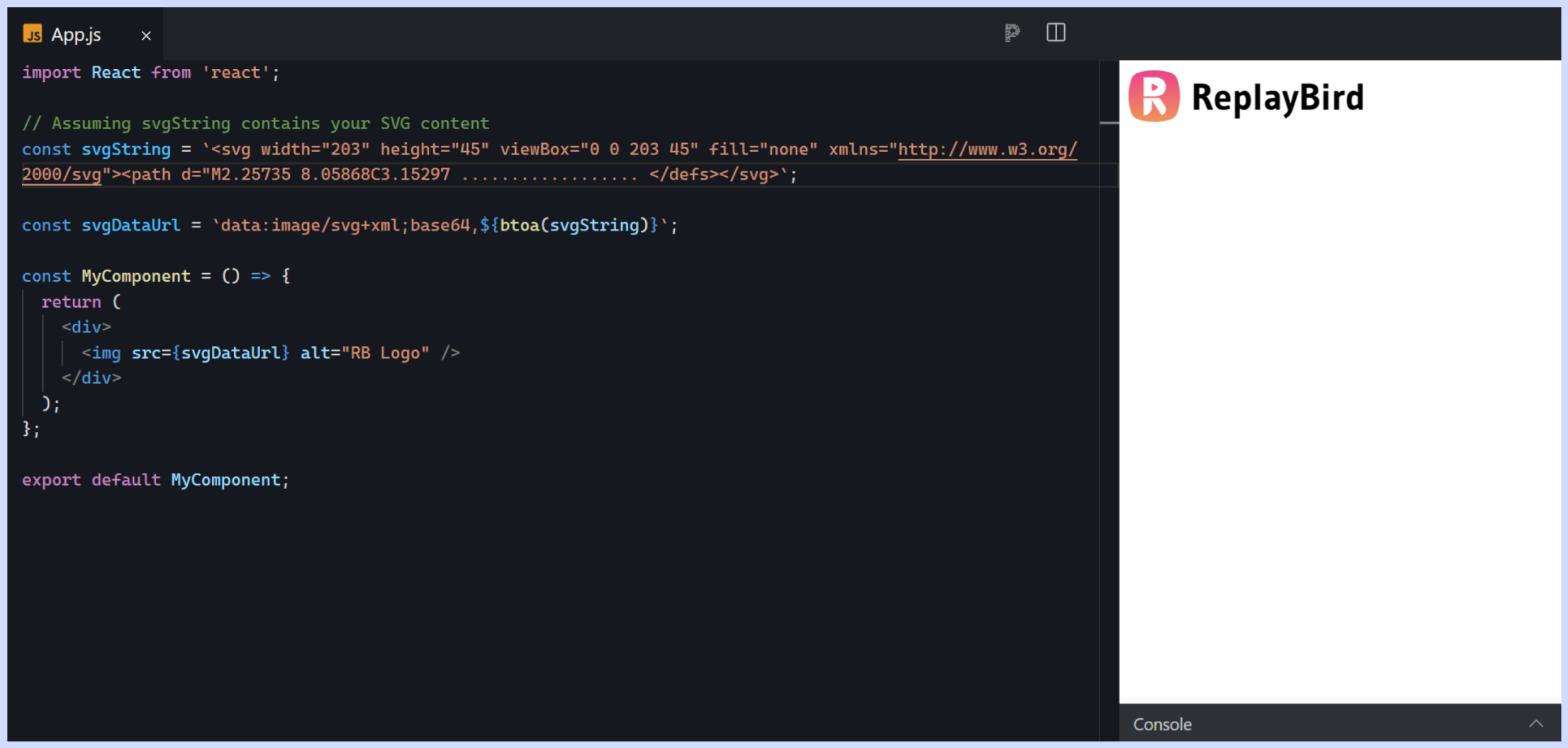
We've created a svgString variable containing the SVG content as a string. Then, we've constructed a data URL using the btoa function to encode the string as base64. Finally, we use this data URL as the source for the <img> element.
#5 Using React SVG into the DOM with <react-svg>
Injecting SVG to the DOM using react-svg is a convenient and efficient method for dynamically rendering SVG graphics within React applications. This approach leverages the react-svg library, which provides a React component for easily injecting SVG content into the DOM.
To use react-svg, developers can follow these steps:
1. Install react-svg: Begin by installing the react-svg package using npm or yarn.
npm install react-svg2. Import react-svg Component: Import the <ReactSVG> component from the <react-svg> package into your React component where you want to inject the SVG.
3. Use ReactSVG Component: Use the <ReactSVG> component in your JSX code and specify the <src> prop to indicate the path to the SVG file that you want to inject.
4. Install react-svg: Begin by installing the <react-svg> package using <npm> or <yarn>.
import React from 'react';
import { ReactSVG } from 'react-svg';

const MyComponent = () => {
  return (
    <div>
      <ReactSVG src="https://www.replaybird.com/logo.svg" />
    </div>
  );
};

export default MyComponent;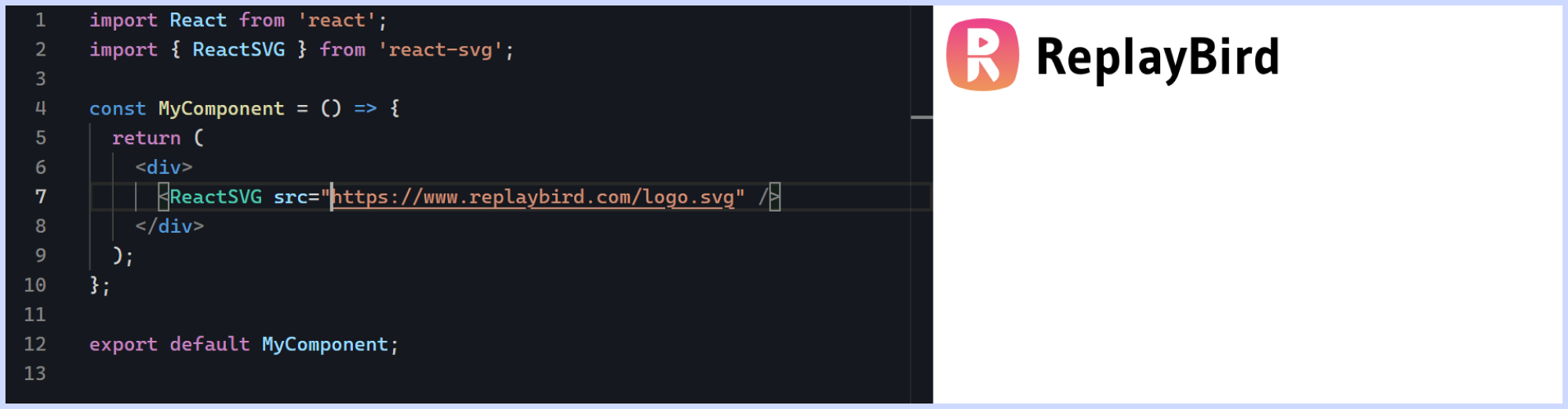
Optional Props using SVG to the DOM with react-svg: The ReactSVG component accepts various optional props for customization, such as beforeInjection, afterInjection, fallback, loading, evalScripts, wrapper, and more. These props allow you to control the behavior and appearance of the injected SVG content.
Animate SVG in React
To conclude this blog we will look into a brief explanation of SVG animation with React, but here you can understand more deeper into how to animate in React with CSS keyframe animations
Animating SVGs in React can be done using various techniques, including CSS animations, JavaScript animations, and libraries like React Spring or GreenSock Animation Platform (GSAP). Below, I'll outline two common methods for animating SVGs in React: using CSS animations and using JavaScript animations with GSAP.
a) Using CSS Animations:
CSS animations offer a straightforward way to animate SVG elements in React. You can define keyframes and apply them to SVG elements using CSS classes.
Define CSS Keyframes: Define keyframes for the animation in your CSS file. For example, you can create a simple scale animation:
@keyframes scale {
  0% {
    transform: scale(1);
  }
  50% {
    transform: scale(1.2);
  }
  100% {
    transform: scale(1);
  }
}
Apply Animation to SVG: Apply the defined animation to your SVG element by adding the CSS class to the SVG element in your React component.
import React from 'react';
import './styles.css';

const AnimatedSVG = () => {
  return (
    <svg width="100" height="100">
      <circle cx="50" cy="50" r="40" className="animate" />
    </svg>
  );
}

export default AnimatedSVG;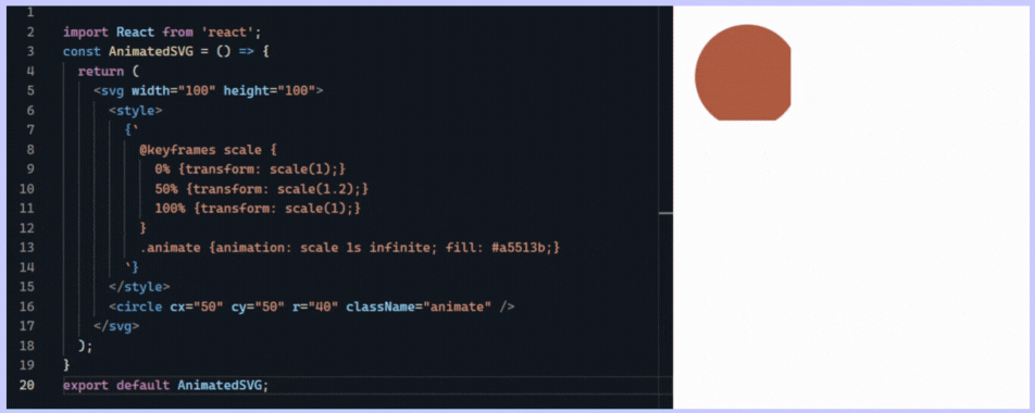
b) Using JavaScript Animations with GSAP:
GSAP (GreenSock Animation Platform) provides powerful JavaScript animation capabilities for animating SVG elements in React.
Install GSAP: Install GSAP as a dependency in your project.
npm install gsapImport GSAP and Animate SVG: Import GSAP and use it to animate SVG elements in your React component.
import React, { useEffect, useRef } from 'react';
import gsap from 'gsap';

const AnimatedSVG = () => {
  const circleRef = useRef(null);

  useEffect(() => {
    gsap.to(circleRef.current, {
      duration: 1,
      scale: 1.2,
      yoyo: true,
      repeat: -1,
    });
  }, []);

  return (
    <svg width="100" height="100">
      <circle ref={circleRef} cx="50" cy="50" r="40" fill="#ff91e7" />
    </svg>
  );
};

export default AnimatedSVG;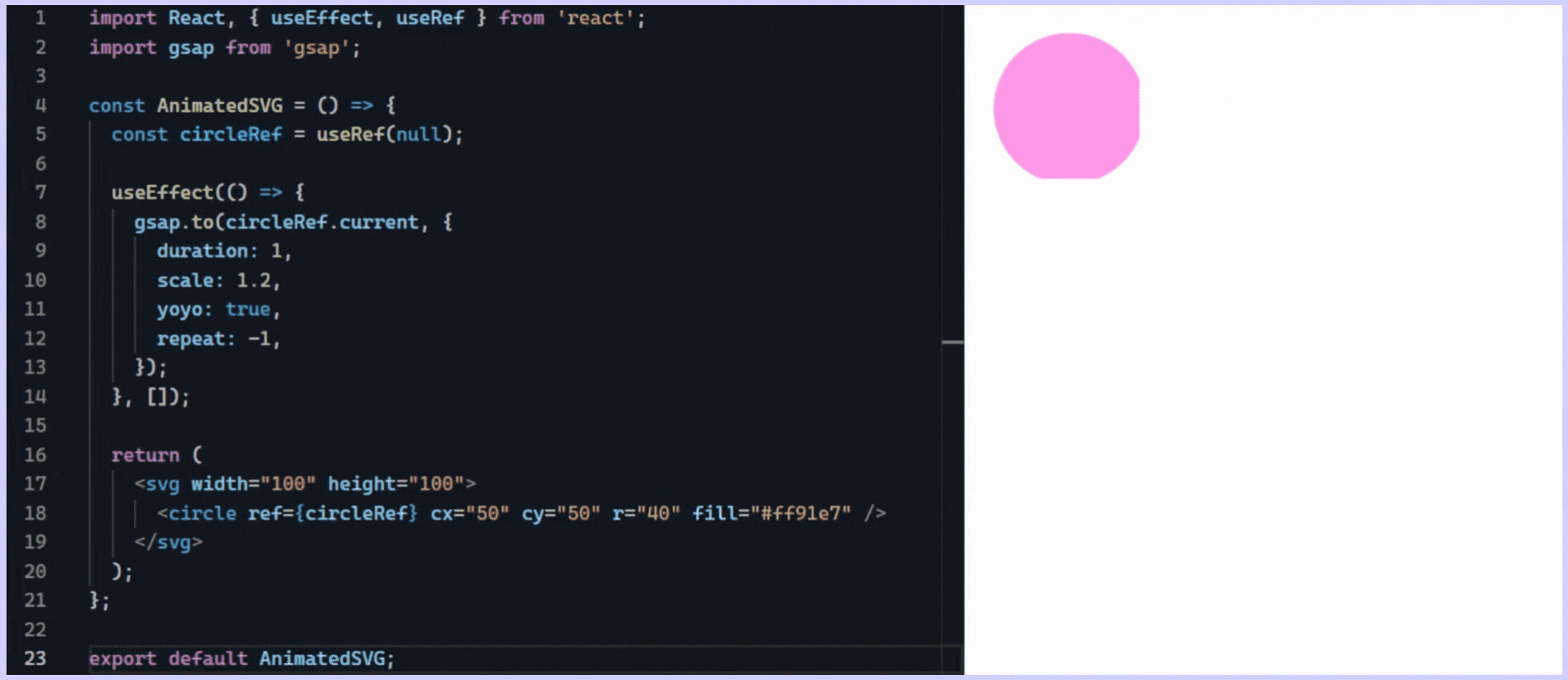
Understand Exactly How Your Users Interact with Your React.js app
ReplayBird, a digital user experience analytics platform designed specifically for Next.js developers with advanced insights to optimize your Next.js applications like a pro!
Unleash the power of behavioral insights with ReplayBird's intuitive heatmaps, session replays, and clickstream analysis allows you to visualize user behavior, identify popular elements, and detect pain points that might hinder user satisfaction.
Customer journey analysis and conversion funnels of ReplayBird to analyze deeper into user journeys, identify where drop-offs occur, and uncover conversion blockers.
Troubleshooting is now simpler with ReplayBird's robust debugging features. Detect and diagnose user experiences issue quickly, ensuring a seamless user journey from start to finish.
With ReplayBird, you have the ultimate toolkit to elevate your Next.js projects to the next level. The platform empowers you to create high-performing, user-centric applications that leave a lasting impression.
Try ReplayBird 14-days free trial
Keep Reading More on React.js
 Uma
Uma Uma
Uma Uma
Uma