Bootstrap is a popular front-end development framework that has been widely used for creating responsive and mobile-friendly websites. React, on the other hand, is a powerful JavaScript library that has taken the web development world by storm with its ability to build complex user interfaces. Combining these two technologies can result in a powerful web development experience.
Bootstrap provides a set of pre-designed UI components, including forms, tables, and buttons, that can be easily integrated into your React application. This means you can focus on building your application logic rather than styling elements from scratch.
React, on the other hand, allows you to create reusable components that can be used across your application. By combining these two frameworks, you can create a consistent and visually appealing user interface that is quick to develop and easy to maintain. In this blog post, we will explore the following table of content.
- How to Install Bootstrap in React
- How to Integrate Bootstrap with React
- Bootstrap React Components
- Customizing Bootstrap React Components
- Benefits of Using Bootstrap with React
How to Install Bootstrap in React
Step 1: Open your React project directory in your terminal or command prompt.
Step 2: Install the Bootstrap package using npm or yarn. Run one of the following commands:
npm install bootstrapHow to Integrate Bootstrap with React
Import the Bootstrap CSS file in your React project's index.js file or in the component where you want to use Bootstrap. Install the Bootstrap package as described in the previous answer. You can do this by adding the following line at the top of your component file:
import 'bootstrap/dist/css/bootstrap.min.css';This will import the Bootstrap CSS file into your project and make the Bootstrap styles available for use in your components.
Use the Bootstrap components in your React component. You can use any of the Bootstrap components by importing them from the react-bootstrap package and using them in your JSX code.
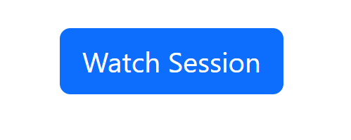
For example, to use a Bootstrap Button component, you can add the following code to your component:
import React from 'react';
import { Button } from 'react-bootstrap';
import './style.css';

export default function App() {
  return (
    <div class="container pt-3">
      <Button variant="primary"> Watch Session </Button>
    </div>
  );
}
This will render a Bootstrap in react button with the primary variant style. And class= "container pt-3" is to make a padding space.
Customize the Bootstrap in react components as needed. You can customize the styles and behavior of Bootstrap components by passing props to them or by adding custom CSS classes. You can also customize the button by changing the variant prop to one of the other predefined options, such as "secondary", "success", "danger", or "warning". You can also add event handlers to the button to handle user interactions.
For example, to add a custom CSS class to a Bootstrap button, you can add the className prop like this:
<Button variant="success" className="my-custom-class"> Replay Session </Button>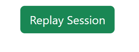
This will add the my-custom-class CSS class to the button element, which you can then style using custom CSS.
Bootstrap Components in React
Bootstrap in react components is easy to use and customize and comes with a wide variety of options for building complex user interfaces.
#1 Bootstrap in React Navigation Bar
Use the Navbar component to create a navigation bar. You can customize the appearance and behavior of the navbar by passing props to the Navbar component.
import React from 'react';
import { Navbar, Nav, NavDropdown} from 'react-bootstrap';
import './style.css';

export default function App() {
  return (
    <div class="container pt-3">
       <Navbar bg="light" expand="lg">
  <Navbar.Brand href="#">ReplayBird</Navbar.Brand>
  <Navbar.Toggle aria-controls="basic-navbar-nav" />
  <Navbar.Collapse id="basic-navbar-nav">
    <Nav className="mr-auto">
      <Nav.Link href="#">Home</Nav.Link>
      <Nav.Link href="#">About</Nav.Link>
      <NavDropdown title="Features" id="basic-nav-dropdown">
        <NavDropdown.Item href="#">Session Replay</NavDropdown.Item>
        <NavDropdown.Item href="#">Product Analytics</NavDropdown.Item>
        <NavDropdown.Divider />
        <NavDropdown.Item href="#">Error Tracking</NavDropdown.Item>
      </NavDropdown>
    </Nav>
  </Navbar.Collapse>
</Navbar>
    </div>
  );
}
This will render a Bootstrap navigation bar with a brand logo, a toggle button for small screens, and a list of navigation links and dropdown menu items.
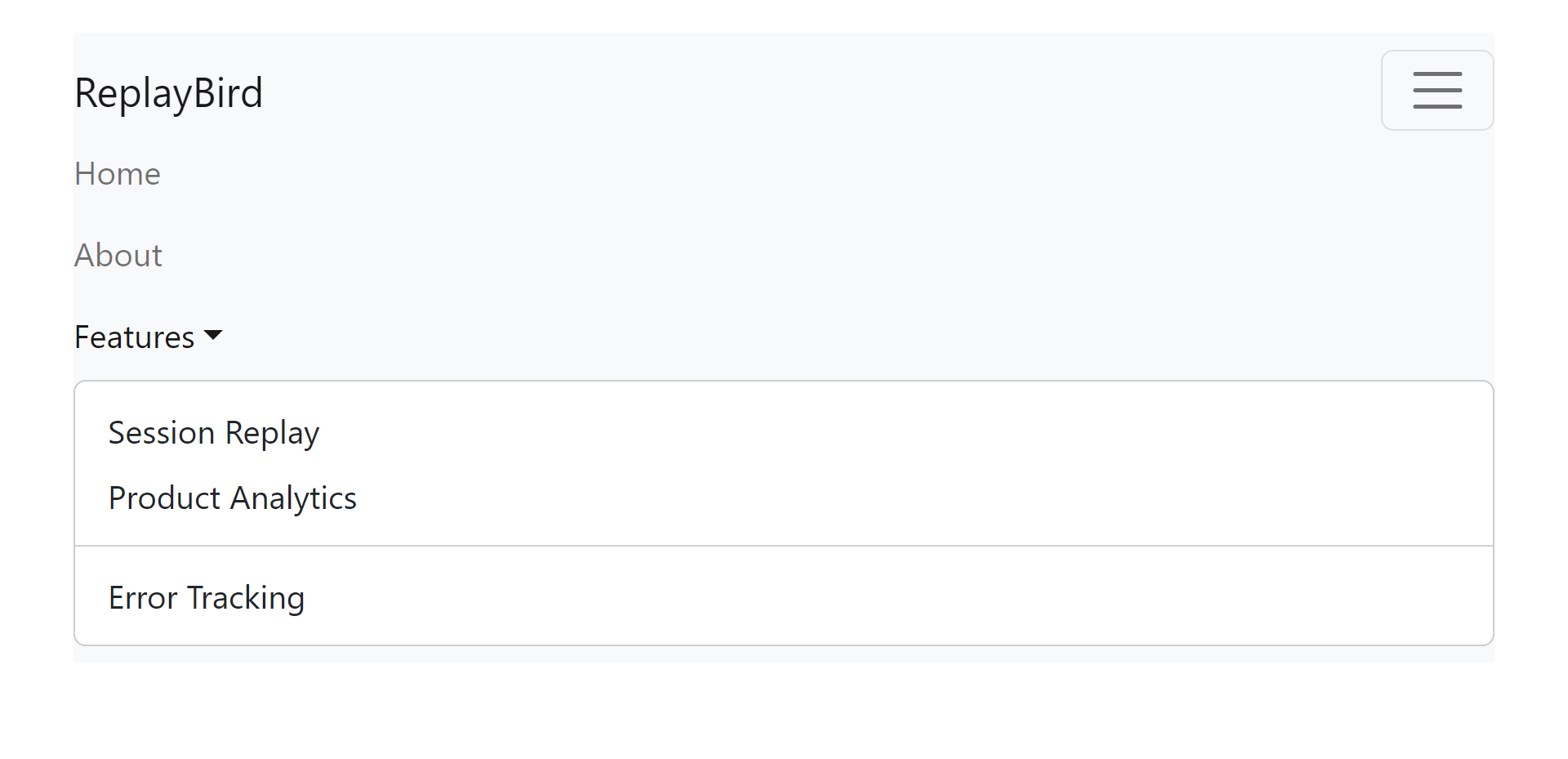
Customize the navbar as needed. You can customize the appearance and behavior of the navbar by passing props to the Navbar, Nav, and NavDropdown components.
#2 Bootstrap in React Forms
Use the Form component to create a form. You can customize the appearance and behavior of the form by passing props to the Form component and its child components.
import React from 'react';
import { Form, InputGroup, FormControl, Button } from 'react-bootstrap';
import './style.css';
export default function App() {
return (
<div class="container pt-3">
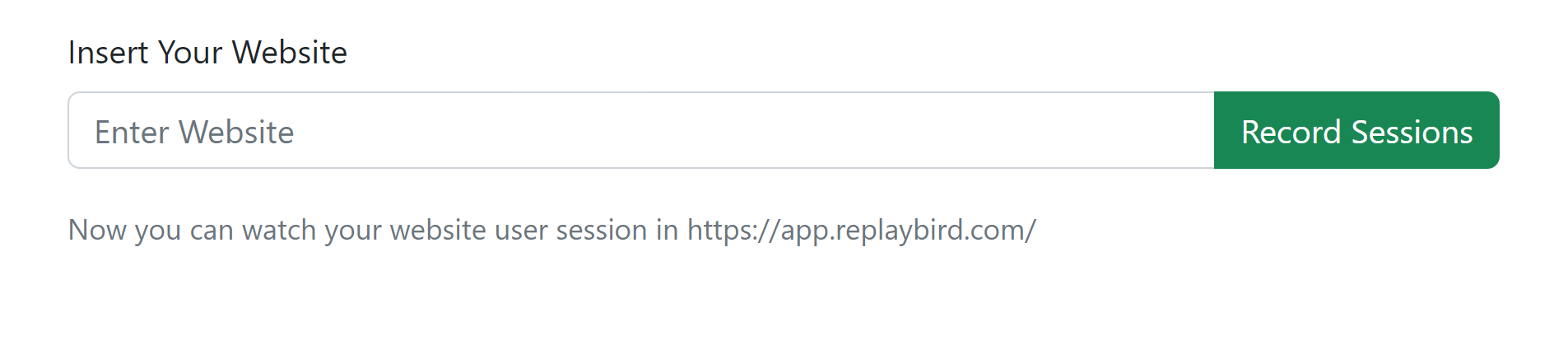
<Form>
<Form.Group controlId="formBasicEmail">
<Form.Label>Insert Your Website</Form.Label>
<InputGroup className="mb-3">
<FormControl type="Wesite" placeholder="Enter Website" />
<Button variant="outline-success">Record Sessions</Button>
</InputGroup>
<Form.Text className="text-muted">
Now you can watch your website user session in https://app.replaybird.com/
</Form.Text>
</Form.Group>
</Form>
</div>
);
}This will render a Bootstrap form with an email input field, a subscription button, and a disclaimer text.
Customize the form as needed. You can customize the appearance and behavior of the form by passing props to the Form, InputGroup, FormControl, and Button components.
#3 Bootstrap in React Modal
Use the Modal component to create a modal. You can customize the appearance and behavior of the modal by passing props to the Modal component and its child components.
function MyModal(props) {
  const [show, setShow] = useState(false);
  const handleClose = () => setShow(false);
  const handleShow = () => setShow(true);

  return (
    <div  class="container pt-3">
      <Button variant="light" onClick={handleShow}>
        Product Analytics
      </Button>

      <Modal show={show} onHide={handleClose}>
        <Modal.Header closeButton>
          <Modal.Title>Sign In
          </Modal.Title>
        </Modal.Header>
        <Modal.Body>
          <Form>
            <Form.Group controlId="formBasicEmail">
              <Form.Label>E-mail</Form.Label>
              <Form.Control type="email" placeholder="Enter E-mail" />
              <Form.Text className="text-muted">
                We'll never share your email with anyone else.
              </Form.Text>
            </Form.Group>

            <Form.Group controlId="formBasicPassword">
              <Form.Label>Password</Form.Label>
              <Form.Control type="password" placeholder="Password" />
            </Form.Group>
          </Form>
        </Modal.Body>
        <Modal.Footer>
          <Button variant="secondary" onClick={handleClose}>
            Close
          </Button>
          <Button variant="primary" onClick={handleClose}>
            Save Changes
          </Button>
        </Modal.Footer>
      </Modal>
    </div>
  );
}

export default MyModal;
This will render a Bootstrap modal with a header, a body containing a form, and a footer containing two buttons.
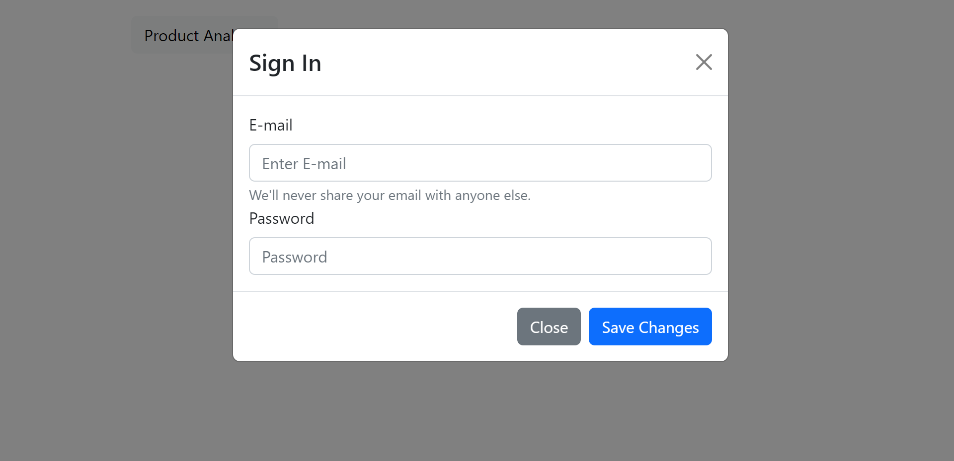
Customize the modal as needed. You can customize the appearance and behavior of the modal by passing props to the Modal, Button, and Form components.
#4 Bootstrap in React Cards
In this example, we are importing the Card component from the react-bootstrap package and using it to create a card with a header, body, and footer. You can customize the card by adding your own content and modifying the Bootstrap classes applied to the various card components.
import React from "react";
import Card from "react-bootstrap/Card";
function MyCard() {
return (
<div className="container pt-3">
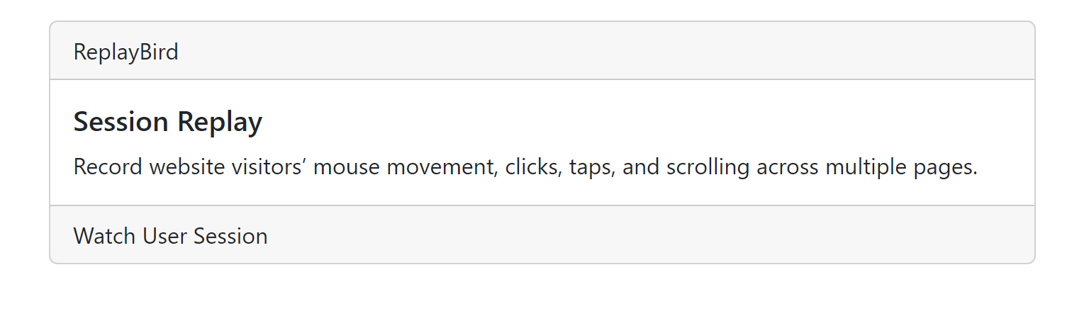
<Card>
<Card.Header>ReplayBird</Card.Header>
<Card.Body>
<Card.Title>Session Replay</Card.Title>
<Card.Text>
Record website visitors’ mouse movement, clicks, taps, and scrolling across multiple pages.
</Card.Text>
</Card.Body>
<Card.Footer>Watch User Session</Card.Footer>
</Card>
</div>
);
}
export default MyCard;The Card component, Bootstrap, also provides a number of related components, such as CardGroup, CardDeck, and CardColumns, which can be used to display multiple cards in different layouts.
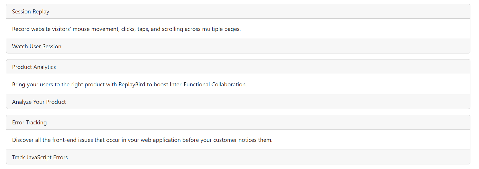
Now, we shall look at this same card repeated three times in order to understand how multiple cards will work. You can customize this code with as many cards as you want, respectively, with a parent component that renders the Card component three times.
import React from "react";
import Card from "react-bootstrap/Card";

function MyCards() {
  return (
    <div class="container pt-3">
      <Card className="mb-3">
        <Card.Header>Session Replay</Card.Header>
        <Card.Body>
          <Card.Text>
          Record website visitors’ mouse movement, clicks, taps, and scrolling across multiple pages.
          </Card.Text>
        </Card.Body>
        <Card.Footer>Watch User Session</Card.Footer>
      </Card>

      <Card className="mb-3">
        <Card.Header>Product Analytics</Card.Header>
        <Card.Body>
          <Card.Text>
          Bring your users to the right product with ReplayBird to boost Inter-Functional Collaboration.
          </Card.Text>
        </Card.Body>
        <Card.Footer>Analyze Your Product</Card.Footer>
      </Card>

      <Card className="mb-3">
        <Card.Header>Error Tracking</Card.Header>
        <Card.Body>
          <Card.Text>
          Discover all the front-end issues that occur in your web application before your customer notices them.
          </Card.Text>
        </Card.Body>
        <Card.Footer>Track JavaScript Errors</Card.Footer>
      </Card>
    </div>
  );
}

export default MyCards;
We have added the className="row" attribute to a parent div element to display the Card components in a row. Then we have added the className="col-md-4" attribute to each div element that contains a Card component to display three Card components in three columns.
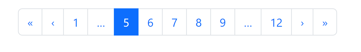
#5 Bootstrap in React Pagination
We have created a MyPagination component that returns the Pagination component from Bootstrap. We have also added some items, ellipses, and navigation buttons to the pagination. The active prop on the 12th item is used to show that it is the current page.
import React from "react";
import Pagination from "react-bootstrap/Pagination";

function MyPagination() {
  return (
    <div class="container pt-3">
      <Pagination>
        <Pagination.First />
        <Pagination.Prev />
        <Pagination.Item>{1}</Pagination.Item>
        <Pagination.Ellipsis />

        <Pagination.Item active>{5}</Pagination.Item>
        <Pagination.Item>{6}</Pagination.Item>
        <Pagination.Item>{7}</Pagination.Item>
        <Pagination.Item>{8}</Pagination.Item>
        <Pagination.Item>{9}</Pagination.Item>

        <Pagination.Ellipsis />
        <Pagination.Item>{12}</Pagination.Item>
        <Pagination.Next />
        <Pagination.Last />
      </Pagination>
    </div>
  );
}

export default MyPagination;
You can customize the pagination by changing the number of pages, the active page, and the content of each item. You can also add event handlers to the navigation buttons to handle user interactions.
#6 Bootstrap in React Flex
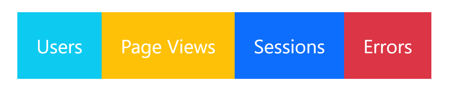
Bootstrap provides flex as an in-built component that makes the division of layout easier and readily available. In this example, we have four layouts divided into rows with class=d-flex for a simpler explanation in react Bootstrap. You can modify the rows to columns by simply removing the d-flex or adding a flex-column next to d-flex.
We have used class="p-3" for the text to be aligned more centric as comfortably as you are. You can adjust the text alignment as you wish. We have used another class, class=text-white, which is also changeAble as required and visible according to the design.
import React from 'react';
import { Container, Row, Col } from 'react-bootstrap';
import './style.css';

export default function App() {
  return (
    <div class="d-flex p-3 text-white">
      <div class="p-3 bg-info">Users</div>
      <div class="p-3 bg-warning">Page Views</div>
      <div class="p-3 bg-primary">Sessions</div>
      <div class="p-3 bg-danger">Errors</div>
    </div>
  );
}
We have used Flex components such as Container, Row and, Col in Bootstrap, which can be used to display multiple flexes in different layouts.
Customizing Bootstrap React Components
Bootstrap provides a set of predefined CSS styles and components that can be used to create visually appealing web pages. However, you may want to customize these components to better suit your application's needs. In React, you can customize Bootstrap components by overriding their default styles or by creating your own components that extend or modify the default ones.
#1 Override Default Styles
You can override Bootstrap's default styles by creating your own CSS styles and applying them to the components using the className prop. For example, if you want to change the background color of a button to green, you can define a CSS class like this:
.green-button {
  background-color: green;
}
And then apply it to a button like this:
This will give the button a green background color instead of the default blue.
import React from 'react';
import { Button } from 'react-bootstrap';
import './style.css';

export default function App() {
  return (
    <div class="container pt-3">
      <Button className="green-button"> Watch Session </Button>
    </div>
  );
}
#2 Create Custom Components
You can create your own components that extend or modify the default Bootstrap components. To do this, you can create a new component that renders the Bootstrap component with any additional props or modifications you need. For example, if you want to create a custom button that has a yellow border, you can create a new component like this:
import React from 'react';
import Button from 'react-bootstrap/Button';
export default function Mycustombutton(props) {
  return <Button {...props} style={{ borderColor: 'yellow', }} />;
}
This component uses the spread operator (props) to pass all of the props received by the component to the Button component while also adding a custom style that sets the border color to yellow.
You can then use this component in your app like any other React component:
import React from 'react';
import MyCustomButton from './Mycustombutton';
export default function App() {
  return (
    <MyCustomButton variant="primary" value="Watch Session">
      Watch Session
    </MyCustomButton>
  );
}
This will render a custom button with a yellow border and a blue background color.

Benefits of Using Bootstrap with React
Bootstrap in react is a widely-used framework for front-end development that provide a range of template-like UI components, including buttons, forms, navigation bars, and other useful elements, which developers can use to develop responsive and visually engaging web applications efficiently.
Furthermore, React is a JavaScript library that empowers developers to construct intricate user interfaces by decomposing them into modular, reusable components.
- Bootstrap in react provides built-in accessibility features, such as keyboard navigation and ARIA roles, which can help developers create UIs that are accessible to users with disabilities which makes using Bootstrap with React more accessible.
- Bootstrap in react offers a consistent set of tested and optimized UI components for different devices and browsers.
- Responsive design in UI components with automatic adjustable size layout to fit different screen sizes makes Bootstrap in react more responsive. Using Bootstrap with React makes it easier for developers to create responsive UIs that work well on desktop and mobile devices.
- Developers can make the development process faster with pre-built UI components in Bootstrap in react, saving a lot of time when creating UIs in React without having to write the CSS and JavaScript code from scratch.
- Using Bootstrap's grid system with React, developers can easily create responsive and flexible layouts that adapt to different screen sizes with the advanced grid system.
- Bootstrap in react provides several built-in themes that can be used to change the look and feel of UI components making developers switch between different themes and customize them to fit the needs of their application.
- By using Bootstrap with React, developers can still customize them to fit the needs of their application and easily override the default styles and behaviors of Bootstrap components using React's powerful styling capabilities.
Conclusion
React Bootstrap components are easy, as React’s components are designed to wrap around existing HTML elements. This allows developers to quickly and easily incorporate Bootstrap components into their React applications. In addition, React’s component-based architecture allows for the efficient reuse of existing code.
Whether you are a beginner or an experienced developer, this blog post would have helped you to understand the basics of using Bootstrap with React and provide you with the knowledge necessary to build responsive and mobile-friendly web applications.
ReplayBird - Driving Revenue and Growth through Actionable Product Insights
ReplayBird is a digital experience analytics platform that offers a comprehensive real-time insights which goes beyond the limitations of traditional web analytics with features such as product analytics, session replay, error analysis, funnel, and path analysis.
With Replaybird, you can capture a complete picture of user behavior, understand their pain points, and improve the overall end-user experience. Session replay feature allows you to watch user sessions in real-time, so you can understand their actions, identify issues and quickly take corrective actions. Error analysis feature helps you identify and resolve javascript errors as they occur, minimizing the negative impact on user experience.
With product analytics feature, you can get deeper insights into how users are interacting with your product and identify opportunities to improve. Drive understanding, action, and trust, leading to improved customer experiences and driving business revenue growth.
Try ReplayBird 14-days free trial
Further Readings:
 Uma
Uma Uma
Uma Uma
Uma