CSS Transitions let you create smooth and eye-catching animations by smoothly changing CSS properties over a specific time period. Whether you want to add elegance when hovering over an element or make it pop when a class is applied, CSS Transitions have covered you.
Using CSS Transitions is totally effortless. You need to specify the transition properties, such as duration, timing function, and delay, in the CSS rule for the element you want to animate. You can animate various properties like colors, sizes, positions, opacity, etc.
When a property change happens, the transition kicks in and smoothly takes your element from its original state to the new state. You control the transition's speed and style through the timing function. Want a snappy acceleration or a gentle deceleration? It's all up to you!
With CSS Transitions, you can easily bring your web elements to life. They add that extra touch of interactivity and visual appeal, making your website or web application more engaging and delightful for users.
So, let's go ahead and learn how to add some CSS Transition magic into your projects for an interactive UI!
- What are CSS Transitions?
- CSS Transition Properties
- CSS Triggering Transitions
- Benefits of Using CSS Transitions
What are CSS Transitions?
CSS Transitions are a CSS feature that enables smooth animations and transitions between different states of an element. They allow you to specify how an element should change over time when certain CSS properties are modified.
The transition is controlled by the duration, which determines how long the animation takes, and the timing function, which defines the pace of the animation. The delay property allows you to introduce a pause before the transition starts.
CSS Transitions can be applied to various CSS selectors, inline, including class, ID, and pseudo-classes. This allows you to trigger transitions in response to user interactions like hovering over an element or clicking on it. You can even use JavaScript to add or remove classes dynamically and initiate transitions based on those changes.
Cross-Browser Compatibility and Support for CSS transition
Cross-browser compatibility is important when using CSS Transitions to ensure consistent behavior and visual effects across different web browsers.
While CSS Transitions are widely supported by modern browsers, you should be aware of some differences in implementation and support. Here's an overview of cross-browser compatibility and support for CSS Transitions:
- W3C Standardization: CSS Transitions, included in the CSS3 standard established by the World Wide Web Consortium (W3C), are typically supported by contemporary web browsers, aligning with the universally accepted specifications.
- Modern Browser Support: CSS Transitions are widely supported by the latest iterations of commonly used web browsers such as Chrome, Firefox, Safari, and Edge. These browsers exhibit consistent behavior when it comes to CSS Transitions. To ensure compatibility, testing your transitions on these recommended browsers is advisable.
- Vendor Prefixes: Previously, various browser vendors utilized vendor prefixes (e.g., -WebKit-, -moz-) to implement experimental CSS features like Transitions. While the necessity for vendor prefixes in CSS Transitions has diminished in recent times, older browser versions might still rely on them. To ensure wider compatibility, especially with older browsers, it is advisable to include vendor prefixes as a good practice.
- Compatibility Testing: To guarantee compatibility across various browsers and their versions, it is essential to thoroughly test CSS Transitions. This can be achieved using browser testing tools. Alternatively, you can conduct tests on physical devices or virtual machines running different browsers.
CSS Transition Properties
CSS transitions offer a powerful toolset that allows you to control the duration, delay, timing function, and targeted properties of your web designs and captivating animations. We'll dive into the essential CSS transition properties and explore how you can use them to create visually appealing and engaging animations.
#1 CSS transition-property
Now, let's talk about the Transition-Property! With Transition-Property, you have the power to explicitly choose which properties you want to animate. You can be specific and target only the properties that need a touch of enchantment, saving your other properties from the transformation.
Example:
.box {
	width: 200px;
	height: 200px;
	background-color: blue;
	transition-property: width, height;
}

.box:hover {
	width: 400px;
	height: 300px;
}
<div class="box"></div>Output:
In this example, we have the transition-property transition at work. It explicitly specifies that only the width and height properties will experience the transformation. When the user hovers over the box, only the width and height properties will change, while the background-color remains untouched.
#2 CSS transition-duration
The transition-duration property in CSS allows you to specify the duration of a transition effect, determining how long the animation will take to complete. By setting a specific duration, such as 1 second (1s) or 500 milliseconds (500ms), you can control the speed at which the transition occurs.
Here's an example to demonstrate the usage of the transition-duration property:
.box {
	width: 200px;
	height: 200px;
	background-color: #E6FFFD;
	transition-property: width, height;
    transition-duration: 2s;
}

.box:hover {
	width: 400px;
	height: 300px;
}
<div class="box"></div>Output:
The transition-property property is used to specify that the width and height properties of the .box class will undergo a transition animation just like in the previous transition of transition-property. This means that when these properties change, such as when the user hovers over the element, a smooth transition effect will be applied.
The "transition-duration" property is like the conductor of a CSS transition. It determines the length of time it takes for a transition to perform its magical animation.
The transition-duration: 2s; sets the duration of the transition to 2 seconds. This means that whenever the width and height properties of the .box element change, the transition will take a leisurely 2 seconds to smoothly transform from one state to another transition.
If you want a slower and more graceful transformation, you can increase the duration. For a quick and snappy change, a shorter duration will do the trick.
By adjusting with the transition-duration property, you can play with the speed and timing of your transitions, creating captivating effects that perfectly suit your style. Just remember to find the right balance, so the duration is noticeable to users without making the transition feel like an eternity or disrupting their overall experience.
#3 CSS transition-delay
The transition-delay property in CSS allows you to specify a pause or delay before a transition effect starts. It introduces a waiting period between the moment a CSS property changes and the beginning of the transition animation. By using the transition-delay property, you can create more dynamic and controlled effects by sequencing transitions or adding delays between them.
Here's an example to illustrate the usage of the transition-delay property:
.box {
    width: 200px;
    height: 200px;
    background-color: #B799FF;
    transition-property: width, height;
    transition-duration: 2s;
    transition-delay: 2s;
	}
.box:hover {
    width: 400px;
    height: 300px;
}
<div class="box"></div>Output:
Let's dive into the transition-delay property! When you hover over the .box element with the transition-delay property set to 2 seconds 2s, a moment of suspense unfolds before the transition effect kicks in.
As you hover over the .box element the width property will gracefully transition from 200 pixels to 400 pixels, and the height property will undergo a transformation from 200 pixels to 300 pixels. The whole performance lasts for a 2 seconds.
But here's the twist! Before the transition starts, there's a playful pause of 2 seconds. This brief delay adds a touch of anticipation and excitement, making the animation feel purposeful and engaging.
By adjusting with the transition-delay property, you can craft experiences that build up anticipation and surprise. It's like giving your transitions their own dramatic entrance, ensuring they captivate your audience and create a lasting impression.
The transition-delay property works by adding a suspenseful 2-second pause before the width and height properties of the .box element elegantly transition.
#4 CSS transition-timing-functions
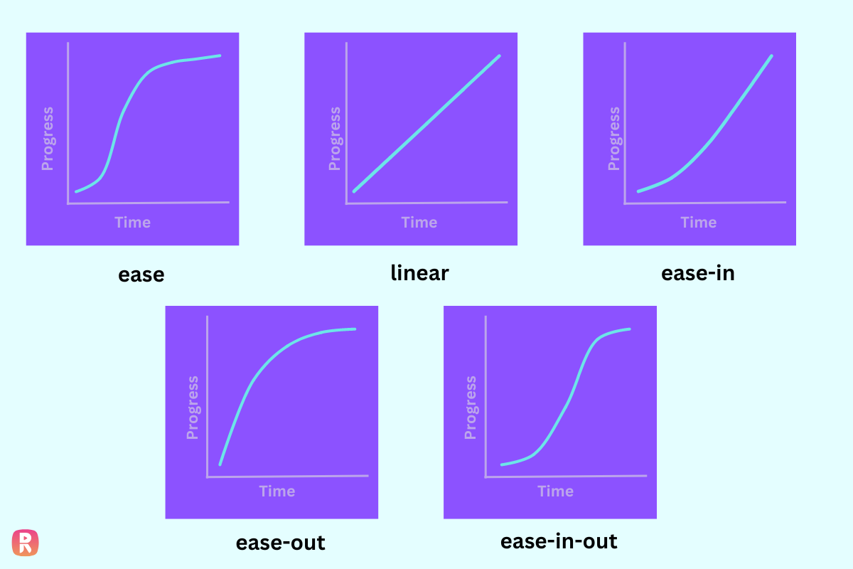
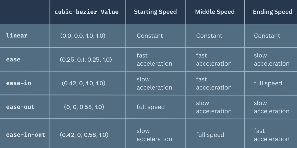
Before continuing into how to use the transition-timing-function property into your codes, we need to explore these transition timing functions.
-
ease:This is the default transition timing function, and it's like the "smooth operator" of the bunch. It starts slowly, picks up speed in the middle, and then eases off towards the end. It creates a natural and graceful transition effect that flows seamlessly.
-
linear:With this timing function, the transition progresses at a constant speed from start to end. It lacks the gradual acceleration and deceleration of other timing functions, resulting in a steady and consistent transition.
-
ease-in:This timing function provides a slow start to the transition, gradually picking up speed as it progresses. It creates an effect where the transition seems to ease into the new state.
-
ease-out:On the contrary, this timing function starts with a normal speed and then gradually slows down towards the end of the transition. It produces an effect where the transition seems to ease out of the current state.
-
ease-in-out:This timing function combines the characteristics of both
ease-inandease-out. It starts with a slow start, accelerates in the middle, and then slows down towards the end. It creates a smooth and balanced transition that eases both into and out of the animation.
cubic-bezier(n,n,n,n):
This cubic-bezier is also one of the timing function yet unique as it allows you to define your own custom values in a cubic-bezier function. The n values range from 0 to 1 and define the control points of a cubic Bézier curve. By adjusting these values, you can create unique and personalized timing functions, giving you complete control over the acceleration and deceleration of the transition. This enables you to create custom easing effects that match your design vision precisely.
Let's now continue with our transitions, by added a little something extra to make our transitions even more delightful. We've included the transition-timing-function property, which allows us to create custom easing curves for our transition animation.
.box {
    width: 200px;
    height: 200px;
    background-color: #E4A5FF;
    transition-property: width, height;
    transition-duration: 2s;
    transition-delay: 0.3s;
    transition-timing-function: cubic-bezier(0.25, 0.1, 0.25, 1);
}

.box:hover {
    width: 400px;
    height: 300px;
}
<div class="box"></div>Output:
By specifying the cubic-bezier timing function and tweaking the control points (in this case, using the values 0.25, 0.1, 0.25, 1), we can design unique and captivating transitions. It's like having our very own control to the acceleration and deceleration of the animation. We can make it start slow, speed up, and then slow down again, all with a touch of creativity.
When the user hovers over our .box element, the width gracefully transitions from 200px to 400px, and the height undergoes a change from 200px to 300px. The transition takes a delightful 2 seconds to complete. To top it off, the custom easing effect provided by the cubic-bezier timing function gives the animation its own unique personality, making it stand out from the crowd.
With this addition of the transition-timing-function property and our carefully chosen cubic-bezier values, our .box element truly comes to life. It's like adding a sprinkle of magic to the mix, enhancing the overall user experience and leaving a lasting impression. So get ready to bring your designs to the next level with these delightful and customizable transition effects.
#5 CSS transition - Shorthand Value
CSS Transition allows you to create super-smooth animations for multiple CSS properties in just one go. It's a handy shortcut that saves you from writing multiple lines of code. With the transition property, you can define the duration, timing function, delay, and the properties that will magically transform in your animation. It's like creating visually stunning and seamless transitions just with one property to access all the other within transition properties.
HTML:
<div class="box"></div>CSS:
.box {
	width: 200px;
	height: 200px;
	background-color: #FF78C4;
	transition: width 1s ease-in-out, height 0.5s linear;
}

.box:hover {
	width: 400px;
	height: 300px;
}
Output:
In this example, the .box class has the transition property set transition: width 1s ease-in-out, height 0.5s linear. It says that when the user hovers over the box, the width will gracefully transform from 200px to 400px over a magical 1-second duration with an enchanting ease-in-out timing function. Meanwhile, the height will transform from 200px to 300px, accompanied by a swift 0.5-second linear transition. It's like watching the box grow and shrink without giving the actual transitions one by one.
Note: By understanding the difference between CSS Transition and CSS Transition-Property, you can use your CSS transition wisely. Whether you want to use transition on multiple properties or specifically choose properties for transformation with the transition-property for your designs.
CSS Triggering Transitions
Triggering transitions involves the event or action that starts the transition animation on an element. It determines when the transition effect should take place, like when a user interacts with the element or when specific conditions are fulfilled.
Here are some triggers where you can use CSS transitions:
#1 Hover
When the user hovers over an element, it can trigger transitions that smoothly change its color, size, or other visual properties. For example, imagine a button that gracefully transitions to a different color when the user hovers over it. It adds a delightful touch to the user experience.
#2 Click
Clicking on an element can also trigger transitions. This is often used for interactive elements like menus or dropdowns. For instance, when a user clicks on a menu item, the menu can smoothly transition to reveal additional sub-items, creating a seamless navigation experience.
#3 Load
Transitions can be triggered when the page or specific elements finish loading. This is perfect for creating entrance animations or revealing content gradually to capture the user's attention. Imagine elements fading in or sliding into view as the page loads, creating an enticing experience.
#5 Time-based Triggers
Transitions can be triggered based on specific times or intervals. By using JavaScript or CSS animations, you can initiate transitions at predefined intervals or based on a countdown timer. This allows for dynamic and time-based animation effects, adding a sense of liveliness to your website design.
#6 Scroll
As the user scrolls the page, transitions can be triggered based on scroll events. This allows elements to gracefully come into view or change their appearance depending on their position in the viewport. It's a powerful way to add depth and interactivity to a webpage.
#7 Class Change
By dynamically adding or removing classes from an element using JavaScript, you can trigger transitions based on user interactions or application states. For example, expanding or collapsing a panel can smoothly transition its height, giving a visually appealing effect as the panel animates to its new state.
Benefits of Using CSS Transitions
CSS transition can be a huge beneit to developers to make smooth animations, engaging interactions, visual feedback, improved user flow, aesthetically pleasing effects, cross-browser compatibility, performance optimization, responsive design capabilities, easy implementation, and customizable options.
- Enhanced User Experience: CSS transitions provide an engaging and interactive user experience by adding smooth animations and visual effects to web elements. They make transitions between different states or interactions seamless, improving the overall usability and aesthetics of a website or web application. With CSS transitions, you can create delightful user interactions that leave a lasting impression.
- Polished User Interface: CSS transitions add a level of polish and professionalism to a website or application. By animating the visual changes smoothly, transitions provide a sense of elegance and sophistication, creating a visually appealing and modern user interface. They elevate the overall look and feel of your design, making it more visually pleasing and enjoyable for users.
- Versatility: CSS transitions can be applied to a wide range of CSS properties, including colors, sizes, positions, opacity, and more. This versatility allows for creative and flexible animations, enabling developers to bring their design visions to life. Whether you want to create subtle fades, smooth transitions, or eye-catching effects, CSS transitions offer a rich set of options to unleash your creativity.
- Attention Grabbing: By animating elements with transitions, you can draw attention to important areas or actions on a webpage. For instance, animating a call-to-action button to pulse or bounce can attract the user's focus and encourage interaction. These attention-grabbing animations can help guide users through your content and increase user engagement.
- Performance Benefits: CSS transitions are hardware-accelerated, meaning they utilize the device's graphical processing power for smoother and more efficient animations. This can lead to better performance and improved battery life on mobile devices. By leveraging hardware acceleration, CSS transitions optimize performance, resulting in faster and more fluid animations that don't drain device resources unnecessarily.
- Improved Accessibility: Transitions can help make websites more accessible by providing visual cues and indicating changes in element states. Smoothly animating transitions can make interactions more apparent to users with visual impairments or cognitive disabilities. By incorporating well-designed transitions, you can create a more inclusive experience for all users.
- Visual Feedback: Transitions can be used to provide visual feedback to users when they interact with elements. For example, you can highlight a button or change its color when hovered over, providing a subtle indication of interactivity. This visual feedback improves user understanding and engagement with the interface, making interactions more intuitive and enjoyable.
- Cross-Browser Compatibility: CSS transitions are supported by modern web browsers, making them widely compatible across different platforms and devices. This ensures a consistent experience for users, regardless of the browser they are using. You can rely on CSS transitions to work seamlessly on various devices, providing a consistent and reliable experience for your users.
Conclusion:
CSS Transitions can also guide your users' attention, highlighting important elements and improving overall usability and navigation. And let's not forget about performance! CSS Transitions are lightweight and performant, ensuring your pages load quickly and your animations play back smoothly.
CSS Transitions are an invaluable tool in modern web design, enabling developers to add delightful and engaging animations to their websites. Through a solid understanding of their syntax, properties, triggering methods, and benefits, developers can create visually stunning and interactive user interfaces.
By harnessing the power of CSS Transitions, websites can captivate and delight visitors, enhancing the overall user experience. So, embrace the possibilities offered by CSS Transitions and elevate your web design to new heights of creativity and user engagement.
ReplayBird - Driving Revenue and Growth through Actionable Product Insights
ReplayBird is a digital experience analytics platform that offers a comprehensive real-time insights which goes beyond the limitations of traditional web analytics with features such as product analytics, session replay, error analysis, funnel, and path analysis.
With Replaybird, you can capture a complete picture of user behavior, understand their pain points, and improve the overall end-user experience. Session replay feature allows you to watch user sessions in real-time, so you can understand their actions, identify issues and quickly take corrective actions. Error analysis feature helps you identify and resolve javascript errors as they occur, minimizing the negative impact on user experience.
With product analytics feature, you can get deeper insights into how users are interacting with your product and identify opportunities to improve. Drive understanding, action, and trust, leading to improved customer experiences and driving business revenue growth.
Try ReplayBird 14-days free trial
Keep Reading about CSS:
 Velantina
 Velantina
 Velantina