Shadows in CSS is one of the major ability of CSS. Properties that can be adjusted when using box-shadow, including the color, size, and position of the shadow. In addition, it is possible to create multiple shadows on an element by using comma-separated values.
This allows you to create complex shadow effects that can enhance the overall design of a website. It is important to note that using too many shadows or using them inappropriately can negatively impact the user experience, so it is important to use them judiciously and with purpose.
Table of Content:
- What are CSS Shadows?
- Types of CSS Shadows
- Ways to style CSS box-shadow effect
- Tips for using CSS shadows effectively and efficiently
- Custom shadow effect to the SVG image using filter properties
What are CSS Shadows?
CSS shadows are a visual effect used for frontend elements on a webpage using Cascading Style Sheets (CSS). CSS shadows can add depth effect and dimensionality to the designs, making elements appear to float overhead into the page. Shadows can create various effects, from subtle and understated to bold and dramatic.
Best CSS shadows can be customized with various properties, such as color, blur radius, and offset, to create various effects. Designers are now able to create more engaging and immersive web experiences.
Also, you may need to know that modern web browser supports the box-shadow property, but there may be some older browsers that still do not support it. Here's a breakdown of the versions that have better browser compatibility with box-shadow:
- Chrome: 4+
- Firefox: 3.5+
- Safari: 3.1+
- Opera: 10.5+
- Edge: 12+
- Internet Explorer: 9+
CSS Shadow property adds a shadow effect to an element's box, such as a div, a button or CSS 3D button with shadow effect, and an image. The box-shadow property also takes five major values, such as:
- Firstly
x-offsetsets the horizontal position of the shadow as the negative values move the shadow to the left of the element, and positive values move it to the right. - Secondly
y-offsetsets the vertical position of the shadow as the negative values move the shadow up, and positive values move it down. - Thirdly
blur-radiuscontrols the amount of blur applied to the shadow as a higher value creates a more diffused shadow, while a lower value makes the shadow sharper. - The
spread-radiussets the size of the shadow with a positive value will make the shadow larger than the element, while a negative value will make it smaller. - Finally
colorsets the color of the shadow.
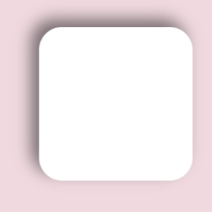
Building a HTML with CSS styles
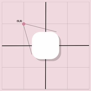
For you to try out the best CSS shadows properties, firstly, you will need base HTML that with a class and CSS styles that develop a shape.
<body>
    <div class=box>
    </div>
</body>
Now we shall add CSS styles that generate a shape, lets keep it simple with a background color that isn't white as our element is going to be in white color to make the shadow work more better visually.
Now our element has a height and a width of 100px, Margin respective to its visible spacings and finally border radius to make the element more softer like a circled square.
body {
  background-color: #f0dae0;
}
div{
  height: 100px;
  width: 100px;
  display: block;
  margin-top: 20px;
  margin-left: auto;
  margin-right: auto;
  background: #fff;
  border-radius: 15px;
 }
We will be addding the folling styles below. Let's break down each values and learn how they affect the shadow effect.
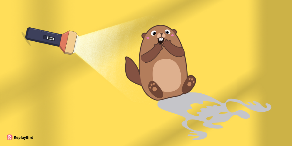
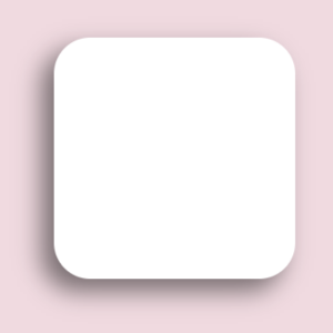
#1 (x,y)
Here in this (x,y) imagine a torch has been lighting towards your element when your element is in the origin and that is how your shadow in the CSS is calculated and generated.
As both x and y are positive and they are passing from top-right as it cast a shadow in the bottom-right direction.
This is because the x value of the shadow determines the horizontal offset of the shadow from the element, while the y value determines the vertical offset. In this case, both values are positive, meaning the shadow will be offset both to the right and downwards.
The direction in which the shadow is cast is determined by the angle at which the light source is hitting the element. Since the shadow is passing from the top-right, the light source is assumed to be coming from the top-left direction, and thus the shadow is cast in the opposite direction.
.box {
  box-shadow: 5px 5px 10px 0px rgba(0, 0, 0, 0.5);
}
Output:
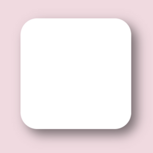
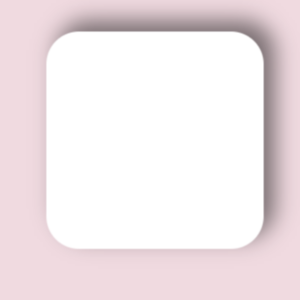
#2 (-x,y)
In this second part x is negative and y is positive and they are passing from top-left as the resulting shadow will be cast in the bottom-right direction.
This is because the x value of the shadow determines the horizontal offset of the shadow from the element, while the y value determines the vertical offset. In this case, x is negative and y is positive, meaning the shadow will be offset to the left and downwards.
The direction in which the shadow is cast is determined by the angle at which the light source is hitting the element. Since the shadow is passing from the top-left, the light source is assumed to be coming from the top-right direction, and thus the shadow is cast in the opposite direction.
.box {
  box-shadow: -5px 5px 10px 0px rgba(0, 0, 0, 0.5);
}
Output:
#3 (x,-y)
In this third part x is positive and y is negative and they are passing from bottom-left as the resulting shadow will be cast in the top-right direction.
This is because the x value of the shadow determines the horizontal offset of the shadow from the element, while the y value determines the vertical offset. In this case, x is positive and y is negative, meaning the shadow will be offset to the right and upwards.
The direction in which the shadow is cast is determined by the angle at which the light source is hitting the element. Since the shadow is passing from the bottom-right, the light source is assumed to be coming from the bottom-left direction, and thus the shadow is cast in the opposite direction.
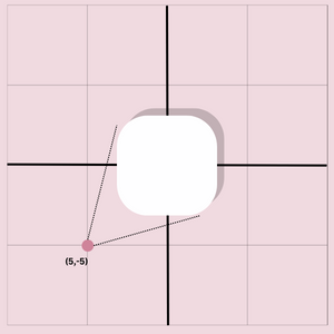
.box {
  box-shadow: 5px -5px 10px 0px rgba(0, 0, 0, 0.5);
}
Output:
#4 (-x,-y)
As both x and y are negative and they are passing from bottom-left as the resulting shadow will be cast in the top-left direction.
This is because the x value of the shadow determines the horizontal offset of the shadow from the element, while the y value determines the vertical offset. In this case, both values are negative, meaning the shadow will be offset both to the left and upwards.
The direction in which the shadow is cast is determined by the angle at which the light source is hitting the element. Since the shadow is passing from the bottom-left, the light source is assumed to be coming from the bottom-right direction, and thus the shadow is cast in the opposite direction.
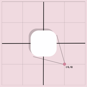
.box {
  box-shadow: -5px -5px 10px 0px rgba(0, 0, 0, 0.5);
}
Output:
Understanding the direction and positioning of shadows is just one of the many factors to consider when using shadows in CSS.
By experimenting with different shadow values and settings, you can create unique and engaging designs that capture your audience's attention and enhance the user experience.
Types of CSS Shadows
#1 Text Shadow:
text-shadow Shadow CSS property adds a shadow effect to the text on your web page. It creates a shadow effect behind the text, giving it more CSS depth effect and making it stand out from the background.
The text-shadow property takes several values that allow you to customize the appearance of the text shadow spread. These values include the horizontal and vertical offset of the shadow, the blur radius, and the color of the shadow. Here's an example of how to use the text-shadow property in CSS:
h1 {
  text-shadow: 2px 2px 4px #000000;
}
We have added a text-shadow to the h1 element. The text-shadow property has three values: 2px for the horizontal offset, 2px for the vertical offset, and 4px for the blur radius. The last value is the color of the shadow, which is black (#000000).
You can add different values for the text-shadow property to create different text-shadow effects, such as a more subtle or bold effect, a translucent or solid effect, or a sharp or blurred effect. Text shadow spread is a simple and effective way to add a visual effect to your text and make it stand out on your web page.
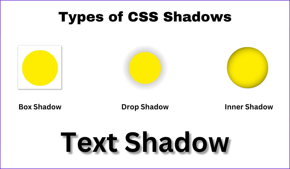
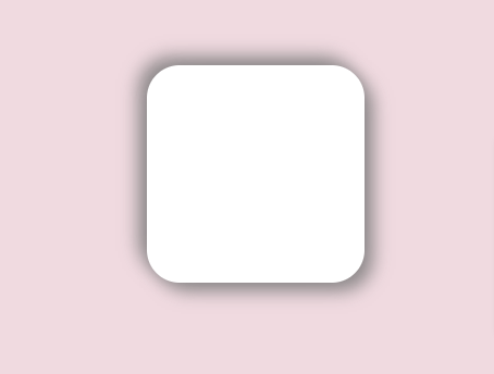
#2 Box Shadow:
The box-shadow CSS property adds a shadow effect to an HTML element in the box, such as a div or image. In subtle box shadow the shadow is added outside the element's border, which creates a 3D effect and makes the element appear to float above the page.
Here's an example of how you can use the box-shadow property in CSS:
.box {
  box-shadow: 2px 2px 5px #333333;
}
The .box class is used to target an HTML element, such as a div or image shadow css. The box-shadow property adds a shadow effect to the element's box. The values 2px and 2px specify the horizontal and vertical offset of the subtle box shadow, respectively, while 5px specifies the blur radius of the shadow.
The box-shadow property creates different types of shadow effects, such as changing the offset, blur radius, and color of the shadow. Additionally, you can use multiple shadows by separating each shadow value with a comma, which allows you to create more complex and layered shadow effects.
Here are two types of box-shadow - CSS Drop shadow and inner shadow are two types of box-shadow that can be applied to an HTML element's box using CSS to create a subtle box shadow.
#2.1 CSS Drop Shadow:
CSS Drop shadow is a type of box-shadow that appears on the outside of an element's box, giving the impression that the element is hovering above the page or has been raised off it; you can even apply a CSS drop shadow effect to an element, you can use the box-shadow property in CSS.
#2.2 Inner Shadow:
Inner shadow, on the other hand, gives a shadow effect inside the edges of an element's box, giving an impression that the edges are being pushed inward or there is an indentation in the box. Here we will use box shadow inset, to apply an inner shadow effect to an element, you can use the box-shadow property with the inset keyword.
Here's an example of how you can apply a CSS drop shadow and inner shadow effect to an element in CSS:
.box {
  box-shadow: 2px 2px 5px #333333; /* drop shadow */
  box-shadow: inset 2px 2px 5px #333333; /* inner shadow */
}
The .box class is used to target an HTML element, such as a div or image. The box-shadow property is used to apply both a CSS drop shadow and an inner shadow effect to the element's box to create a subtle box shadow. The values 2px and 2px specify the horizontal and vertical offset of the shadow, respectively, while 5px specifies the blur radius of the shadow. Finally, #333333 specifies the color of the shadow using a hex color value.
By adjusting the values of the box-shadow property, you can create various drop-shadow and inner shadow effects to add CSS depth effect and visual interest to your website's design.
You can filter drop shadow, the CSS filter property applies visual effects to elements, including drop-shadow, which adds a shadow effect around an element.
Syntax
filter: drop-shadow(horizontal-offset vertical-offset blur-radius color);For example, filter: drop-shadow(2px 2px 4px black); creates a black drop shadow 2 pixels horizontally and vertically, with a blur radius of 4 pixels.
Ways to style CSS box-shadow effect
#1 Multiple box-shadow effects:
You can create multiple box-shadow effects on an element by specifying multiple values for the box-shadow property.
.box {
  box-shadow:
    2px 2px 4px rgba(117, 117, 117, 0.8),
    -2px -2px 4px rgba(117, 117, 117, 0.8);
}
Output:
Now this code has created two box-shadow effects on the same element, both with a black color. The first value creates a shadow with a horizontal offset of 2 pixels, a vertical offset of 2 pixels, a blur radius of 4 pixels, and a black color with an opacity of 0.4. The second value creates a shadow with a horizontal offset of -2 pixels, a vertical offset of -2 pixels, a blur radius of 4 pixels, and a white color with an opacity of 0.4.
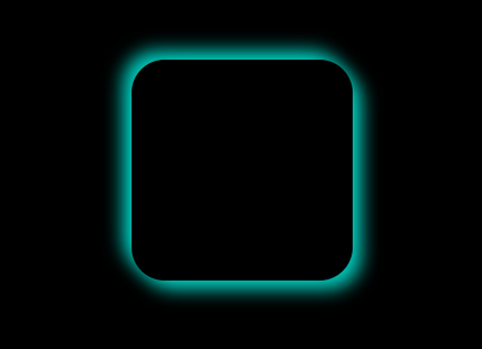
Now here is a trick with this multiple box-shadow effect now, you can ultimately make a neon effect by changing the rgba color from shadow shade to some pop-out color to give a neonic effect. We just need some color theory here.
In the previous multiple box-shadow effects, we have used rgba color (117, 117, 117, 0.8), which is a grey shade leading to give a shadow effect. Now let us change the color to cyan rgba(0, 255, 236, 0.8) as the shadow effect.
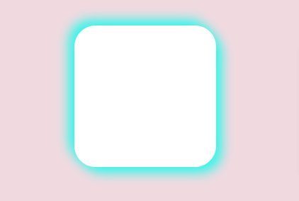
Let me change the background and element to black to make the cyan pop-out brighter. Remember, you will need the help of black color to make any neon effect more prominent.
#2 Inset box-shadow effect:
You can create an inset box-shadow effect by adding the inset keyword to the box-shadow property. This creates a shadow effect inside the element instead of outside.
.box {
  box-shadow: inset 2px 2px 4px rgba(0, 0, 0, 0.4);
}
Output:
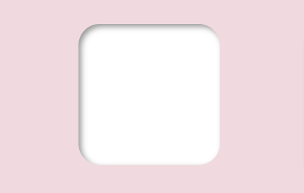
This code creates an inset box-shadow effect with a horizontal offset of 2 pixels, a vertical offset of 2 pixels, a blur radius of 4 pixels, and a black color with an opacity of 0.4.
#3 Spread box-shadow effect:
You can create a spread box-shadow effect by adding a fourth value to the box-shadow property, which specifies the size of the shadow spread.
.box {
  box-shadow: 2px 2px 4px 2px rgba(0, 0, 0, 0.4);
}
Output:
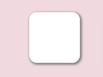
This code creates a box-shadow effect with a horizontal offset of 2 pixels, a vertical offset of 2 pixels, a blur radius of 4 pixels, a spread size of 2 pixels, and a black color with an opacity of 0.4.
These are just a few examples of how you can style CSS box-shadow effects. You can experiment with different values for the box-shadow property to create a wide range of effects, from subtle shadows to bold and dramatic effects.
Tips for using CSS shadows effectively and efficiently
- Use blur and spread properties sparingly: The
box-shadowproperty's blur and spread characteristics can produce a more natural-looking shadow effect, but they can also slow down page load speed. Use them cautiously and only when absolutely required. - Use vendor prefixes for compatibility: Use vendor prefixes when using the
box-shadowproperty to ensure compatibility with outdated browsers. For Safari and earlier versions of Chrome, for example, you may need to include '-webkit-box-shadow'. - Consider the element's context: When applying shadows to an element, consider its context in the overall design. A shadow that looks great on one element may not work well on another element with a different background or color scheme.
- Use
box-shadowfor rounded corners: If an element has rounded edges, usebox-shadowinstead of border-radius to achieve a more natural-looking shadow effect. - Use a separate element for shadows: Instead of using
box-shadowon the main element, consider utilizing a secondary element to generate shadow effects. This might be handy for producing intricate shadow effects or boosting mobile device performance. - Consider the light source: Consider the direction of the light source in the design while producing shadow effects. To generate a more realistic look, shadows should be consistent with the direction of the light source.
- Use clip-path for custom shadow shapes: Instead of
box-shadow, consider utilizing the clip-path property to create a custom form for your shadow. This can be handy for producing more intricate shadow forms or improving mobile device performance. - Use multiple box shadows for layered effects: You can use multiple
box-shadowdeclarations to create layered shadow effects. This can be useful for creating more complex shadow effects, such as shadows with multiple colors or different blur radii. - Test on different devices: Shadows can be resource-intensive, especially on mobile devices. Be sure to test your design on different devices and screen sizes to ensure the shadows perform well and do not slow down the page load time.
- Use shadow sparingly: While shadow effects may give depth effect and complexity to your design, they should be used carefully. Too many shadow effects might result in a crowded or confusing design, as well as a poor page load time.
- Use the filter for shadow effects on images: If you want to create an image shadow css, consider using the filter property instead of
box-shadow. The drop-shadow() function in the filter property can create a more natural-looking shadow effect on images. - Use rgba() for shadow color: Consider using the rgba() color method instead of a hex or named color when defining the color for your shadow. You may use rgba() to supply a color with an alpha channel to generate more subtle and natural-looking shadows.
Custom CSS shadow on SVG image using filter properties
Here is a final part where I would like to share how you can create custom CSS shadows with SVG filters. SVG (Scalable Vector Graphics) is an XML-based markup language for creating vector graphics. In CSS, you can use SVG filters to apply complex visual effects to elements, including custom shadows.
Here's an example of creating custom CSS shadow with the SVG filter:
.box {
  filter: drop-shadow(0 0 10px #333333);
}
Output:

The filter property can be used to apply an SVG filter to an element with the class .box. The CSS drop-shadow filter creates a shadow effect that has a blur radius of 10px and is colored using the hex color value #333333.
Conclusion:
Using shadows is important to remember that less is often more. A subtle drop shadow can be just as effective as a heavy one, and too many shadows can quickly overwhelm your design. Play around with different settings and styles until you find the perfect balance for your design.
Adding CSS depth effect and visual interest, shadows can also help to create a sense of hierarchy on your page. By applying shadows to key elements, such as headers or call-to-action buttons, you can draw the user's attention and guide them towards the desired action.
ReplayBird - Understand Exactly Where Your UI need Improvement
ReplayBird is a digital experience analytics platform that offers a comprehensive real-time insights which goes beyond the limitations of traditional web analytics with features such as product analytics, session replay, error analysis, funnel, and path analysis.
With Replaybird, you can capture a complete picture of user behavior, understand their pain points, and improve the overall end-user experience. Session replay feature allows you to watch user sessions in real-time, so you can understand their actions, identify issues and quickly take corrective actions. Error analysis feature helps you identify and resolve javascript errors as they occur, minimizing the negative impact on user experience.
With theproduct analytics feature, you can get deeper insights into how users are interacting with your product and identify opportunities to improve. Drive understanding, action, and trust, leading to improved customer experiences and driving business revenue growth.
Try ReplayBird 14-days free trial
Further Readings:
 Velantina
 Uma
Uma Uma
Uma