Flexbox in CSS makes designing web layouts super easy and flexible! With Flexbox, you can arrange elements within a container in a way that suits different screens and devices without any fuss.
What's great about Flexbox is that it adapts to various screen sizes and shapes effortlessly which means you can create layouts that look great on different devices without diving into complicated CSS stuff or media queries. Plus, it's really user-friendly when it comes to aligning and positioning elements in your design.
By mastering flexbox, you can create layouts that are both visually appealing and functional, without the need for complex CSS rules or media queries. Here in this CSS flexbox guide we cover all the basics you need to know to master CSS flexbox.
- Basics of CSS Flexbox
- Creating flexible and responsive web layouts
- Simple examples and use cases of CSS Flexbox
- CSS Flexbox Best practices
Basics of CSS Flexbox
Flexbox is a layout module in CSS that provides a flexible way to arrange elements within a container whereas, it create dynamic and responsive layouts with less code and more control over the positioning and alignment of elements.
In traditional CSS Flexbox layout, elements are arranged using floats, positioning, and inline-block which can be cumbersome and time-consuming, especially when creating responsive designs that adapt to different screen sizes.
With CSS Flexbox, you can create complex layouts with just a few lines of code also, it offers a simpler and more efficient way to position and align elements within a container, regardless of the content or size of the elements.
CSS Flexbox is based on a set of flexible boxes or "flex containers" that contain "flex items." The flex container can be any HTML element, and the flex items can be any child elements of the container.
Key concepts on Flexbox in CSS
Lets first look the two major axes of CSS flexbox that are main axis and cross axis.
- The main axis is the primary axis along which the flex items are laid out.
- The cross axis is the secondary axis perpendicular to the main axis.
The direction of the main axis is determined by the flex-direction property.
- Flex flow: The
flex-flowproperty is a shorthand property that let you to set theflex-directionandflex-wrapproperties at the same time, you can useflex-flow: row wrapto set the main axis to a row and wrap the flex items onto the next line when they don't fit in the container. - Justify content: The
justify-contentproperty is used to control the alignment of the flex items along the main axis, you can create spaces in the flex items evenly, align them to the start or end of the container, or distribute them with different spacing. Some of the common values forjustify-contentincludeflex-start,flex-end,center,space-between, andspace-evenly. - Align items: The
align-itemsproperty is used to control the alignment of the flex items along the cross axis, you can align the items to the top, bottom, center, or stretch them to fill the height of the container. Some of the common values foralign-itemsincludestretch,center,flex-start,flex-end, andbaseline. - Align content: The
align-contentproperty is used to control the alignment of the rows or columns of flex items along the cross axis when there are multiple lines of flex items in the container as it allows you to space the lines evenly, align them to the start or end of the container, or distribute them with different spacing. - Flex items: The child elements of the Flex container are called flex items. They can have various properties set on them to control their size and position within the container. Some of the common properties for flex items include
flex-grow,flex-shrink,flex-basis,order, andalign-self. - Flex wrap: By default, Flex items are laid out in a single row or column depending on the direction of the main axis. However, if the items don't fit in the container, they can be wrapped onto the next line or column using the
flex-wrapproperty. This property allows you to control whether the items should wrap or not, and in which direction. - Flex direction: The
flex-directionproperty determines the direction of the main axis. It can be set torow,row-reverse,column, orcolumn-reverse. If set torow, the main axis runs horizontally from left to right. If set tocolumn, the main axis runs vertically from top to bottom. The-reversevalues reverse the direction of the main axis. - Flex basis: The
flex-basisproperty sets the initial size of the Flex item before any remaining space is distributed among the items. It can be set to a length value or the keywordauto, which sets the basis to the size of the content. - Flex grow: The
flex-growproperty specifies how much the Flex item should grow to fill the remaining space along the main axis. It is a unitless value that represents the proportion of the available space that should be allocated to the item. For example, if two Flex items haveflex-growvalues of 1 and 2, the second item will take up twice as much space as the first item. - Flex shrink: The
flex-shrinkproperty specifies how much the Flex item should shrink if there is not enough space to accommodate all the items along the main axis. It is also a unitless value that represents the proportion of the available space that should be reduced for the item. For example, if two Flex items haveflex-shrinkvalues of 1 and 2, the second item will shrink twice as much as the first item. - Order: The
orderproperty specifies the order in which the Flex item should appear along the main axis. It is an integer value that defaults to 0, and higher values push the item further down the axis.
Creating CSS flexible and responsive web layouts
Using flexbox in CSS is the best way to create flexible and responsive web layouts, as flexbox is a layout model that makes it easy to align and distribute elements in a container. Here's an example of how to use CSS flexbox to create a flexible grid system:
<style>
.container {
  display: flex;
  justify-content: space-between;
  align-items: center;
}

.box {
  background: #f9f1f6;
  flex: 1;
  margin: 0 10px;
  padding: 20px;
  height: 340px;
  width: 80px;
  border: 1px solid black;
  text-align: center;
}
</style>
<div class="container">
   <div class="box">
      <h2>Session Replay</h2>
      <p>Identify how users interact with your product, which pages they visit, and where they get stuck.</p>
   </div>
   <div class="box">
      <h2>Product Analytics</h2>
      <p>Analytics reports that measure the impact of product changes, optimize your conversion funnel, and improve user engagement.</p>
   </div>
   <div class="box">
      <h2>Error Analysis</h2>
      <p>Understand the cause of the error, the frequency of occurrence, and the impact on user behavior</p>
   </div>
</div>
Output:
Session Replay
Identify how users interact with your product, which pages they visit, and where they get stuck.
Product Analytics
Analytics reports that measure the impact of product changes, optimize your conversion funnel, and improve user engagement.
Error Analysis
Understand the cause of the error, the frequency of occurrence, and the impact on user behavior
The container has a display of flex, which makes the row items align horizontally. The flex-wrap property allows the items to wrap to a new line if they exceed the container width. The justify-content property is set to space-between, which distributes the items evenly with space between them.
Each column has a flex property set to 1 1 300px, which means it can grow and shrink to fill the available space, but will not be smaller than 300px. The margin property is set to 0 1rem to create spacing between the columns.
By using CSS flexbox, you can create a flexible and responsive grid system that adjusts to different screen sizes and orientations. To make this layout truly responsive, you can add media queries to adjust the column widths and margins for different screen sizes.
#1 Create a container element:
To use CSS flexbox, you need to create a container element and set its display property to flex. Here's an example of how to create a container element with the class name "container":
<div class="container-a">
   <!-- content goes here -->
</div>
.container-a {
display: flex;
}#2 Create a row element:
Next, you need to create a row element inside the container element. This can be any HTML element such as a div, section, or article. Here's an example of how to create a row element with the class name "row":
<div class="container">
   <div class="row">
      <!-- columns go here -->
   </div>
</div>
.row {
display: flex;
}#3 Create columns using CSS flexbox:
Inside the row element, you can create columns using the CSS flexbox model. Here's an example of how to create three columns with the class names "col-1", "col-2", and "col-3":
</div> <div class="container">
   <div class="row">
      <div class="col-1">Column 1</div>
      <div class="col-2">Column 2</div>
      <div class="col-3">Column 3</div>
   </div>
</div>
.row {
display: flex;
}
.col-1, .col-2, .col-3{
flex: 1;
}In this example, each column has a flex property of 1, which means they will share the available space equally. You can adjust the flex property of each column to create different column widths.
#4 Add spacing between columns:
To add spacing between the columns, you can use the margin property. Here's an example of how to add 1rem of margin between the columns:
.col-1,
.col-2,
.col-3 {
	border: 1px solid #ddd;
	flex: 1;
	margin: 50px 50px;
    padding: 25px;
}
#5 Adjust column order:
You can also adjust the order of the columns using the order property. Here's an example of how to display the columns in the order of "col-3", "col-1", "col-2":
<div class="container">
   <div class="row">
      <div class="col-3 order-1">Column 3</div>
      <div class="col-1 order-2">Column 1</div>
      <div class="col-2 order-3">Column 2</div>
   </div>
</div>
.col-1,
.col-2,
.col-3 {
flex: 1;
margin: 0 1rem;
}
.order-1 {
order: 3;
}
.order-2 {
order: 1;
}
.order-3 {
order: 2;
}#6 Use media queries to make the layout responsive:
To make the layout responsive, you can use media queries to adjust the column widths and margins for different screen sizes. Here's an example of how to make the columns stack vertically on smaller screens:
@media (max-width: 768px) {
    .row {
    	flex-wrap: wrap;
    }
        .col-1,
        .col-2,
        .col-3 {
        flex-basis: 100%;
        margin: 0;
    }
}
The media query sets the flex-wrap property of the row element to wrap, which allows the columns to stack vertically. The flex-basis property is set to 100%, which means the columns will take up the full width of the container. The margin property is also set to 0 to remove the spacing between the columns.
By using CSS flexbox and media queries, you can create a flexible and responsive web layout that adjusts to different screen sizes and orientations. You can customize the layout by adjusting the flex properties and adding additional CSS styles as needed.
Simple examples and use cases of CSS Flexbox
#1 Navigation menu
You can use CSS Flexbox to create navigation menus that automatically adjust their size and position based on the width of the screen. This allows you to create a menu that looks great on both desktop and mobile devices.
<style>
  /* Styling for the navigation bar */
  nav {
    display: flex; /* Using flexbox for the navigation bar */
    justify-content: center; /* Centering the content horizontally within the nav */
    background-color: #f2f2f2; /* Setting a background color for the navigation */
  }

  /* Styling for the unordered list (ul) */
  ul {
    display: flex; /* Using flexbox for the list */
    list-style: none; /* Removing default list styles */
    margin: 0; /* Removing default margin */
    padding: 0; /* Removing default padding */
  }

  /* Styling for list items (li) */
  li {
    margin: 0 10px; /* Adding margin to create space between list items */
  }

  /* Styling for anchor (link) elements */
  a {
    display: block; /* Setting the anchor elements as blocks for layout purposes */
    padding: 10px; /* Adding padding inside the links */
    color: #333; /* Setting the text color */
    text-decoration: none; /* Removing underlines from links */
    font-weight: bold; /* Making the text bold */
  }
</style>

<!-- HTML structure for the navigation -->
<nav>
  <ul>
    <!-- List items containing links -->
    <li><a href="#">Home</a></li>
    <li><a href="#">About Us</a></li>
    <li><a href="#">Services</a></li>
    <li><a href="#">Contact</a></li>
  </ul>
</nav>
Output:

#2 Image galleries
Flexbox is perfect for creating image galleries that display images in a grid layout. You can use CSS Flexbox to set the width and height of each image and adjust the spacing between them.
<style>
  /* Styling for the container holding the image gallery */
  .image-gallery {
    display: flex; /* Using flexbox to arrange images */
    flex-wrap: wrap; /* Allowing images to wrap to the next line */
    justify-content: space-between; /* Distributing space between images */
  }

  /* Styling for individual images within the gallery */
  .image-gallery img {
    width: calc(50% - 10px); /* Setting image width to half of the container minus margins */
    margin-bottom: 10px; /* Adding space at the bottom of each image */
  }
</style>

<!-- HTML structure for the image gallery -->
<div class="image-gallery">
  <!-- Image elements -->
  <img src="img1.jpg" alt="Image 1">
  <img src="img2.jpg" alt="Image 2">
  <img src="img3.jpg" alt="Image 3">
  <img src="img4.jpg" alt="Image 4">
</div>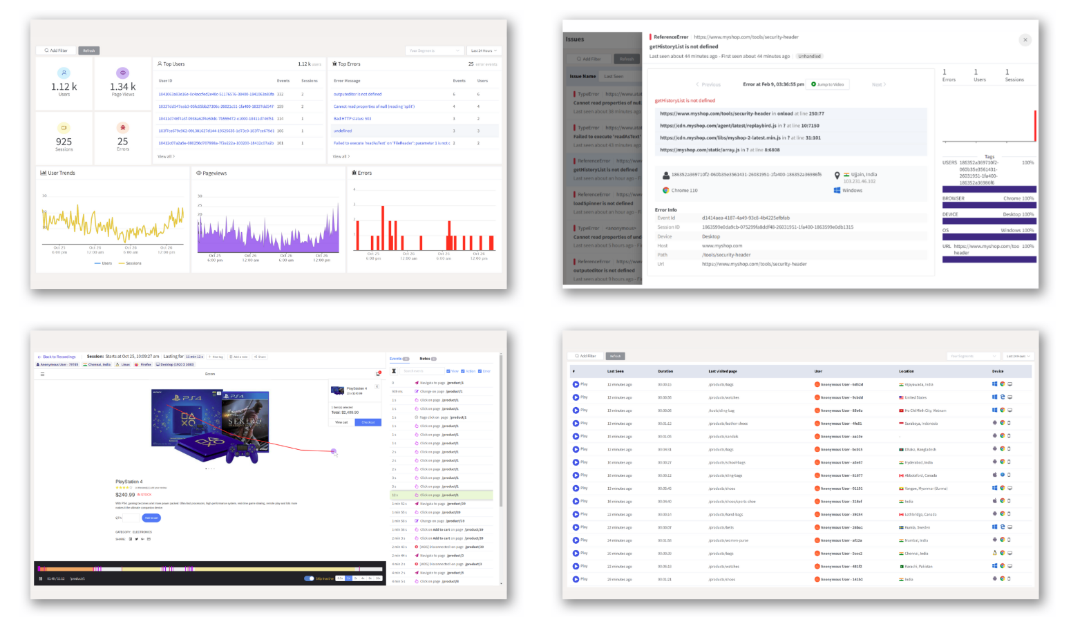
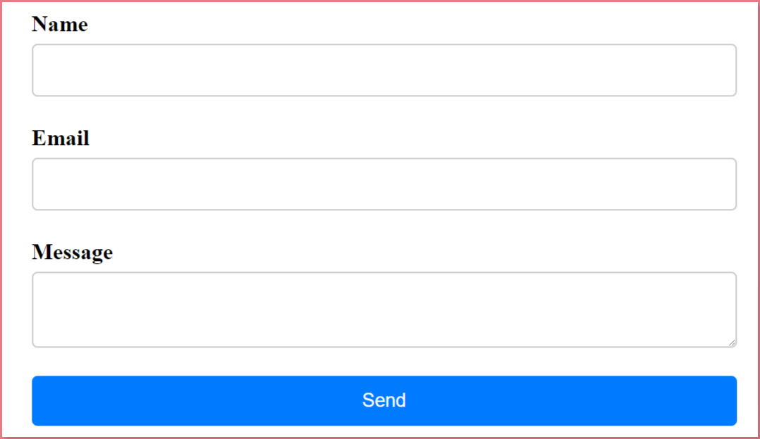
#3 Forms
You can use CSS Flexbox to build responsive forms with CSS flexbox that adjust their layout based on the width of the screen. This allows you to create a form that looks great on both desktop and mobile devices.
<style>
  /* Styling for the entire form */
  form {
    display: flex; /* Using flexbox to arrange elements */
    flex-direction: column; /* Setting the flex container's direction to column */
    max-width: 500px; /* Setting maximum width for the form */
    margin: 0 auto; /* Centering the form horizontally */
  }

  /* Styling for form groups (each input + label pair) */
  .form-group {
    display: flex; /* Using flexbox for each group */
    flex-direction: column; /* Setting the flex container's direction to column */
    margin-bottom: 20px; /* Adding space between form groups */
  }

  /* Styling for labels */
  label {
    font-weight: bold; /* Making labels bold */
    margin-bottom: 5px; /* Adding space below labels */
  }

  /* Styling for input and textarea elements */
  input,
  textarea {
    padding: 10px; /* Adding padding inside input and textarea */
    border: 1px solid #ccc; /* Adding a border with a light gray color */
    border-radius: 4px; /* Adding a slight border radius for rounded corners */
  }

  /* Styling for the submit button */
  button {
    padding: 10px; /* Adding padding inside the button */
    background-color: #007bff; /* Setting background color for the button */
    color: #fff; /* Setting text color for the button */
    border: none; /* Removing button border */
    border-radius: 4px; /* Adding a slight border radius for rounded corners */
    cursor: pointer; /* Changing cursor to pointer on hover */
  }

  /* Styling when hovering over the button to build responsive forms with CSS flexbox*/
  button:hover {
    background-color: #0062cc; /* Changing background color on hover */
  }
</style>

<!-- HTML form structure -->
<form>
  <!-- Each input and label pair wrapped in a form group -->
  <div class="form-group">
    <label for="name">Name</label>
    <input type="text" id="name" name="name">
  </div>
  <div class="form-group">
    <label for="email">Email</label>
    <input type="email" id="email" name="email">
  </div>
  <div class="form-group">
    <label for="message">Message</label>
    <textarea id="message" name="message"></textarea>
  </div>
  <div class="form-group">
    <!-- Submit button -->
    <button type="submit">Send</button>
  </div>
</form>
Output:
#4 Card layouts
CSS Flexbox is great for creating card layouts where each card has the same height and width. This allows you to display a collection of items in a grid layout that looks clean and organized.
<style>
/* Styling for the container holding the cards */
.card-container {
display: flex; /* Using flexbox for the card container */
flex-wrap: wrap; /* Allowing cards to wrap to the next line */
justify-content: space-between; /* Distributing space between cards */
max-width: 1200px; /* Setting maximum width for the container */
margin: 0 auto; /* Centering the container horizontally */
}
/* Styling for individual cards */
.card {
width: calc(33.33% - 20px); /* Setting card width with margin accounted for */
background-color: #fff; /* Setting background color for cards */
padding: 20px; /* Adding padding inside each card */
border-radius: 4px; /* Adding border-radius for rounded corners */
box-shadow: 0 4px 8px rgba(0, 0, 0, 0.1); /* Adding box shadow for a subtle elevation */
margin-bottom: 20px; /* Adding space between cards */
}
/* Styling for images inside cards */
.card img {
width: 100%; /* Making images inside cards take full width */
border-radius: 4px; /* Adding border-radius for rounded image corners */
margin-bottom: 10px; /* Adding space below images */
}
/* Styling for headings in cards */
.card h3 {
font-size: 18px; /* Setting font size for headings */
margin-bottom: 10px; /* Adding space below headings */
}
/* Styling for paragraphs in cards */
.card p {
font-size: 14px; /* Setting font size for paragraphs */
margin-bottom: 10px; /* Adding space below paragraphs */
}
/* Styling for links/buttons in cards */
.card a {
display: inline-block; /* Setting links as inline-block for styling */
padding: 10px; /* Adding padding inside links/buttons */
background-color: #007bff; /* Setting background color for links */
color: #fff; /* Setting text color for links */
border-radius: 4px; /* Adding border-radius for rounded corners */
text-decoration: none; /* Removing underlines from links */
transition: background-color 0.2s ease-in-out; /* Adding transition effect */
}
/* Styling for link hover effect */
.card a:hover {
background-color: #0062cc; /* Changing background color on hover */
}
</style>
<!-- HTML structure for the card container -->
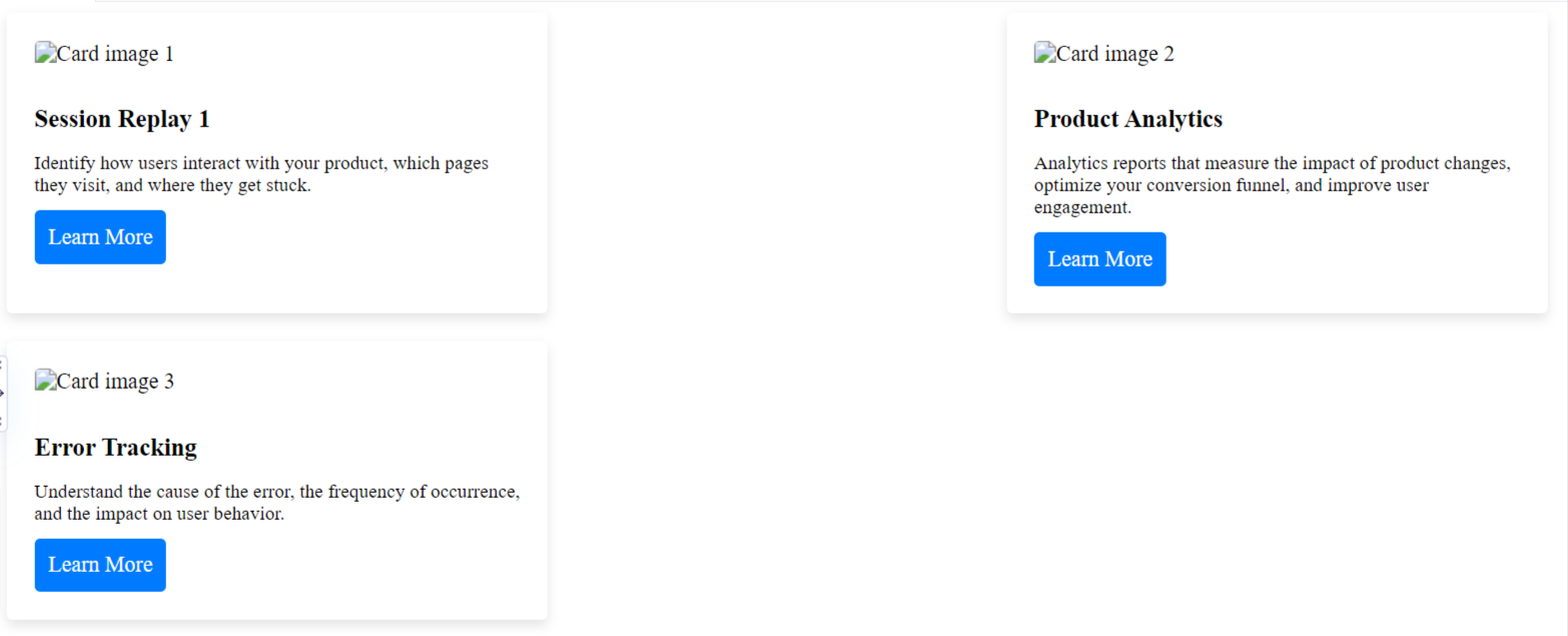
<div class="card-container">
<!-- Individual card elements -->
<div class="card">
<img src="card-img-1.jpg" alt="Card image 1">
<h3>Session Replay 1</h3>
<p>Identify how users interact with your product, which pages they visit, and where they get stuck.</p>
<a href="#">Learn More</a>
</div>
<!-- More card elements... -->
</div>
Output:
#5 Pricing tables
CSS Flexbox is perfect for creating pricing tables where each pricing plan is displayed in a column. You can use Flexbox to set the width and height of each column and adjust the spacing between them.
<style>
  /* Styling for the container holding the pricing plans */
  .pricing-table {
    display: flex; /* Using flexbox for the pricing table */
    justify-content: center; /* Centering content horizontally */
    align-items: center; /* Centering content vertically */
    flex-wrap: wrap; /* Allowing plans to wrap to the next line */
    margin: 0 auto; /* Centering the table horizontally */
    max-width: 1200px; /* Setting maximum width for the table */
  }

  /* Styling for individual pricing plans */
  .plan {
    background: #f9f1f6; /* Setting background color for plans */
    border-radius: 10px; /* Adding border-radius for rounded corners */
    box-shadow: 0 2px 10px rgba(0, 0, 0, 0.3); /* Adding box shadow for elevation */
    margin: 20px; /* Adding space around each plan */
    padding: 40px; /* Adding padding inside each plan */
    text-align: center; /* Centering text within each plan */
    width: 300px; /* Setting a fixed width for each plan */
    transition: all 0.3s ease; /* Adding transition effect for hover */
  }

  /* Styling when hovering over individual plans */
  .plan:hover {
    box-shadow: 0 4px 20px rgba(0, 0, 0, 0.3); /* Changing box shadow on hover */
    transform: translateY(-10px); /* Moving plans upward slightly on hover */
  }

  /* Styling for headings in plans */
  .plan h3 {
    font-size: 24px; /* Setting font size for headings */
    font-weight: 700; /* Making headings bold */
    margin-bottom: 20px; /* Adding space below headings */
    text-transform: uppercase; /* Transforming text to uppercase */
  }

  /* Styling for price within plans */
  .plan p.price {
    /* Additional styling for pricing elements can be added here */
  }
</style>

<!-- HTML structure for the pricing table -->
<div class="pricing-table">
  <!-- Individual pricing plans -->
  <div class="plan">
    <h3>Basic</h3>
    <p class="price">$1/month</p>
    <!-- List of features -->
    <ul class="features">
      <li>Feature 1</li>
      <li>Feature 2</li>
      <li>Feature 3</li>
    </ul>
    <button class="btn">Choose Plan</button>
  </div>

  <!-- More plans... -->
</div>
Output:
#6 Footer
Flexbox is also great for creating footers that adjust their layout based on the width of the screen. You can use CSS Flexbox to set the width and height of each footer item and adjust the spacing between them.
<style>
  /* Styling for the footer section */
  footer {
    background-color: #222; /* Setting background color for the footer */
    color: #fff; /* Setting text color for the footer */
    padding: 40px 0; /* Adding padding to the top and bottom of the footer */
  }

  /* Styling for the container holding footer columns */
  .footer-container {
    display: flex; /* Using flexbox for the footer columns */
    flex-wrap: wrap; /* Allowing columns to wrap to the next line */
    justify-content: space-between; /* Distributing space between columns */
    max-width: 1200px; /* Setting maximum width for the container */
    margin: 0 auto; /* Centering the container horizontally */
  }

  /* Styling for individual footer columns */
  .footer-column {
    width: calc(33.33% - 20px); /* Setting width for each column with margin accounted for */
    padding: 0 10px; /* Adding horizontal padding to columns */
    margin-bottom: 20px; /* Adding space at the bottom of each column */
  }

  /* Styling for headings in footer columns */
  .footer-column h3 {
    font-size: 18px; /* Setting font size for headings */
    margin-bottom: 10px; /* Adding space below headings */
  }

  /* Styling for paragraphs and lists in footer columns */
  .footer-column p,
  .footer-column ul {
    font-size: 14px; /* Setting font size for paragraphs and lists */
  }

  /* Styling for list items within footer columns */
  .footer-column ul li {
    margin-bottom: 5px; /* Adding space below list items */
  }

  /* Styling for links within list items in footer columns */
  .footer-column ul li a {
    color: #fff; /* Setting text color for links */
    text-decoration: none; /* Removing underlines from links */
  }

  /* Styling when hovering over links within list items */
  .footer-column ul li a:hover {
    color: #007bff; /* Changing text color on hover */
  }
</style>

<!-- HTML structure for the footer -->
<footer>
  <div class="footer-container">
    <!-- Individual footer columns -->
    <div class="footer-column">
      <h3>About Us</h3>
      <p>Lorem ipsum dolor sit amet, consectetur adipiscing elit, sed do eiusmod tempor incididunt ut labore et dolore magna aliqua.</p>
    </div>
    <div class="footer-column">
      <h3>Contact Us</h3>
      <ul>
        <li><a href="#">Email</a></li>
        <li><a href="#">Phone</a></li>
        <li><a href="#">Address</a></li>
      </ul>
    </div>
    <div class="footer-column">
      <h3>Follow Us</h3>
      <ul>
        <li><a href="#">Facebook</a></li>
        <li><a href="#">Twitter</a></li>
        <li><a href="#">Instagram</a></li>
      </ul>
    </div>
  </div>
</footer>
Output:

CSS Flexbox Best practices
CSS Flexbox best practices provide a solid framework for using it effectively, but you need to be work on your approach based on the unique demands of your project and design goals.
- Start with a plan: Before diving into writing code, plan out the structure of your layout and identify the main containers and their properties.
- Use appropriate Flexbox properties: CSS Flexbox offers a variety of properties to control the layout of your elements, including display, flex-direction, justify-content, align-items, flex-wrap, flex-grow, and flex-shrink. Use them appropriately to achieve the desired layout.
- Use nested CSS Flexbox containers: In complex layouts, you may need to nest Flexbox containers to control the layout of sub-elements. This can be achieved by setting the display property of a child element to flex.
- Use percentage widths and heights: Use percentage widths and heights to make your layout responsive and adaptable to different screen sizes.
- Avoid using fixed widths and heights: Avoid using fixed widths and heights as they can lead to layout issues on different screen sizes.
- Use the align-self property: Use the align-self property to control the alignment of individual items within a CSS Flexbox container.
- Use Flexbox with other layout techniques: CSS Flexbox is not the only layout technique available in CSS. You can combine it with other techniques, such as grid, to achieve more complex layouts.
- Use vendor prefixes: Some older browsers require vendor prefixes for certain CSS Flexbox properties. Include them in your code to ensure compatibility with older browsers.
- Test on multiple devices: Test your Flexbox layout on multiple devices to ensure that it looks good and functions properly on all devices and screen sizes. This is one the major and mandatory CSS flexbox best practices.
- Practice and experiment: The best way to master CSS Flexbox is to practice and experiment with different layouts and techniques. Try different approaches and see what works best for your needs.
- Flex Line: A flex line is a set of flex items that are placed on the same line in a flex container.
- Flex Flow: The flex-flow property is a shorthand property that combines the flex-direction and flex-wrap properties in one declaration.
- Flex Container Sizing**: When working with a flex container, it's important to remember that its size is determined by the size of its content and any explicit size properties set on it.
- Nested Flex Containers: Nested flex containers are flex containers that are contained within another flex container. These are useful for creating more complex layouts that require finer control over the alignment of individual items.
- Flex Basis Sizing: The flex-basis property can be used to set the initial size of a flex item before any extra space is distributed according to the flex-grow and flex-shrink properties.
- Flex Item Sizing: The width and height properties can be used to set the size of a flex item. However, it's important to keep in mind that these properties can conflict with the flexible sizing behavior of the flex-grow, flex-shrink, and flex-basis properties.
- CSS Flexbox and Accessibility: When using CSS Flexbox, it's important to consider accessibility by ensuring that content is presented in a logical and meaningful order for screen readers and other assistive technologies.
- Cross-Browser Compatibility: While CSS Flexbox is supported by most modern browsers, it's important to test your code in different browsers to ensure cross-browser compatibility. You may need to use vendor prefixes for certain CSS Flexbox properties in older browsers. This is one the major and mandatory CSS flexbox best practices.
- Debugging Flexbox Issues: When working with CSS Flexbox, it's important to understand how to debug layout issues. Common tools for debugging CSS Flexbox issues include the browser's dev tools, the flexboxfroggy game, and the flexplorer online tool. This is also one the major and mandatory CSS flexbox best practices.
- Flexbox and Responsive Design: CSS Flexbox can be used to create responsive designs that adapt to different screen sizes. By using percentage widths and heights, along with the flex-wrap property, you can create flexible layouts that adjust to different screen sizes without requiring media queries.
Conclusion:
By using CSS Flexbox, web developers can easily create complex layouts with minimal code, reducing development time and improving the user experience.
With its intuitive syntax and numerous properties, CSS Flexbox offers unparalleled control over the positioning and alignment of elements on a webpage. Whether you're designing a simple webpage or a complex web application, CSS Flexbox is an essential skill to have in your web development toolkit.
By mastering the basics of CSS Flexbox, you can create beautiful, responsive designs that work seamlessly across all devices. With CSS Flexbox take your web design skills to the next level!
ReplayBird - Driving Revenue and Growth through Actionable Product Insights
ReplayBird is a digital experience analytics platform that offers a comprehensive real-time insights which goes beyond the limitations of traditional web analytics with features such as product analytics, session replay, error analysis, funnel, and path analysis.
With Replaybird, you can capture a complete picture of user behavior, understand their pain points, and improve the overall end-user experience. Session replay feature allows you to watch user sessions in real-time, so you can understand their actions, identify issues and quickly take corrective actions. Error analysis feature helps you identify and resolve javascript errors as they occur, minimizing the negative impact on user experience.
With product analytics feature, you can get deeper insights into how users are interacting with your product and identify opportunities to improve. Drive understanding, action, and trust, leading to improved customer experiences and driving business revenue growth.
Try ReplayBird 14-days free trial
Further Readings:
 Velantina
 Velantina
 Velantina