The HTML 3D buttons are a must if you want a techy and a good looking frontend.
Comparing our world’s technology from 23 years back, we may find interfaces have gone through too many changes with more and more creativity and innovation included in their development process.
In that case, buttons are a more common part where HTML and CSS buttons are one of the main features in an interface that helps developers to know if their interface is interactive, responsive, and helpful to the users.
Imagine you have a website landing page as a good gradient background and good text designs, and your “buy now” HTML and CSS button is now too basic, and you forgot to add any shadow or 3d effects; even you, as a user, may want to try clicking some 3d buttons.
Let's create this button:
Here in this blog, we will learn how to build stunning 3d buttons with HTML and CSS for any beginners.
- HTML - As Fundamental
- Inline styling with CSS
- Body and Button Element
- Adding Class
- Creating pseudo-element by ::before
- Final Output
- Other HTML 3D Button Styles
HTML - As Fundamental
HTML (Hypertext Markup Language) is the fundamental frontend language that we are now using in this 3D button building as it supports inline CSS styling which provides a standardized way of describing our 3D button structure.
<button>Click Me</button>Inline Styling with CSS
The <style> and </style> tags are going to help us to define and apply our CSS (Cascading Style Sheets) styles and rules that determine how HTML elements should be styled.
If you are much more comfortable with adding your CSS styles into your CSS stylesheet seperately without adding <style> tag.
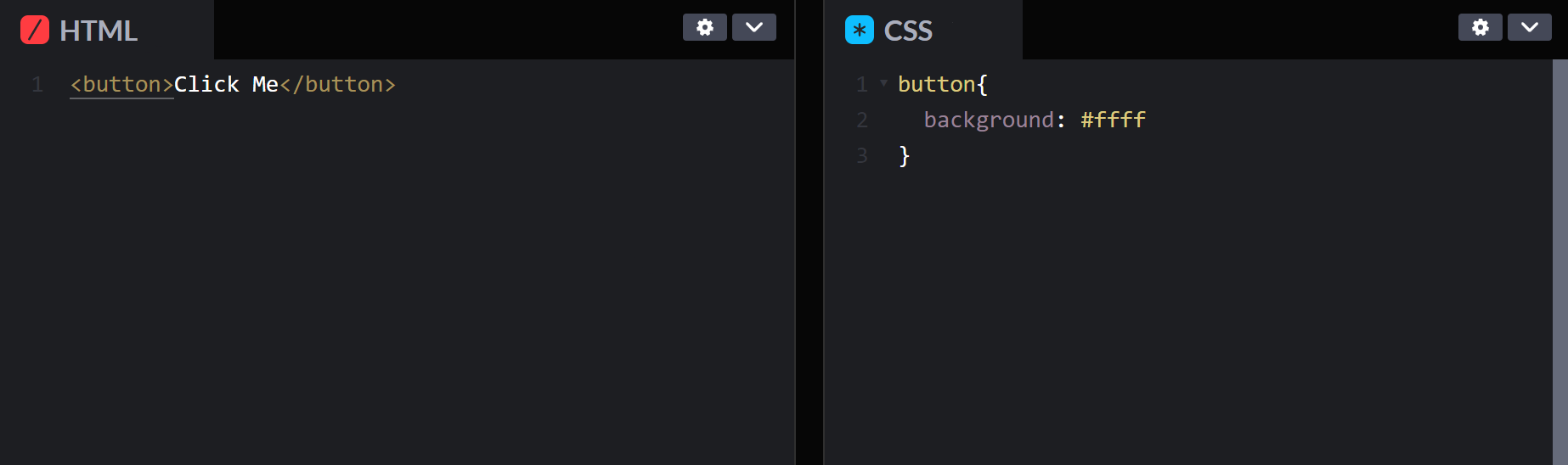
Now let us create a <style> tag into our HTML 3D button and add some styling to the body and the button element of our HTML and CSS button.
We will now add the following styles to our HTML and CSS button to make it look more 3D.
Body and Button Elements
Firstly, this part of the code is to set basic features like display, alignment, height or width and background styles for the HTML 3D button's body element.
<style>
body {
	display: flex;
	align-items: center;
	justify-content: center;
	min-height: 100vh;
	background: #fff;
}
button {
	position: relative;
	margin: auto;
	width: 250px;
	cursor: pointer;
	outline: none;
	border: 0;
	text-transform: inherit;
	font-size: inherit;
	font-family: inherit;
	}
</style>
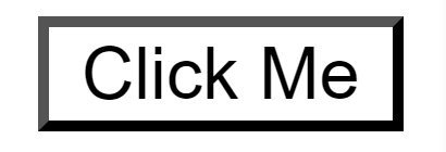
<button>Click Me</button>display: The display property controls how an element is rendered on a web page. When using display, flex on the 3D button's body element allows for flexible and lively layouts. This creates visually stunning and professional designs that stand out.- The
align-itemsandjustify-contentproperties work together to center the content both horizontally and vertically on the page. This is a convenient method for aligning a single element, like our HTML 3D button, or a group of elements inside a container. - To create a full-screen layout,
min-heightproperty with "100vh" value is used to set the 3D button's body element's minimum height to 100 viewport height units. This makes sure that the HTML 3D button's body element will always occupy at least the viewport's height. - By using
background: #fff, the background color of the 3D button's body element is set to white. This is the default background color, which guarantees a white background for the page if no other color is explicitly specified.
Now, after adding the body element lets now add button elements that let the HTML and CSS button get a better defined design.
- The
positionproperty with "relative" value is used to set our HTML 3D button's position relative to its normal position in our document flow. - The
marginproperty with "auto" value is used to center the button horizontally by setting its left and right margins to auto. - The
widthproperty with "200px" value, in our 3D button's width is now set to a fixed 200 pixels regardless of its content. - The
cursorproperty with "pointer" value sets the cursor style to pointer, indicating to the user that the button is clickable. - The
outlineproperty with "none" value removes the default outline around focused buttons, improving the visual appearance and preventing distortion. - The
borderproperty with "0" value removes the button's border for a cleaner, minimalist look. - The
text-transformproperty with "uppercase" value makes all button text uppercase for a consistent appearance. - The
font-sizeandfont-familyproperty with "inherit" value makes the font size and family from the body element for consistency unless overridden by a more specific CSS rule.
Adding Class
Note: Now we will add a different classes to our different level of codes of our HTML and CSS Button element. As we dont want our upcoming code's class to affect our other levels of codes. If the classes are repeated in every code no matter what you remove or add, the final class is still going to affect our previous level of code.
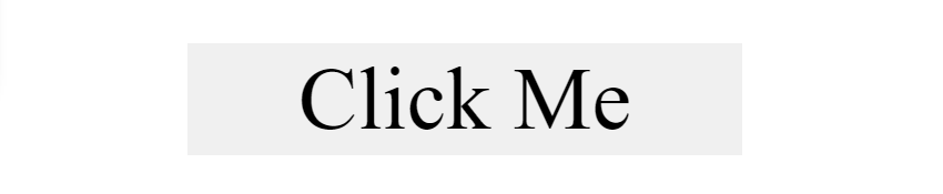
We have applied many specific styles to our 3D button element with the class of "styling1". It sets the font weight to 600, which makes the text appear bolder than normal and also sets the text color to #382b22, which is a dark brown color.
The padding property adds spacing inside the button element, and the background property sets the background color of the button to #a7e7fc, which is a light blue color.
The border property creates a 2-pixel-wide border around the button element with a color of #0692c0, which is a darker shade of blue. The border-radius property adds rounded corners to our HTML 3D button element with a value of 0.75em, giving the button a slightly curved appearance.
The transform-style property with a value of preserve-3d allows the button to be transformed in 3D space. The transition property specifies the duration and easing function of the transition when the button is hovered or clicked.
<style>
	body {
		display: flex;
		align-items: center;
		justify-content: center;
		min-height: 100vh;
		background: #fff;
	}

	button {
		position: relative;
		margin: auto;
		width: 250px;
		cursor: pointer;
		outline: none;
		border: 0;
		text-transform: inherit;
		font-size: inherit;
		font-family: inherit;
	}

	button.styling-a{
		font-weight: 600;
		color: #382b22;
		padding: 1.25em 2em;
		background: #a7e7fc;
		border: 2px solid #0692c0;
		border-radius: 0.75em;
		transform-style: preserve-3d;
		transition: transform 150ms cubic-bezier(0, 0, 0.58, 1), background 150ms cubic-bezier(0, 0, 0.58, 1);
	}
</style>

<button class="styling-a">Click Me</button> Creating pseudo-element using ::before
Now that we will add different class as we doesnot want our following element class to affect the other incomplete button codes
We have used pseudo-element before the HTML and CSS button element, which is designated by the ::before selector. We have given pseudo-element the same dimensions as the button, and the position property "absolute" value for positions it is relative to the nearest positioned ancestor element(button).
The content property with '' empty value sets the content of the pseudo-element to an empty string.
The background property sets the background color of the pseudo-element to #75dafb value, which is a light blue color.
The border-radius property sets the rounded corner radius of the pseudo-element to the same value as the button's border-radius property.
The box-shadow property adds a box shadow around the pseudo-element. The first set of values (0 0 0 2px #0692c0) creates a border shadow, and the second set of values (0 0.625em 0 0 #d8f5fe) creates a light blue shadow underneath the button.
Finally, the transform property applies a 3D transform to the pseudo-element, moving it 0.75em down and 1em backwards in the z-axis. The transition property specifies the transition effect for the transform and box-shadow properties.
<style>
	body {
		display: flex;
		align-items: center;
		justify-content: center;
		min-height: 100vh;
		background: #fff;
	}

	button {
		position: relative;
		margin: auto;
		width: 250px;
		cursor: pointer;
		outline: none;
		border: 0;
		text-transform: inherit;
		font-size: inherit;
		font-family: inherit;
	}

	button.styling-b{
		font-weight: 600;
		color: #382b22;
		padding: 1.25em 2em;
		background: #a7e7fc;
		border: 2px solid #0692c0;
		border-radius: 0.75em;
		transform-style: preserve-3d;
		transition: transform 150ms cubic-bezier(0, 0, 0.58, 1), background 150ms cubic-bezier(0, 0, 0.58, 1);
	}

	button.styling-b::before {
		position: absolute;
		content: '';
		width: 100%;
		height: 100%;
		top: 0;
		left: 0;
		right: 0;
		bottom: 0;
		background: #75dafb;
		border-radius: inherit;
		box-shadow: 0 0 0 2px #0692c0, 0 0.625em 0 0 #d8f5fe;
		transform: translate3d(0, 0.75em, -1em);
		transition: transform 150ms cubic-bezier(0, 0, 0.58, 1), box-shadow 150ms cubic-bezier(0, 0, 0.58, 1);
	}
</style>

<button class="styling-b">Click Me</button>#1 Hover
Now that our element gave an 3D effect with all the shadows but now let give our HTML 3D button a clickable effect.
button.styling-c:hover {
	background: #a7e7fc;
	transform: translate(0, 0.25em);
}
This section applies styles to the button element when the mouse pointer hovers over it. Specifically, it changes the background color to a lighter blue, and it moves the button down by 0.25em (one quarter of the button's height) using the transform property.
button.styling-c:hover::before {
	box-shadow: 0 0 0 2px #0692c0, 0 0.5em 0 0 #d8f5fe;
	transform: translate3d(0, 0.5em, -1em);
}
This section applies styles to a pseudo-element that is added to the button element when the mouse pointer hovers over it. The pseudo-element is created using the ::before selector, which creates a new element that appears before the button's content.
#2 Active
The styles we applied to the pseudo-element created a shadow around the HTML and CSS button, which is made up of two parts: a solid blue border and a lighter blue shadow below it. The box-shadow property creates the shadow effect, while the transform property moves the shadow down by 0.5em.
button.styling-c:active {
	background: #a7e7fc;
	transform: translate(0em, 0.75em);
}
This section applies styles to the button element when it is being actively clicked by the user. Specifically, it changes the background color to a lighter blue, and it moves the button down by 0.75em using the transform property.
This section applies styles to the pseudo-element that is added to the button element when the HTML and CSS button is being actively clicked by the user. The styles applied to the pseudo-element create a shadow effect that is made up of a solid blue border and a light blue shadow on the top. The box-shadow property creates the shadow effect, while the transform property moves the shadow back up by 1em.
Now lets align up all of the above css codes in our final output with right class name "styling".
Final Output:
button.styling-c:active::before {
	box-shadow: 0 0 0 2px #0692c0, 0 0 #d8f5fe;
	transform: translate3d(0, 0, -1em);
}
<style>
body {
display: flex;
align-items: center;
justify-content: center;
min-height: 100vh;
background: #fff;
}
button {
position: relative;
margin: auto;
width: 250px;
cursor: pointer;
outline: none;
border: 0;
text-transform: inherit;
font-size: inherit;
font-family: inherit;
}
button.styling {
font-weight: 600;
color: #382b22;
padding: 1.25em 2em;
background: #a7e7fc;
border: 2px solid #0692c0;
border-radius: 0.75em;
transform-style: preserve-3d;
transition: transform 150ms cubic-bezier(0, 0, 0.58, 1), background 150ms cubic-bezier(0, 0, 0.58, 1);
}
button.styling::before {
position: absolute;
content: '';
width: 100%;
height: 100%;
top: 0;
left: 0;
right: 0;
bottom: 0;
background: #75dafb;
border-radius: inherit;
box-shadow: 0 0 0 2px #0692c0, 0 0.625em 0 0 #d8f5fe;
transform: translate3d(0, 0.75em, -1em);
transition: transform 150ms cubic-bezier(0, 0, 0.58, 1), box-shadow 150ms cubic-bezier(0, 0, 0.58, 1);
}
button.styling:hover {
background: #a7e7fc;
transform: translate(0, 0.25em);
}
button.styling:hover::before {
box-shadow: 0 0 0 2px #0692c0, 0 0.5em 0 0 #d8f5fe;
transform: translate3d(0, 0.5em, -1em);
}
button.styling:active {
background: #a7e7fc;
transform: translate(0em, 0.75em);
}
button.styling:active::before {
box-shadow: 0 0 0 2px #0692c0, 0 0 #d8f5fe;
transform: translate3d(0, 0, -1em);
}
</style>
<button class="styling">Click Me</button>Output:
Other HTML 3D Button Styles
We also have many other simpiler 3D buttons that can be effective to your interface.
#1 Button Style A
<style>
  .button-a {
    border: none;
    background-color: #F891B3;
    color: #ffff;
    padding: 10px 20px;
    font-size: 20px;
    width: 200px;
    border-radius: 10px;
    margin: auto;
    position: relative;
    box-shadow: 5px 5px 5px #FBC1D4;
    transition: all 0.3s ease;
  }
  .button-a:hover {
    box-shadow: 0px 2px 20px #A20A3C;
    top: 3px;
  }
  .button-a:active {
    box-shadow: none;
    top: 5px;
  }
</style>

<button class="button-a">Button a</button>
Output:
#2 Button Style B
<style>
  .button-b {
    display: inline-block;
    position: relative;
    width: 200px;
    padding: 0;
    border-radius: 5px;
    background: linear-gradient(to left, #9b51de, #a45fe1, #a45fe1, #9b51de);
    box-shadow: 2px 2px 0 hsl(0deg 0% 0% / 0.5);
    transition: transform 600ms cubic-bezier(.3, .7, .4, 1);
    cursor: pointer;
    outline-offset: 4px;
  }

  .button-b:hover, .button:active {
    transform: translateY(-2px);
    transition: transform 250ms cubic-bezier(.3, .7, .4, 1.5);
  }

  .button-b:focus:not(:focus-visible) {
    outline: none;
  }

  .text {
    display: block;
    padding: 12px 42px;
    font-size: 1.25rem;
    color: white;
    background: #c499eb;
    border-radius: 5px;
    transform: translateY(-4px);
    transition: transform 600ms cubic-bezier(.3, .7, .4, 1);
  }
</style>

<button class="button-b">
  <span class="text">
    Button B
  </span>
</button>
Output:
#3 Button Style C
<style>
 button.button-c{
  color:#000;
  margin:auto;
  width:150px;
  line-height:40px;
  font-size:12px;
  font-weight:900;
  letter-spacing:3px;
  text-transform:inherit;
  background-color: #fff;
  position: relative;
  border:5px solid #000;
  box-shadow:1px 1px 0, 2px 2px 0, 3px 3px 0, 4px 4px 0,5px 5px 0;
}
 button.button-c:active{
   top:5px;
   left:5px;
   box-shadow:0 0 0 0;
}
</style>
  <button class="button-c"> Button-c</button>
Output:
Conclusion:
3D buttons are now gaining significant popularity in recent years. I hope this blog let you build your HTML and CSS 3D buttons into your interface design, with developing instructions on how to create them effectively without making your website design worst.
Whether you are designing your HTML and CSS 3D buttons for your website design, mobile app, or desktop software, incorporating; you would be able to create a more interactive and engaging customer experience.
ReplayBird - Driving Revenue and Growth through Actionable Product Insights
ReplayBird is a digital experience analytics platform that offers a comprehensive real-time insights which goes beyond the limitations of traditional web analytics with features such as product analytics, session replay, error analysis, funnel, and path analysis.
With Replaybird, you can capture a complete picture of user behavior, understand their pain points, and improve the overall end-user experience. Session replay feature allows you to watch user sessions in real-time, so you can understand their actions, identify issues and quickly take corrective actions. Error analysis feature helps you identify and resolve JavaScript errors as they occur, minimizing the negative impact on user experience.
With product analytics feature, you can get deeper insights into how users are interacting with your product and identify opportunities to improve. Drive understanding, action, and trust, leading to improved customer experiences and driving business revenue growth.
Try ReplayBird 14-days free trial
Further Readings:
 Uma
Uma Velantina
 Uma
Uma