Websites are created for many purposes, like advertisements or personal blogs, but the real and only purpose of having a website is to let users visit and contact you.
With all this technology, you do want someone to meet in person.
However, meeting people on the internet is the best way and it has lots and lots of advantages like time-saving, energy-saving and more.
You need a platform to meet people and show them your products or anything you like.
When its real motto is to get people to visit, you need to make your website really good-looking and welcoming.
So websites are usually designed according to how the people want the website to be looked. Website designers consider UX and UI to design the best and good looking websites.
And they sometimes make mistakes, and even small mistakes can take a lot of effort and bring them down to failure.
Some website creators have designed their websites without considering any kind of user experience and have designed some of the worst website designs of 2023 and ever, which absolutely tells you why you should never even try this out in your website design.
Here are 30 worst website designs 2023:
#1 Bob Eagle

Review:
Color scheme - Using a darker color scheme can be a mistake and give a flashing effect to the website visitors.
Text - Too many links rather than using any kind of button can make it so cluttered.
Logo - A header or the logo, which is not well designed or god-looking. Using his own image made the website look more cringe. not a well-designed division.
#2 Restaurant Bob

Review:
Font and images - Poorly designed fonts and badly used images make it look like some kind of spam page.
Color scheme - worst color scheme for the fonts. Moreover, the fonts with shadows do not make it look good at all.
Logo - The header image, or the top most image with a duck, makes it look so flagitious.
#3 Old Computer Museum
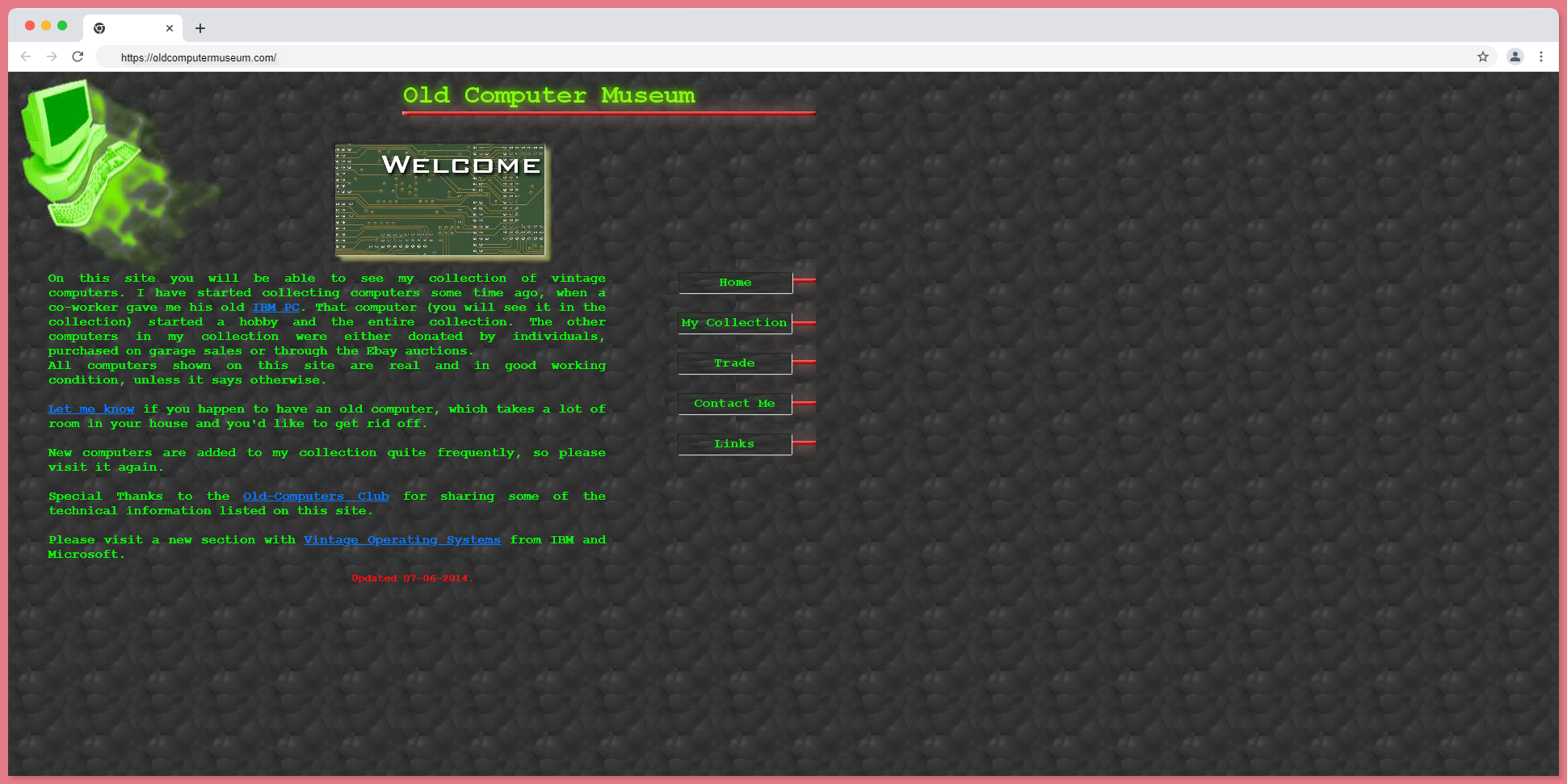
Review:
Color scheme - This website has the worst combination of green and brown.
Text - a green color that did not suit its background.
Background - looks like a printed wallpaper from a 90s house.
Logo - the green ghostly effect is totally vile.
Space - too much empty space. They have aligned the whole website to the top-left corner which makes it too small and like an ad on some other web page.
#4 Geiler Wein
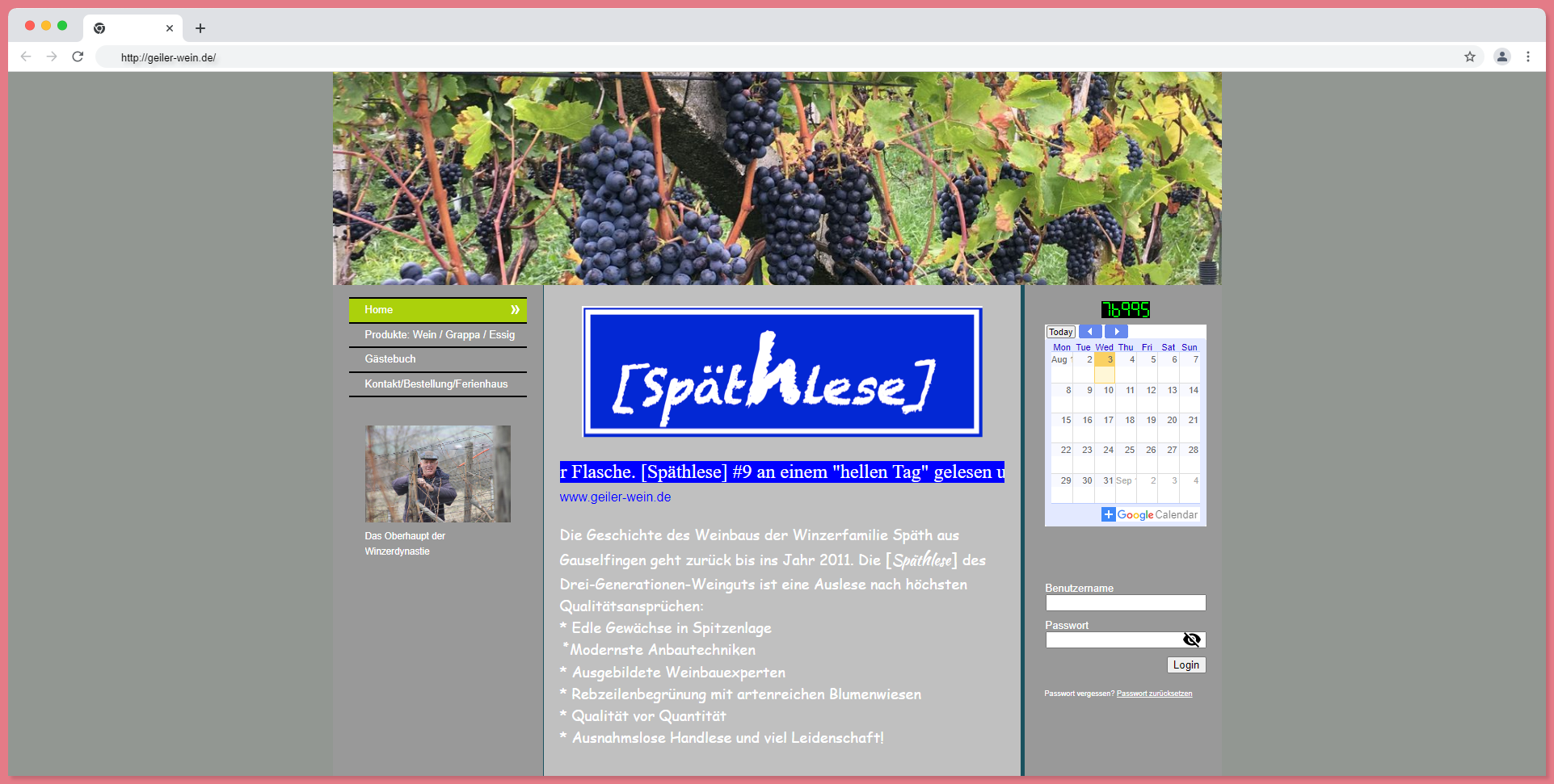
Review:
Color Scheme - greenery image with grey doesn't provide any pleasant palate.
Text - too many para and points may take a lot of time to read, which is useless.
Background - grey background is such a boring or dull color to use and the website has more empty spaces on the sides.
Logo - the logo, or the dark blue image, is totally irrelevant.
Font - using the student font has made the website look lamer.
#5 All Solutions Network

Review:
Color Scheme - using colors like dark blue, black, and yellow makes the website look ugly and unpleasant.
Text - too much text and words. Most of the text is irrelevant.
Background - the black blank space with an image of the earth makes the website more cringe.
Logo - the logo or the text in the background with colors, making it look more old-fashioned.
Font - the fonts are huge in size, and the gradient effect with shadows in some gives an awful appearance.
#6 Peaxis Stricker
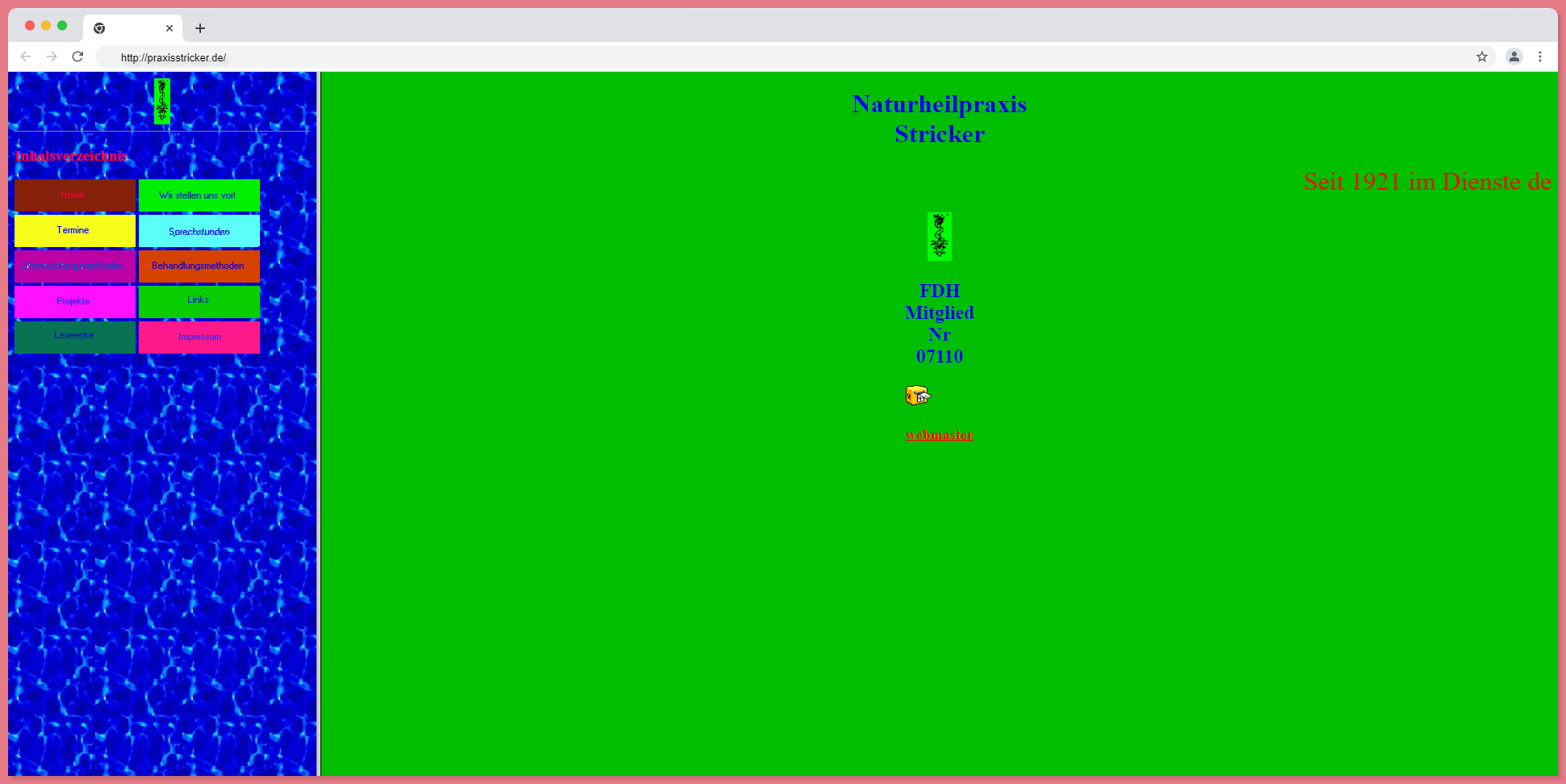
Review:
This website is just a perfect example of a bad website design, where this website will get negative marks if it was ranked.
#7 Tavern HG

Review:
Color Scheme - the color scheme of dark red and black could have been better.
Text - the texts are in italic and smaller in size than the other texts, making them look mismatched.
Logo - the logo is too bad but they could have done a decent job if it was in SVG. It has a white background and it has been done just like that.
#8 Pacific NorthWest X-Ray

Review:
Color Scheme - blue shades and black text are bad website design combinations.
Text - the texts are in black, so they are not even visible in the first place.
Background - the background is wallpaper in shades of blue. Not so good. It would be better if the background had any plain light color.
Logo - About the logo, it has been done by the worst logo designer, just lame color, font, and shadows, making it look more cringe.
#9 RainBow Dividers

Review - too clumsy.
Background - they have used gifs for the background, which makes it totally clumsy and flashy. The website is giving pain to the eyes.
Logo - they have tried to give the logo and the header, which is simple text in a basic font with a highlight of the bad color combination.
#10 Gates N Fences
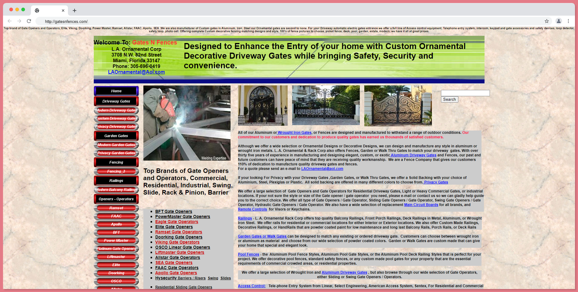
Review:
Color Scheme - all bold red, black and green do not look good, as there are many other good combinations.
Text - they have mentioned a bunch of text on the top and front page, which is too much and looks cluttered.
#11 Lipton

Review:
Color Scheme - Lipton is a well-known brand, and it is a green tea brand, so they have used green and yellow colors on the whole website.
Text - they have tried to give a decent website copy with a top header.
They have tried to provide a good-looking website, but maybe because they are bigger in size, the website looks more cluttered and clumsy.
#12 Toronto Cupcake
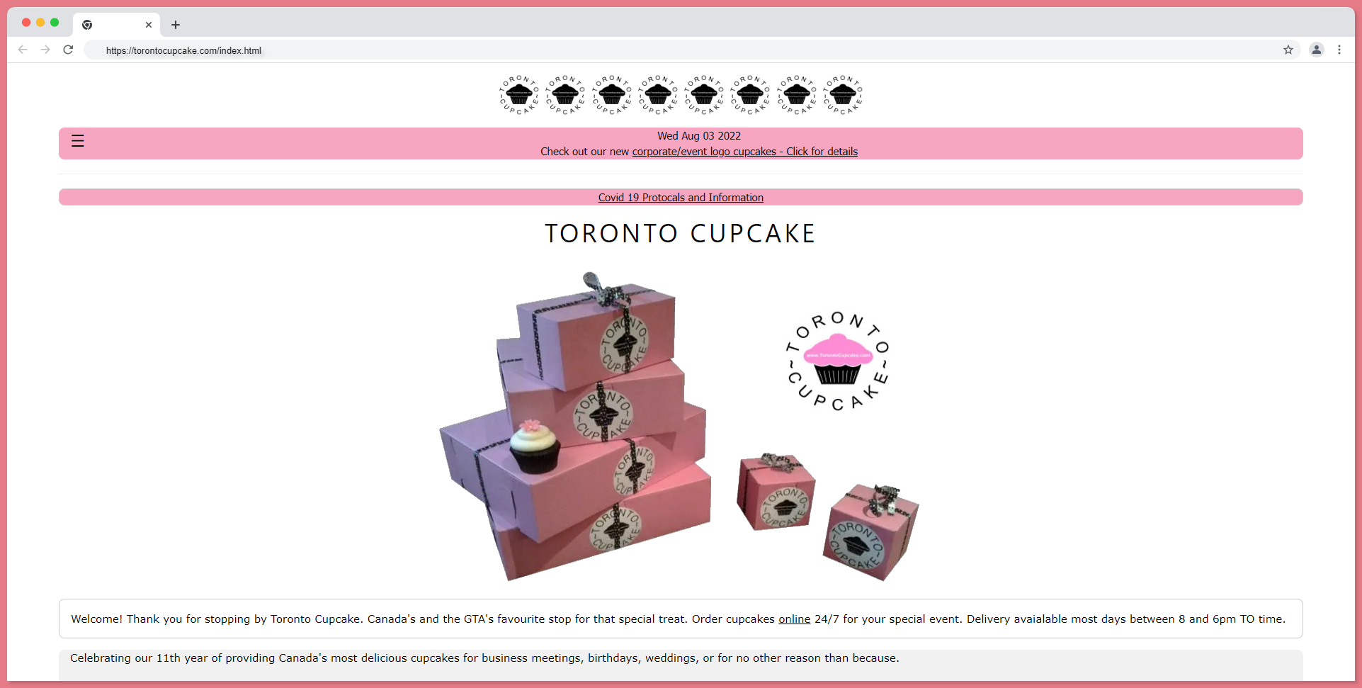
Review:
Color Scheme - a white and pink color scheme for a cake shop is a good idea, which gives a sweeter feeling.
Background - it is not properly aligned with divisions.
Logo - with the logo aligned on the top, but it isn't necessary to repeat the logo eight times.
#13 University of Advancing Technology
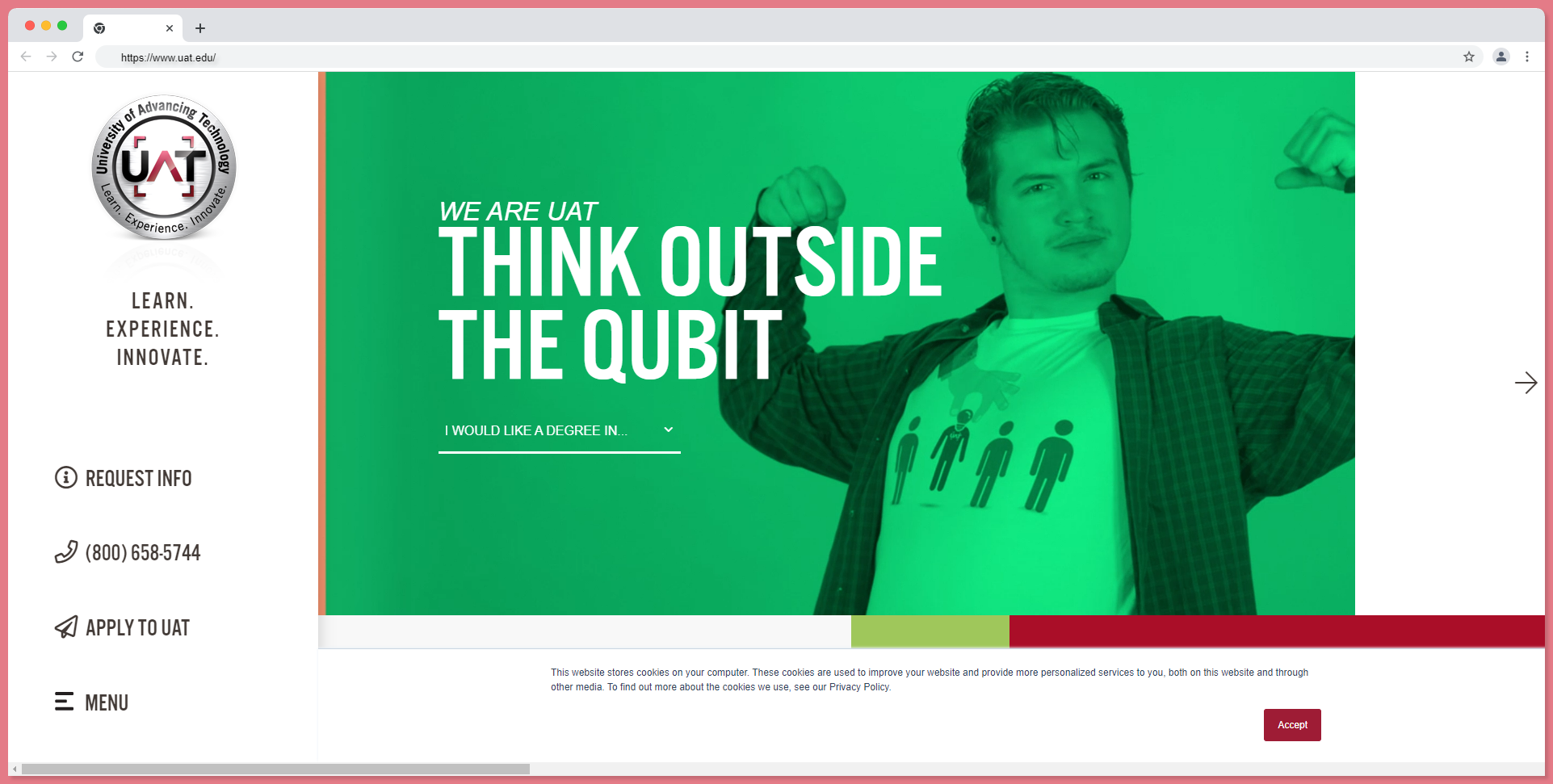
Review:
Text - they do not have much text, but all the text they have by now is quite decent. But we shall look at the buttons. They are all too big and aligned in the left sidebar, which is quite poorly designed.
Logo - the logo they have tried to do a decent job of, but it looks like a steel company's logo.
They have tried to do a video intro on their student, and it is nice, that I don't see any loading or mistakes in the video player.
#14 Art Yale

Review:
Text - the texts are with highlights and look so lame and dull. and all the text is aligned to the left of the website.
Background - the background in a graphic design would be better if it was an image, illustration, or just a blank color.
Logo - they didn't have any logo, and they gave their school name just as a header.
#15 Ingeb

Review:
Text - all the texts on this page are linked and have a blue color that gives them a cluttered and clumsy look.
Background - the background is empty and textured.
Logo - in this website they do not have any logo kind of thing but have a welcome text where I don't know what it is for, they have a child's image, which makes this page look too cringe and do not understand the use of the website.
#16 Los Manantiales
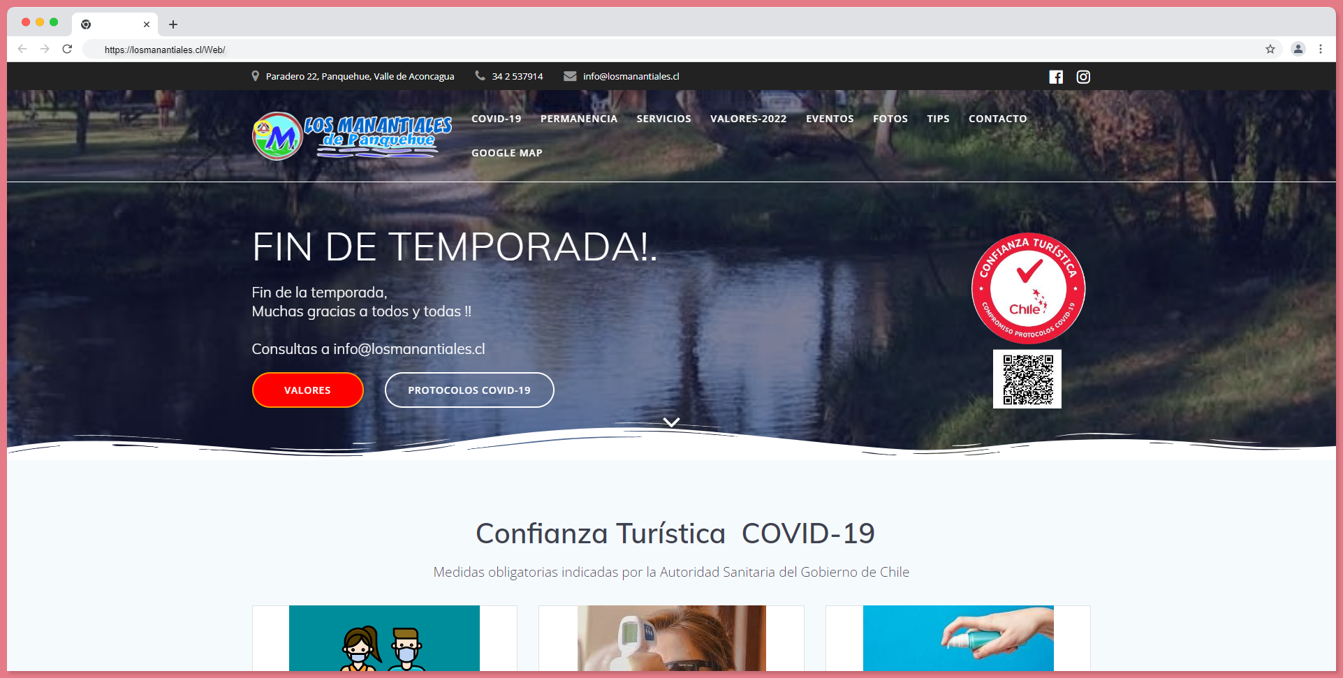
Review:
This website does not have a lot of UX mistakes.
They have tried to do a decent job, but the page speed and links that are combined with the buttons and links are not proper at all.
When a website is designed, the more important things to consider are page speed and internal links.
Logo - About the logo, it has been done by the worst logo designer. It's just lame color, font, and shadows, making it look more cringe.
#17 Paralaflesta
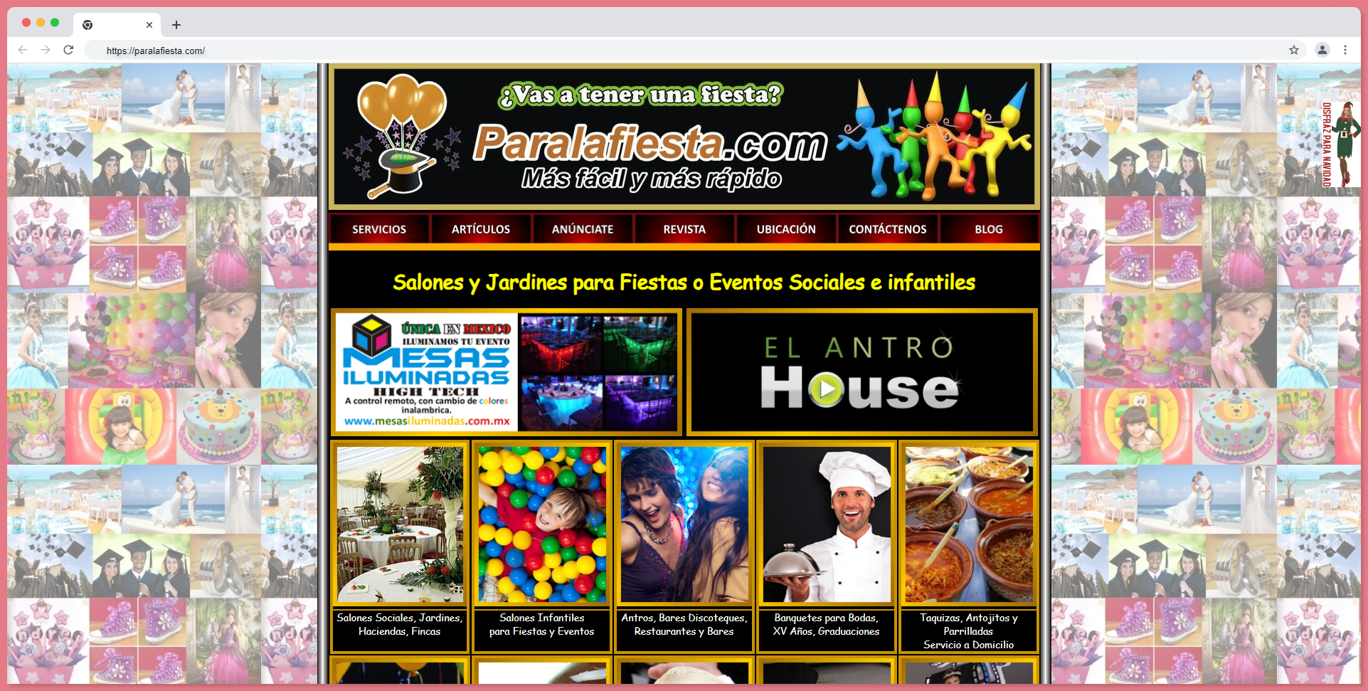
Review:
Color Scheme - the combination of pink, black, and gold is an excellent combination, but here on this website it would have been so much better if they had utilized them in a better way.
Background - the background is too cluttered as they have included lots and lots of images, which are repeated. It is a cool idea to have a multi-collage of images, but if it is smaller in size and gives a one-colored view.
Logo - with the logo, they have simply used their own website name and used a basic font and color. The logo has been mismatched with this kind of shadow.
#18 Geodienst
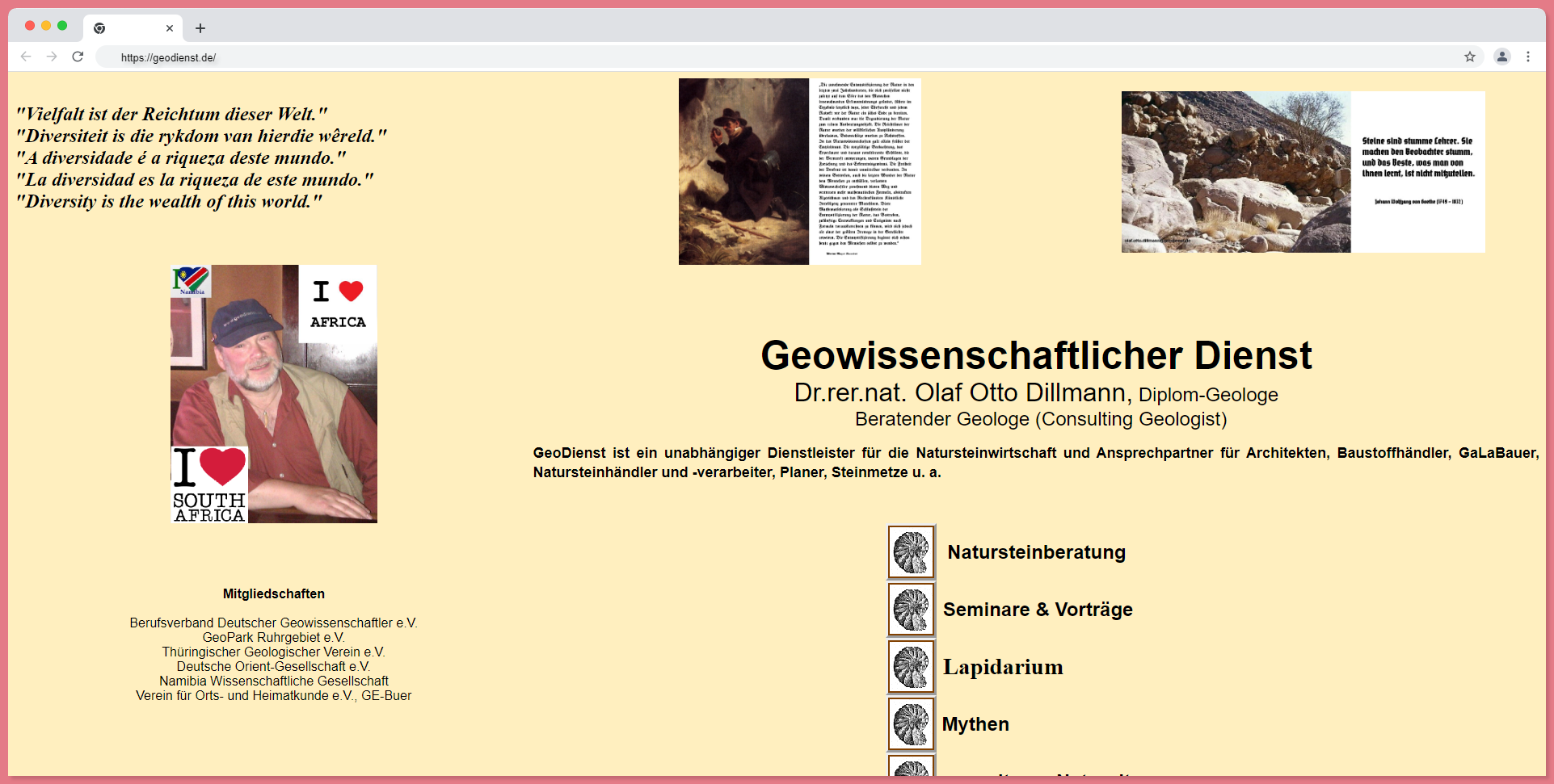
Review:
Text - texts are placed in random parts of the web page, which is an absolute no as it looks too clumsy.
Background - the background has no division at all, with some images of themselves, making the page too cringe. It looks like a webpage by a boomer.
#19 Norm Did It

Review:
Color Scheme - the color scheme of blue and green and the shiny gradient effect is decent, but the dull combination is not so good.
Text - they do not have any content or text except for their welcoming message, contact details, and the logo.
Background - the dark, dull blue definitely gives a boring feeling.
Logo - the logo of Website Magic is simply added as text here, with font and shadow.
Font - the fonts don't look like a scheme, but they do look like a mismatched combination of texts.
#20 Arngren
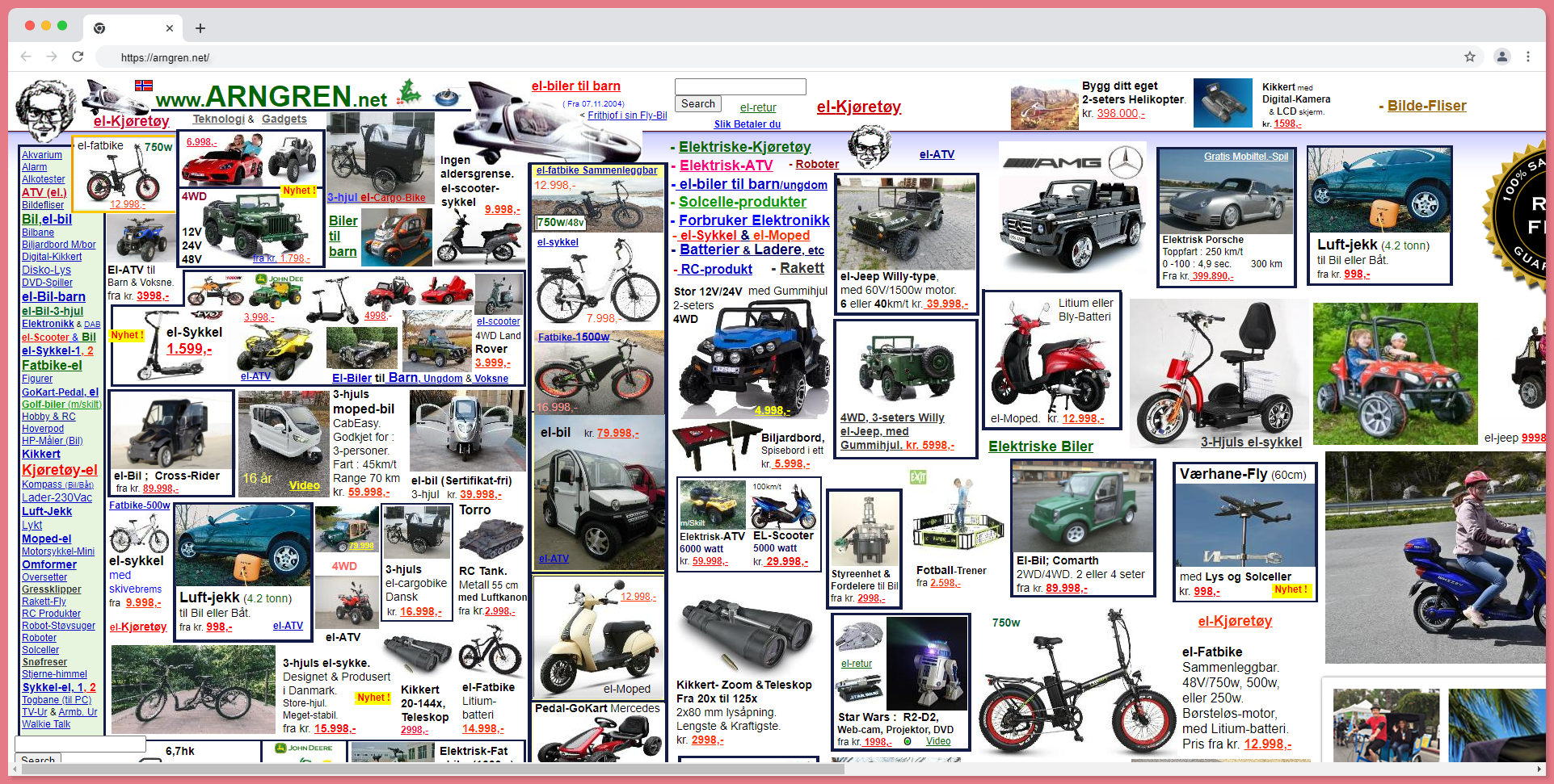
Review:
Color Scheme - the color scheme used in this website is just white background, dark red, and dark green texts. This is so common and old styled
Text - texts are too small and colored in black and red. This gives a basic look, and the link in the sidebar makes the whole website too clumsy.
Background - there is no background here, only ads. There must be 60+ ads here, so it must have a high bounce rate for looking like spam.
Logo - there is no specific logo; they have placed their website's name itself, and the color of the logo is too tame.
Font - as the fonts are too small, they look too clumsy and cluttered, as well as having the appearance of a load of stuff.
#21 Kazenergy

Review:
Color Scheme - the color combination is this website is the only negative in this website, using dark bold green without having some color scheme language.
Logo - Logo is the second negative, it would have been decent if it was done by a proper logo or graphic designer.
#22 Collen Corby

Review:
Color Scheme - the color scheme of pink and white is actually a good combination for a website, but here other characteristics make the website worse.
Text - this website does not use any text but they have made the logo, header, and everything into one single part and placed it in the middle of the website, which makes it worse.
The website has been designed with the goal of looking beautiful and cute, it isn't
Background - the background and the buttons and the designs look so bad that it actually makes me cringe with all this girly pink stuff like hearts and flowers.
Font - the font is some old-fashioned handwriting font that looks quite cringy with shadows.
#23 Vizzed
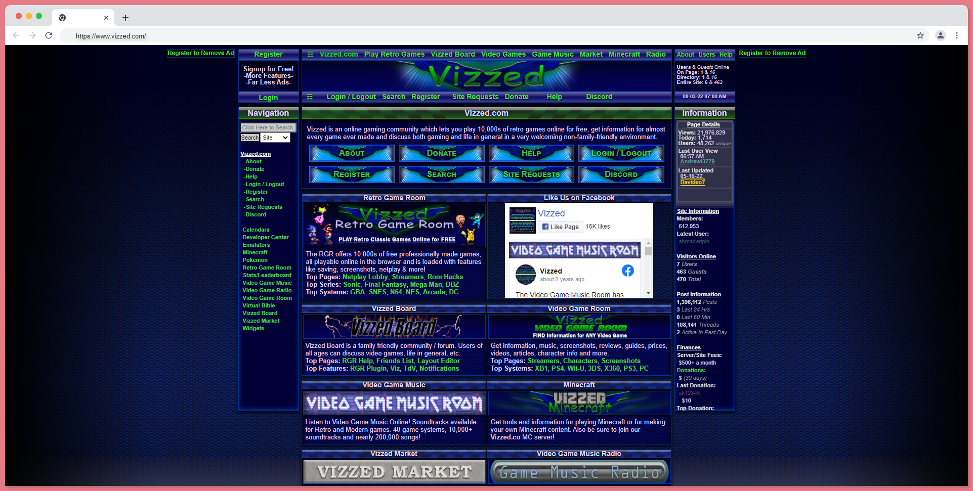
Review:
Color Scheme - the dark blue can be cooler, but not with the cluttered and mismatched color scheme.
Text - the texts look more clumsy and cluttered, with dark green and white with a lot of shadows, which looks really awful.
Background - the background has too many divisions that make the website look bad and worse.
Logo - the smaller space between logos and text and other elements looks too bad as they have used the same font, shadow, and colors everywhere.
Font - the fonts are too small and the header fonts are too huge. That makes the website look too bad.
#24 Heavens Gate

Review:
Color Scheme - absolutely the worst color scheme, with a mixture of dark green, dark pink, yellow, and light blues, does not suit well.
Text - they have done some text work, but the stuffy text looks more like a scam.
Background - the background that looks like a night sky is not that good, and it looks poor.
Logo - the logo is in an inappropriate position with no the related color which make it look heavier
Font - the font looks just too basic.
#25 Pixel Design
Review:
Color Scheme - color scheme of this website isn't any worse or worse.
Text - this website does not have any text or stuff.
Background - the background with a low-quality graphical image will make the website poor and look like a scam.
Logo - logo with two different contrast colors isn't so good. They should have simply used a good color combination.
#26 The Ages
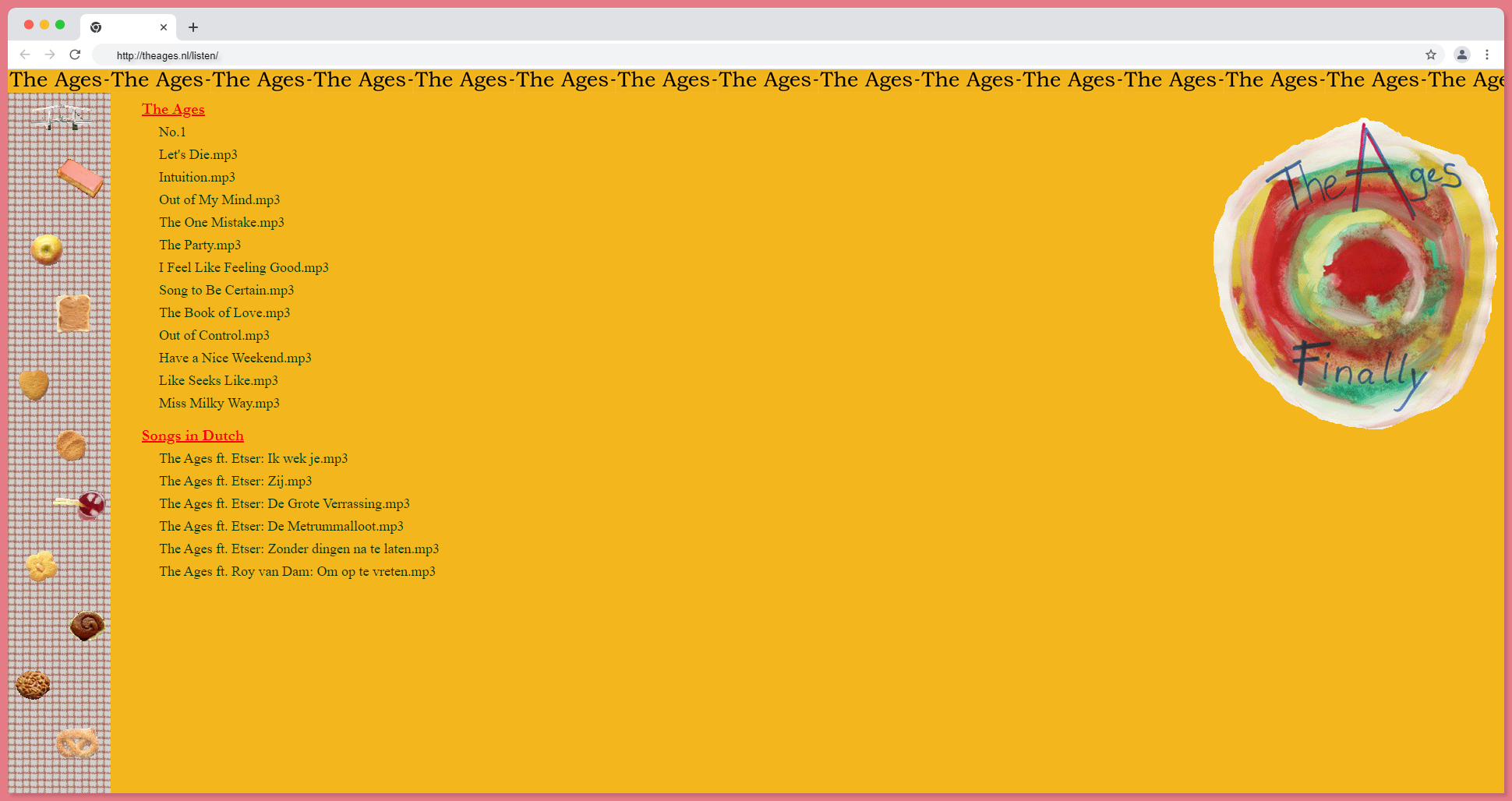
Review:
Color Scheme - the color scheme of this website has a yellow, dark green, and red header, which are 3 different abstract colors, giving an amateur color palate.
Text - they have really text which is not even distributed equally and has aligned to the left.
Background - background with empty spots with no division makes the website boring or useless.
Logo - the logo is the website's kind of draw, but it is totally fine for a website that is about entertainment to place the logo in an inappropriate place. It largely makes the website look terrible.
Font - the fonts are in dark green and dark red, and fonts like Times New Roman make the texts and website look more basic and tedious.
#27 V Cal
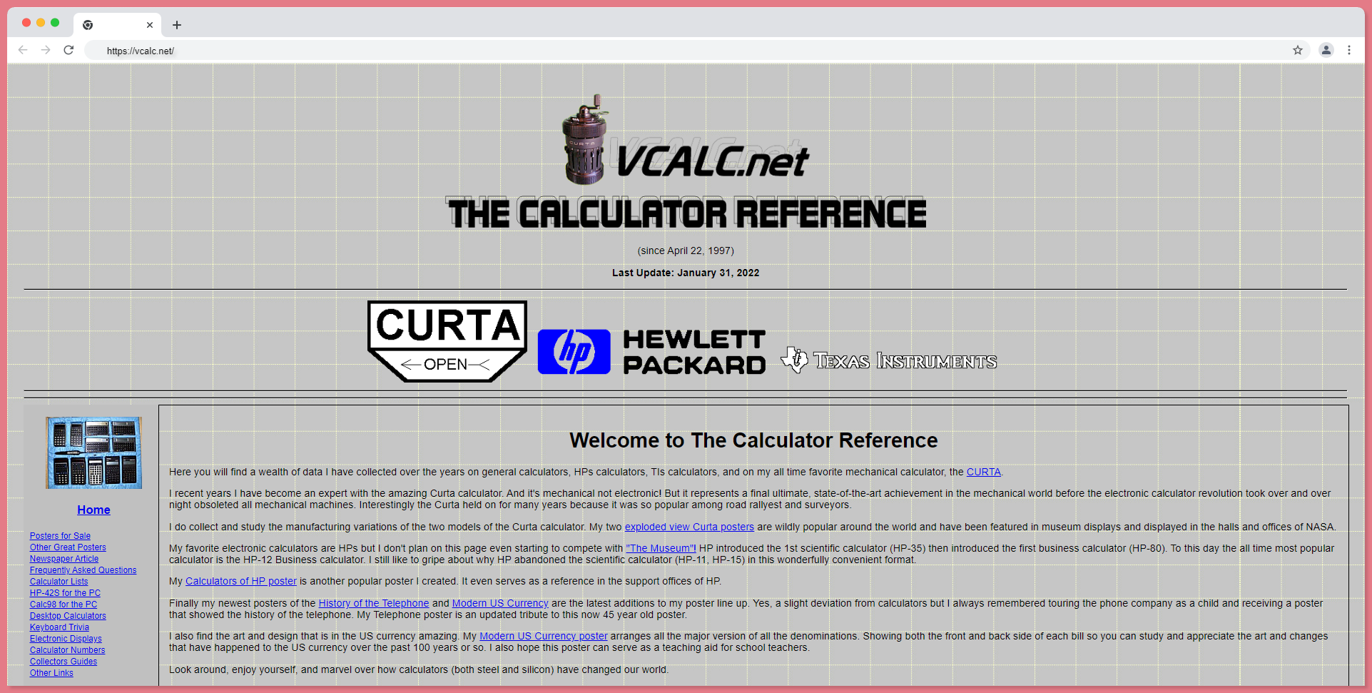
Review:
Color Scheme - black text on a grey background makes your website look ugly.
Text - they have stuffed more text in, which makes the reading too tough. with darker colors and too many links, they aren't interactive and make the website a more annoying interface.
Background - the grey background with white stripes can look good on shirts, but as a background, it could be good looking on cuter websites, but not on a website like this. You can absolutely tell someone with poor UX knowledge would have made this output.
Logo - The logo or the headline text is really done with low-quality pixels, and the font and the italic style don't give a good look at the website logo. There are so many website logo styles that are minimalist and cool. Compared to them, this logo is absolutely on an average level.
Font - the font is too basic and bold. The header and normal text have so many differences that they are both cluttered.
#28 Dream Land Resort
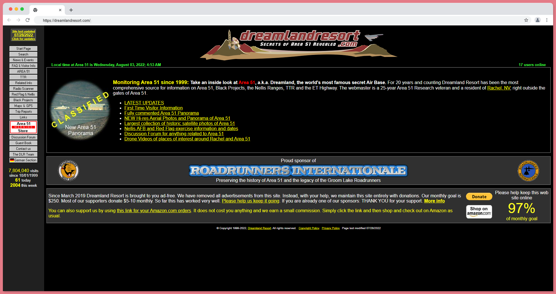
Review:
Color Scheme - black background, yellow text, and red logo are unsatisfying color combinations. They did not use a proper color palette.
Text - the text is in yellow and white with unreadable content. It is too cluttered.
Background - the black background and the sidebar are too old-fashioned. It looks like some website from the 80s.
Logo - their logo is really big and more explainable. The logo itself is a short form of the brand, where the log is really big and has a website name on it, making it poor.
Font - they have a common and basic font, and the size of the font is so small that you can even understand it. They probably wanted to squish more text on their website.
TIP: always add more pages to stuff your keyword or write more, never stuff all your content n one page and confuse the website visitor, which makes your UX design worst.
#29 Valley Isle Aquatics

Review:
Color Scheme - using such a bold color and contrast color combination.
Text - Have used more text with text in italic and they have given the texts multi-colored which makes it more confusing and does not give an idea of how to read them.
Background - this brings yellow, which can be flashy for the website visitor, and there are more empty spaces on the sides. They might have tried this to attract children, which is absolutely a bad idea.
Logo - giving a curved text for the logo with old styled animal action image is making the logo more cringe.
#30 Andrea Rizzo
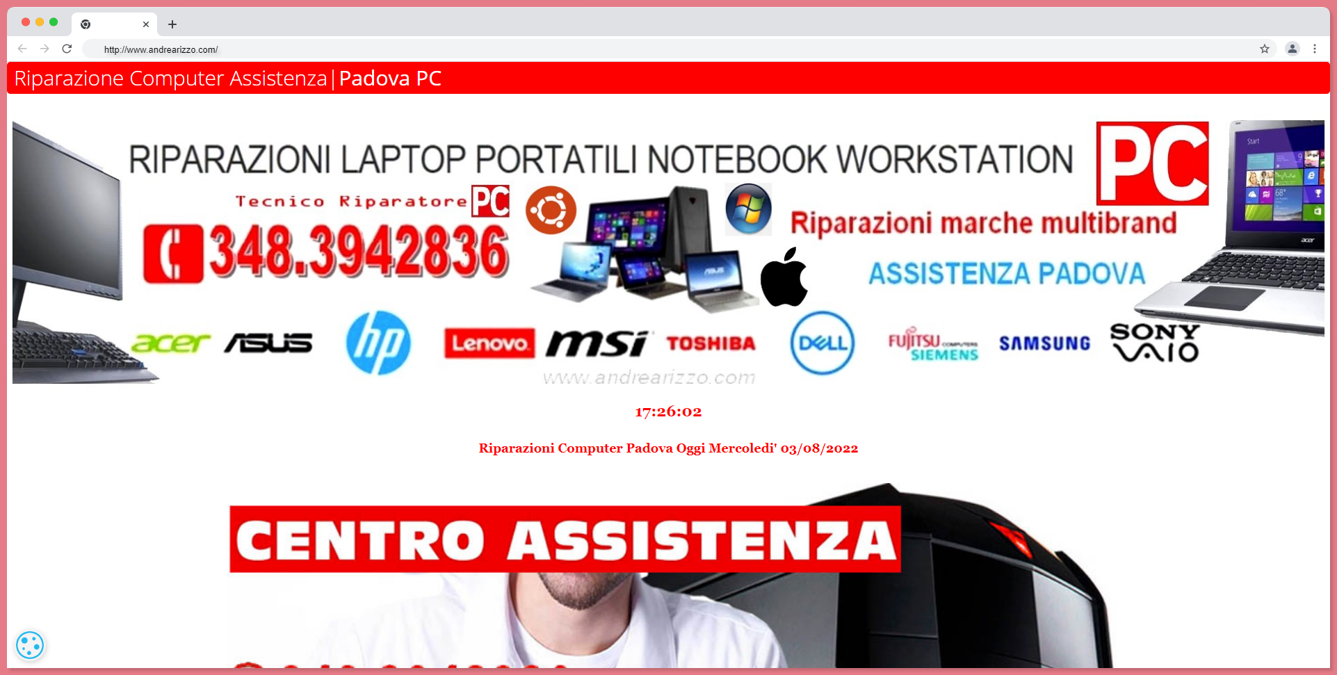
Review:
Color Scheme - red and white color scheme is a good combination, but it isn't utilized well on this website.
Text - the title does not have to be big-sized; the phone number is also really huge, and giving it a shadow makes the whole website uglier.
Background - background images are all cropped or half cut and are not of good quality.
Logo - they have mentioned their logo as a bar, in a dark color combination.
Adding all these images, texts in huge fonts, and bad color combinations make the website more cluttered.
Best practice to follow while designing your Website:
- Website copy: Give some time and make an appropriate website copy for your website by adding relevant keywords.
- Call to action: make sure you add a call to action on your website so that your website visitors know what to do next, rather than leaving them confused.
- Color palette: Go with one specific color palette on your whole website so that it does not look terrible.
- White Space: Give your website some white space. It needs some decluttering. Filling up every space will definitely give your website a messy look.
- Font: Never mismatch your fonts; follow up with two or three matching fonts.
- Size: Making mini or really minute text, buttons, and designs is going to leave your website visitors confused or they are going to reach for them. When they are huge in size, the website will look ugly.
- Mobile friendly: Not all your website visitors are going to be from the desktop. There are really lots of mobile searches, and if your website isn't mobile-friendly, it has lots of chances that you may miss lots of conversions.
- Page speed: more than SEO and keywords, the most important point here is page speed. If your page is loading for more than 10 seconds, it is the worst case, and you need to fix it.
- Update Latest Norms: Redesign your website with current standards and always have a neat and newly made-up website look.
ReplayBird - Driving Revenue and Growth through Actionable Product Insights
ReplayBird is a digital experience analytics platform that offers a comprehensive real-time insights which goes beyond the limitations of traditional web analytics with features such as product analytics, session replay, error analysis, funnel, and path analysis.
With Replaybird, you can capture a complete picture of user behavior, understand their pain points, and improve the overall end-user experience. Session replay feature allows you to watch user sessions in real-time, so you can understand their actions, identify issues and quickly take corrective actions. Error analysis feature helps you identify and resolve javascript errors as they occur, minimizing the negative impact on user experience.
With product analytics feature, you can get deeper insights into how users are interacting with your product and identify opportunities to improve. Drive understanding, action, and trust, leading to improved customer experiences and driving business revenue growth.
Try ReplayBird 14-days free trial
Further Readings:
 Velantina
 Komahal G
 Komahal G