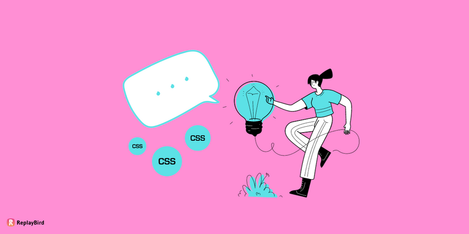
Tooltip, non-technically, pop up with extra info when you hover over something on a website or app inspired by the chat boxes, just like as if the UI element itself is speaking to the users.
This is super important because it makes the experience much smoother and less confusing, especially for people who might be new to the platform. Plus, if you've got a piece of text that's a bit on the long side, a CSS tooltip can neatly tuck away the extra info until it's needed.
One of the best parts? You don't have to clutter up your main text with all this extra information. The tooltip only pops up when someone hovers their mouse over the relevant part of the site.
And the good news is, you don't need to be a coding wizard to make use of these tooltips. All you need is a basic understanding of CSS, That's it.
In this blog, we will cover all you need to become a tooltip pro:
- What is a Tooltip?
- Methods to Create a Tooltip
- Tooltip Positioning
- Animating the Tooltip
- Different Types of Tooltip Examples
What is a ToolTip?
A tooltip is a graphical user interface element that appears when you hover your mouse over something, giving you extra information or a hint about what it does. It's like message that conveying context or details regarding the associated UI component
Let's say you're using a computer program or a website, and you see a small icon or a button. If you're not sure what that icon does, you can hover your mouse over it, and a little box will pop up with a short description. That's the tooltip! It's there to give you a quick heads-up, so you don't have to guess what will happen if you click on it.
Hover here!
This is a TooltipWe will need HTML for the basic body, followed by CSS properties for its appearance, positioning, and content. And finally, JavaScript is often used to handle the events related to the tooltip.
For example, let's say you're in a photo editing app and you see a paintbrush icon. If you're not sure if it's for drawing, erasing, or something else, just hover your mouse over it. A tooltip might pop up saying, "Paintbrush tool" That way, you instantly understand what that icon is all about.
Importance of Tooltips in User Interface Design
Tooltips plays a maour role in many part of the tech as they are almost mandatory in top software companies, websites and even small guides.
1. Clarity:
Tooltips gives quick and concise guides to the users with specific information about elements within an interface. This is particularly valuable when the purpose or functionality of an element may not be immediately obvious to the user.
Imagine an icon without a clear label; it can be better with a tooltip that explains what it does. This friendly touch helps users understand everything they come across instead of leaving them confused and needing a tutorial.
2. Stress-free:
Cognitive load refers to the mental effort needed to process information. In user interfaces, icons, buttons, and other elements often have related meanings that users need to remember. But it's tough to remember them all.
Tooltips reduce the need for users to memorize these meanings or guess their functions. Instead, they provide on-demand explanations that users can access when needed. This brings a lighter cognitive load, so you don't have to stress about remembering everything and can navigate into the interface more simply, without looking like a guide, and with better confidence.
3. Simplier to Learn:
Tooltips are mandatory in the learning process for both new and infrequent users, as they give you quick tips and guidance so you can understand and use the whole interface efficiently.
This gives users a quicker learning curve to use the website or your application with more confidence. As a result, users are more likely to feel comfortable with the interface, which improves the user's engagement.
4. Does not disturb the Design:
It is necessary for a seamless and intuitive user experience that tooltips sync and align with the design language of the interface on every base, such as typography, color schemes, and placement.
Well-designed tooltips that stick to these design standards contribute to the overall coherence and consistency of the well-organized user interface. So, no matter where you click or swipe, it's all a seamless and delightful experience, just for your user.
Methods to Create a Tooltip
How to Create a Tooltip Only with CSS?
Instead of using two class one for the tooltip and for the tooltip text, we care here going to work with just one class of that is tooltip element, with an attribute on the CSS property content .
When a user hovers over the "Hover over me!" text inside the span, the CSS code takes the value stored in the data-text attribute and displays it as a tooltip. This approach allows you to create tooltips using only HTML and CSS, making it a lightweight and efficient method.
<span
  data-text="This is a tooltip"
  class="tooltip">
    I have a Tooltip, Hover me!
</span>
HTML Structure: We have created a span element with a class of "tooltip".
CSS Styling:
.tooltip {
  position:relative;
}
position:relative;: This sets the position of the element to be relative to its normal position. This is important for positioning the tooltip relative to the element.
Important! Part: Custom Data Attribute
The span element has a custom data attribute called data-text with the value "This is a tooltip". This data attribute is used to store the content that will be displayed in the tooltip.
.tooltip:before {
  content: attr(data-text);
}
The CSS code that follows targets the span element with the class of "tooltip" and uses the :before pseudo-element to create the tooltip.
- Using
:before: The:beforepseudo-element is a way to insert content before the content of the selected element (in this case, the span with class "tooltip"). contentProperty: The content property is used to specify the content that should be inserted before the element. In this case, it's set toattr(data-text), which means it will take the value of the data-text attribute from the span element.
.tooltip:before {
    content: attr(data-text);
    position:absolute;
    top:50%;
    transform:translateY(-50%);
    left:100%;
    margin-left:10px; /* Adjusted left margin */
    width:120px;
    padding:10px; /* Increased padding for better readability */
    border-radius:3px; /* Slightly rounded corners */
    background:#919191; /* Darker background color */
    color: #fff;
    text-align:center;
    display:none;
}.tooltip:before: This selects a pseudo-element before the .tooltip element. This pseudo-element is used to create the tooltip box.position:absolute;: This positions the pseudo-element absolutely, so it can be placed precisely relative to its nearest positioned ancestor (which is the .tooltip element in this case).top:50%;: This centers the top edge of the pseudo-element vertically.transform:translateY(-50%);: This further adjusts the vertical positioning to center the tooltip vertically.left:100%;: This positions the left edge of the pseudo-element to the right of the .tooltip element.margin-left:10px;: This provides a bit of space between the .tooltip element and the tooltip box.width:120px;: This sets the width of the tooltip box.padding:10px;: This adds padding inside the tooltip box for better readability.border-radius:3px;: This rounds the corners of the tooltip box slightly.background:#919191;: This sets the background color of the tooltip box to a dark gray.color: #fff;: This sets the text color inside the tooltip to white.text-align:center;: This centers the text inside the tooltip box.display:none;: This initially hides the tooltip.
.tooltip:hover:before {
    display:block;
}.tooltip:hover:before: This selects the pseudo-element before the .tooltip element when the .tooltip element is being hovered over. And, display:block; to make the tooltip box visible when the .tooltip element is being hovered over.
.tooltip:after {
    content: "";
    position:absolute;
    left:100%;
    margin-left:-5px;
    top:50%;
    transform:translateY(-50%);
    border:10px solid #000;
    border-color: transparent #919191 transparent transparent;
    display:none;
}.tooltip:after: This selects a pseudo-element after the.tooltipelement. This pseudo-element is used to create the arrow-like shape pointing to the.tooltipelement.content: "";: This sets the content of the pseudo-element to an empty string.position:absolute;: This positions the pseudo-element absolutely, so it can be placed precisely relative to its nearest positioned ancestor (which is the.tooltipelement in this case).left:100%;: This positions the left edge of the pseudo-element to the right of the.tooltipelement.margin-left:-5px;: This adjusts the position of the arrow-like shape to align it correctly with the tooltip box.top:50%;: This centers the top edge of the pseudo-element vertically.transform:translateY(-50%);: This further adjusts the vertical positioning to center the arrow-like shape.border:10px solid #000;: This creates a border around the arrow-like shape to give it a triangular appearance.border-color: transparent #919191 transparent transparent;: This sets the color of the border, creating a triangle shape with one transparent side and one side matching the background color of the tooltip box.display:none;: This initially hides the arrow-like shape.
.tooltip:hover:before, .tooltip:hover:after {
    display:block;
}
.tooltip:hover:before, .tooltip:hover:after: This selects both the pseudo-element before and after the .tooltip element when the .tooltip element is being hovered over. And, display:block; to make both the tooltip box and the arrow-like shape visible when the .tooltip element is being hovered over.
This code will create a tooltip effect where when you hover over the text "Hover over me!", a box with the text "This is a Tooltip" appears to the right of the text, along with a triangular arrow pointing to it.
How to Create a Tooltip with HTML and CSS?
Basic HTML Structure
The structure is built using a div element with a class of "tooltip". Inside this div, there's a piece of text that says "Show Tooltip".
<div class="tooltip">
  Show Tooltip
  <div class="tooltiptext">This is a tooltip</div>
</div>
Nested within the "tooltip" div, there's another div element with a class of "tooltiptext". This is where the actual content of the tooltip is placed (in this case, it says "This is a tooltip").
Styling with CSS
The CSS styles for both the tooltip container and its content are provided.
/* Tooltipped element css */
.tooltip {
    position: relative;
    display: inline-block;
    cursor: pointer;
    background: #ecf2fd;
    border-radius: 3px;
    padding: 0 20px;
    margin: 50px;
    width: 250px;
}
position: relative;: Sets the position of the element relative to its normal position. This is important for positioning the tooltip relative to this element.display: inline-block;: Makes the element behave as an inline block element. It allows other elements to sit beside it horizontally, but it can also have its width and height set.cursor: pointer;: Changes the cursor to a pointer when hovering over the element, indicating that it is clickable.background: #ecf2fd;: Sets the background color of the element to a light blue shade.border-radius: 3px;: Rounds the corners of the element slightly.padding: 0 20px;: Adds 20 pixels of padding on the left and right sides of the element.margin: 50px;: Adds 50 pixels of margin around the element, creating some space between it and other elements.width: 250px;: Sets the width of the element to 250 pixels.
/* Tooltip container css */
.tooltip .tooltiptext {
    visibility: hidden;
    width: 150px;
    background-color: #333;
    color: #fff;
    text-align: center;
    border-radius: 5px;
    padding: 5px;
}
visibility: hidden;: Initially hides the tooltip.width: 150px;: Sets the width of the tooltip container to 150 pixels.background-color: #333;: Sets the background color of the tooltip container to a dark gray.color: #fff;: Sets the text color inside the tooltip container to white.text-align: center;: Centers the text inside the tooltip container.border-radius: 5px;: Rounds the corners of the tooltip container slightly.padding: 5px;: Adds 5 pixels of padding inside the tooltip container.
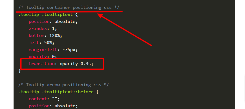
/* Tooltip container positioning css */
.tooltip .tooltiptext {
    position: absolute;
    z-index: 1;
    bottom: 120%;
    left: 50%;
    margin-left: -75px;
    opacity: 0;
    transition: opacity 0.3s; /* Tooltip animation with css */
}
position: absolute;: Positions the tooltip container absolutely, so it can be placed precisely relative to its nearest positioned ancestor (which is the.tooltipelement in this case).z-index: 1;: Sets the z-index of the tooltip container. It controls the stacking order of elements, with higher values appearing on top of lower values.bottom: 120%;: Positions the bottom edge of the tooltip container 120% of its own height above the bottom edge of the.tooltipelement.left: 50%;: Positions the left edge of the tooltip container at the horizontal center of the.tooltipelement.margin-left: -75px;: Shifts the position of the tooltip container 75 pixels to the left. This is used to properly center the tooltip horizontally.opacity: 0;: Sets the initial opacity of the tooltip container to 0, making it initially invisible.transition: opacity 0.3s;: Specifies a transition effect for theopacityproperty over a duration of 0.3 seconds. This creates a smooth fade-in effect when the tooltip becomes visible.
/* Tooltip arrow positioning css */
.tooltip .tooltiptext::before {
    content: "";
    position: absolute;
    bottom: -10px;
    left: 50%;
    margin-left: -5px;
    border-width: 5px;
    border-style: solid;
    border-color: #333 transparent transparent transparent;
}
This block of CSS styles is for positioning the arrow on the tooltip. Here's the breakdown:
content: "";: Sets the content of the pseudo-element to an empty string. This is used as a placeholder for the arrow.position: absolute;: Positions the pseudo-element absolutely, so it can be placed precisely relative to its nearest positioned ancestor.bottom: -10px;: Positions the bottom edge of the pseudo-element 10 pixels below the parent element (creating the space for the arrow to extend downwards).left: 50%;: Positions the left edge of the pseudo-element at the horizontal center of the parent element.margin-left: -5px;: Shifts the position of the pseudo-element 5 pixels to the left. This is used to properly center the arrow horizontally.border-width: 5px;: Sets the thickness of the borders that form the arrow.border-style: solid;: Sets the style of the border to be solid.border-color: #333 transparent transparent transparent;: Sets the color of the borders. It creates a triangular shape with one side (the top side) being transparent and the other sides having the color#333(a shade of gray).
/* Tooltip triggering with css */
.tooltip:hover .tooltiptext {
    visibility: visible;
    opacity: 1;
}
Now, this block of CSS styles controls the behavior of our tooltip when the user hovers over the tooltipped element.
.tooltip:hover .tooltiptext: Selects an element with the class "tooltiptext" that is a descendant of an element with the class "tooltip" when the "tooltip" element is being hovered over.visibility: visible;: Makes the tooltip element (with the class "tooltiptext") visible when the parent element (with the class "tooltip") is being hovered over.opacity: 1;: Sets the opacity of the tooltip element to fully opaque when the parent element is being hovered over.
Output:
Tooltip Positioning
We can position tooltips in different ways on a webpage to make sure that our users find and use the user interface with the right relevant information. Here are four common types of tooltip positioning, along with examples:
Top Positioning:
In this type, the tooltip appears above the target element. This is useful when you want to provide additional information about an element without obstructing the content below it.
For example, when you hover over a button, the tooltip appears at the top, giving you information about what the button does.
Using both HTML and CSS:
/* Tooltip container positioning css */
.tooltip .tooltiptext {
    position: absolute;
    z-index: 1;
    bottom: 120%;
    left: 50%;
    margin-left: -75px;
    opacity: 0;
    transition: opacity 0.3s;
}

/* Tooltip arrow positioning css */
.tooltip .tooltiptext::before {
    content: "";
    position: absolute;
    bottom: -10px;
    left: 50%;
    margin-left: -5px;
    border-width: 5px;
    border-style: solid;
    border-color: #333 transparent transparent transparent;
}Using only CSS:
.tooltip:before {
  content: attr(data-text);
    position:absolute;
    bottom:100%;
    left:50%;
    transform:translateX(-50%);
    margin-bottom:10px;
    width:120px;
    padding:10px;
    border-radius:3px;
    background:#919191;
    color: #fff;
    text-align:center;
    display:none;
}

.tooltip:after {
    content: "";
    position:absolute;
    bottom:100%;
    left:50%;
    transform:translateX(-50%);
    margin-bottom:-5px;
    border:10px solid #000;
    border-color: #919191 transparent transparent transparent;
    display:none;
}
Bottom Positioning:
With bottom positioning, the tooltip is shown below the target element as it is effective when you want to provide context that complements the element without covering it.
For instance, when you hover over a link, the tooltip may appear below it, offering a brief description of where the link will take you.
Using both HTML and CSS:
/* Tooltip container positioning css */
.tooltipBottom .tooltiptextBottom {
    position: absolute;
    z-index: 1;
    top: 100%;
    left: 50%;
    margin-left: -75px;
    opacity: 0;
    transition: opacity 0.3s;
}

/* Tooltip arrow positioning css */
.tooltipBottom .tooltiptextBottom::before {
    content: "";
    position: absolute;
    top: -10px;
    left: 50%;
    margin-left: -5px;
    border-width: 5px;
    border-style: solid;
    border-color: transparent transparent #333 transparent;
}Using only CSS:
.tooltip:before {
  content: attr(data-text);
  position:absolute;
  top:100%; /* Changed from 'top' to 'bottom' */
  left:50%;
  transform:translateX(-50%);
  margin-top:10px; /* Adjusted top margin */
  width:120px;
  padding:10px;
  border-radius:3px;
  background:#919191;
  color: #fff;
  text-align:center;
  display:none;
}

.tooltip:after {
    content: "";
    position:absolute;
    top:100%; /* Changed from 'top' to 'bottom' */
    left:50%;
    transform:translateX(-50%);
    margin-top:-5px; /* Adjusted top margin */
    border:10px solid #000;
    border-color: transparent transparent #919191 transparent; /* Adjusted border color */
    display:none;
}
Left Positioning:
Left positioning involves displaying the tooltip to the left of the target element. This can be beneficial when there is limited horizontal space and you want to ensure the tooltip is visible without overlapping other content.
For example, when you hover over an icon, the tooltip might appear to the left, explaining its function.
Using both HTML and CSS:
/* Tooltip container positioning css */
.tooltipLeft .tooltiptextLeft {
    position: absolute;
    z-index: 1;
    top: 50%;
    left: -160px;
    margin-top: -15px;
    margin-left: -15px;
    opacity: 0;
    transition: opacity 0.3s;
}

/* Tooltip arrow positioning css */
.tooltipBottom .tooltiptextBottom::before {
    content: "";
    position: absolute;
    top: -10px;
    left: 50%;
    margin-left: -5px;
    border-width: 5px;
    border-style: solid;
    border-color: transparent transparent #333 transparent;
}Using only CSS:
.tooltip:before {
  content: attr(data-text);
  position:absolute;
  top:50%;
  right:100%; /* Changed from 'left' to 'right' */
  transform:translateY(-50%);
  margin-right:10px; /* Adjusted right margin */
  width:120px;
  padding:10px;
  border-radius:3px;
  background:#919191;
  color: #fff;
  text-align:center;
  display:none;
}

.tooltip:after {
    content: "";
    position:absolute;
    top:50%;
    right:100%; /* Changed from 'left' to 'right' */
    transform:translateY(-50%);
    margin-right:-5px; /* Adjusted right margin */
    border:10px solid #000;
    border-color: transparent transparent transparent #919191; /* Adjusted border color */
    display:none;
}
Right Positioning:
In right positioning, the tooltip is positioned to the right of the target element. This is useful when you want to provide additional information without covering the element or interfering with other nearby content.
For instance, when you hover over an image, the tooltip may appear to the right, offering details about the image.
Using both HTML and CSS:
/* Tooltip container positioning css */
.tooltipRight .tooltiptextRight {
    position: absolute;
    z-index: 1;
    top: 50%;
    left: 100%;
    margin-top: -15px;
    margin-left: 15px;
    opacity: 0;
    transition: opacity 0.3s;
}

/* Tooltip arrow positioning css */
.tooltipRight .tooltiptextRight::before {
    content: "";
    position: absolute;
    top: 50%;
    left: -10px;
    margin-top: -5px;
    border-width: 5px;
    border-style: solid;
    border-color: transparent #333 transparent transparent;
}Using only CSS:
.tooltip:before {
  content: attr(data-text);
  position:absolute;
  top:50%;
  left:100%; /* Changed from 'right' to 'left' */
  transform:translateY(-50%);
  margin-left:10px; /* Adjusted left margin */
  width:120px;
  padding:10px;
  border-radius:3px;
  background:#919191;
  color: #fff;
  text-align:center;
  display:none;
}

.tooltip:after {
    content: "";
    position:absolute;
    top:50%;
    left:100%; /* Changed from 'right' to 'left' */
    transform:translateY(-50%);
    margin-left:-5px; /* Adjusted left margin */
    border:10px solid #000;
    border-color: transparent #919191 transparent transparent; /* Adjusted border color */
    display:none;
}
Animating Tooltip
Now let us animate the tooltip to give a smooth pop-up instead of a sudden pixel braking pop-up out of no-where. For this the CSS transition effect will be placed under the class of both .tooltip and .tooltiptext classes, as we want the container positioning to have the animation effect.
- opacity: This transition controls the opacity level of an element, creating a smooth fade-in or fade-out effect.
transition: opacity 0.3s;- transform: This transition allows you to apply transformations like scale, rotate, and translate to an element, enabling effects like zooming in or out.
transition: transform 0.3s;- color: You can transition the color property, which is useful for creating color changes in your
transition: color 0.3s;- width/height: You can transition the dimensions of your tooltips to create an expanding or contracting effect.
transition: width 0.3s, height 0.3s;- background-color: This transition allows you to smoothly change the background color of your
transition: background-color 0.3s;- box-shadow: You can apply a transition to the box-shadow property for effects like shadow
transition: box-shadow 0.3s;- border: Transitioning border properties can create effects like border color changes or size adjustments.
transition: border 0.3s;- filter: The filter property allows for transitions in effects like blur, brightness, contrast, etc.
transition: filter 0.3s;- margin/padding: You can transition the margin and padding properties for tooltip resizing effects.
transition: margin 0.3s, padding 0.3s;All these examples are based on 0.3s , you can customize it as much transition you want to be applied.
Different Types of Tooltip Examples
Tooltip are very common that it can be seen with any kind of elements like:
- Buttons
- Icons
- Links
- Forms and Input Fields
- Tabs
- Images
- Menu Items
- Icons in a Navigation Bar
- Graphical Elements
- Interactive Widgets
- Status Indicators
- Table Headers and Cells
1. Icons in a Navigation Bar Tooltip:
2. Inline Editor Tools:
3. Status Indicators:
4. Graphical Element Tooltip:
5. Image Tootltip:

So let us look how you can replace the same CSS styling code into your different elements.
HTML Structure: Create a generic container element (e.g., a <div>) that will hold your UI element and the tooltip. Add a class to this container to identify it.
<div class="tooltip-container">
    <!-- Your UI Element - eg: button (here is the place you have to replace with your element)-->
    <button class="tooltip-target" title="Tooltip Text">Button</button>
    <!-- Tooltip -->
    <div class="tooltip">Tooltip Text</div>
</div>
Replace the tooltip-target class with the appropriate class for the UI element you're working with (e.g., button, icon, link, etc.).
.tooltip-container {
  position: relative;
  display: inline-block;
}

.tooltip {
  visibility: hidden;
  background-color: #000;
  color: #fff;
  text-align: center;
  padding: 5px;
  border-radius: 4px;
  position: absolute;
  z-index: 1;
  bottom: 125%;
  left: 50%;
  margin-left: -60px;
  opacity: 0;
  transition: opacity 0.3s;
}

.tooltip-container:hover .tooltip {
  visibility: visible;
  opacity: 1;
}
Exception on image: As you need to add the path and the source of the image.
<div class="tooltip-container">
    <!-- Your UI Element -->
    <img src="path_to_your_image.jpg" class="tooltip-target" alt="Image Description" title="Tooltip Text">
    <!-- Tooltip -->
    <div class="tooltip">Tooltip Text</div>
</div>
Conclusion:
CSS tooltips are a fundamental UX/UI element as they improve user comprehension, facilitate accessibility, and contribute to a clean and intuitive interface design.
Well-designed tooltips can be a subtle yet effective way to reinforce a brand's identity. They also offer an opportunity to incorporate brand colors, typography, and design elements, creating a cohesive and visually appealing interface.
This can be one of the reason behind best user experince providing user ineterface, as user love being guided along the way. You may have to think about proving tooltips in your website or applications too, but don't overdo as sometimes it can be annoying, and make your user feel dumb.
Also, positioning is alos one of the considerated oprion, as it can hide other elements and make you website too cluttered.
Understand Exactly Where User Struggle without Tooltips
ReplayBird, a digital user experience analytics platform designed specifically for developers with advanced insights to optimize your website with right placement of tooltips, by watching session replay of your users struggling and getting frustrated.
Unleash the power of behavioral insights with ReplayBird's intuitive heatmaps, session replays, and clickstream analysis allows you to visualize user behavior, identify popular elements, and detect pain points that might hinder user satisfaction.
Customer journey analysis and conversion funnels of ReplayBird to analyze deeper into user journeys, identify where drop-offs occur, and uncover conversion blockers.
Troubleshooting is now simpler with ReplayBird's robust debugging features. Detect and diagnose UX issues quickly, ensuring a seamless user journey from start to finish.
With ReplayBird, you have the ultimate toolkit to elevate your websites to the next level. The platform empowers you to create high-performing, user-centric applications that leave a lasting impression.
Try ReplayBird 14-days free trial
Read more about CSS:
 Velantina
 Velantina
 Velantina