Having a stylish, trendy, or elagant homepage design can be a flex to your business! It's like the face of your website, the first thing people see when they pop by. And you know what they say about first impressions, right? You want to wow them from the get-go!
A great homepage design makes it easy for visitors to understand what you're website is about, and how you can solve your visitor problem. Think of it as having a friendly chat with your visitors. You want to communicate your message clearly and hassle-free. That way, they'll know exactly what you're offering and how it can make their search better.
You don't want your visitors wandering around like a lost child. A well-organized homepage design helps them find their way with a skip in their step.
When your homepage looks professional and cool, it shows you mean business. It's like giving your visitors a warm, fuzzy feeling that says, "Hey, we do our stuff perfectly!" People love doing business with brands they trust, so a top-notch homepage design can work wonders.
So remember, a better homepage design is all about creating a fantastic first impression, getting your message across in an instant, providing easy peasy navigation, and building trust with your awesome audience.
Let's jump into the contexts you need to create impressive homepage designs:
- What is a Homepage Design?
- Importance of a Well-Designed Homepage
- Essential Elements that Make a Homepage Design Effective
- Best Homepage Design Examples
What is a Homepage Design?
A homepage, also known as a home page or main page, refers to the initial or main web page of a website. It serves as the starting point or entry point for users to access and navigate through the rest of the site.
The homepage design is typically the layout that is carefully planned and arranged with various components to create the website's content, organization, and navigation options, allowing visitors to find the information or resources they are seeking.
The specific layout and content of a homepage can vary depending on the nature of the website and its intended audience.
The primary goal of a homepage is to provide visitors with a clear overview and easy access to the website's content, encouraging them to explore further and find what they are looking for.
Importance of a Well-Designed Homepage
Remember, designing a homepage is an ongoing process. Continuously monitor and analyze user feedback and engagement metrics to make improvements and keep your blog fresh and appealing.
By investing time and effort into a well-designed homepage, you'll create a welcoming and attractive entry point to your blog that will keep readers coming back for more.
-
Build a better User experience
When someone visits your homepage, you want them to navigate and explore around your website. But for that, your user needS to have a smooth and enjoyable experience.
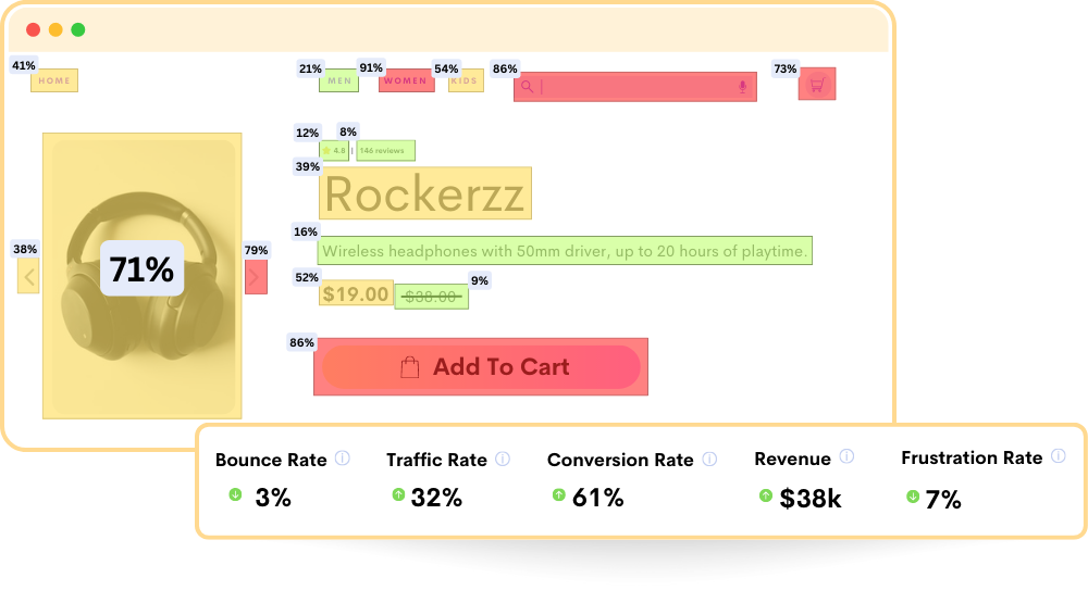
Imagine you are going inside a website and having irrelevant texts in paragraphs and paragraphs, with zero images, and you need to read the whole context in order to find the button or link where you can click and move to another page of the website, will you do it? you just exit the website within seconds creating a high bounce rate to that website.
That's where a well-designed homepage comes in. It should be easy to navigate, with a clear menu that guides visitors to different sections of your features, blogs, and products. Organizing your content, and buttons in a logical and user-friendly way.
-
Create a competitive advantage
In the vast marketing internet globe, standing out from the crowd is significant. A well-designed homepage can give you a competitive edge. Not every websites have an impressive homepage design.
But you can create and impress your vistors by creating a visually appealing and user-friendly design better than your competitors; you'll need to understand UX and UI design, a little more creativity, and a lot of inspiration for an impressive homepage design to stand out which we will be covering below.
-
Increase conversion optimization
The internet is the best place for anyone to generate revenue with ay kind of product or service, the bare minimum you need to reach your customers is a website.
Now coming to the point as you have a website as one o the main tool to impress your visitors and make them your product or service, all you need is to make it attractive to influence your vistors to turn into your buyers. Implementing some psychological triggers with your homepage design can definitely convert your users and increase the revenue of your business.
-
Make changes in search engine optimization (SEO)
To attract more organic traffic to your homepage, it's important to optimize your homepage for search engines. Choose relevant keywords for your headlines and content, and make sure your meta tags are optimized. By following SEO best practices, you'll improve your visibility in search engine results and attract more visitors to your website.
-
Create an impactful first impression
Your homepage is like the welcoming smile of your website. It's the first thing visitors see, and it has a big impact on how they perceive your brand. So, it's important to make it visually appealing and engaging. A well-designed homepage can catch people's attention, spark their curiosity, and make them want to explore more.
-
Develop a brand representation
Your website is a reflection of your business's unique personality and style. So, your homepage should showcase that. Choose colors, fonts, and images that align with your website's theme and vibe. Consistency is key here. Maintaining a consistent design throughout your homepage create a cohesive brand identity.
Essential Elements to Make Homepage Design Effective
Here are 9 essential elements and their best practices into your homepage design, can hlp you to create a visually appealing, user-friendly, and effective homepage that grabs attention, communicates your brand's message, and encourages visitors to take the desired actions.
#1 Logo
- Your logo is the visual representation of your brand, so it's essential to make it stand out on your homepage. Ensure that it is positioned prominently and is easily recognizable.
- Consider the sizing of your logo, making sure it is appropriately scaled for different devices and screen resolutions. You want it to be clearly visible and not too small or too large.
- Link your logo to the homepage itself. This is a common practice that allows users to easily navigate back to the main page no matter where they are on your website.
#2 Navigation Menu
- The navigation menu serves as a roadmap for users to explore your website. Use clear and friendly labels for your menu items, making it easy for visitors to understand what each section or page represents.
- Avoid overwhelming your visitors with an excessively long list of menu items. Keep it concise and organized by focusing on the most important sections of your site. You can use dropdown menus to include additional subcategories or options, keeping the main menu tidy and user-friendly.
- Ensure that your navigation menu is easily accessible and visible from any page on your website. Typically, it is placed at the top of the page or in a prominent location, making it easy for users to find and navigate through your site.
#3 Headline
- Your homepage headline is like a captivating book title that grabs visitors' attention and encourages them to explore further. Craft a concise and compelling headline that conveys the essence of your brand or the purpose of your website.
- Use persuasive and friendly language that resonates with your target audience. Consider the tone and style that best represents your brand's personality, whether it's casual, professional, or playful.
- Incorporate relevant keywords into your headline that align with your target audience's interests or the core focus of your website. This can help with search engine optimization (SEO) and attract the right visitors.
4. Image
- High-quality imagery enhances the visual appeal and engagement of your homepage. Choose images that are relevant to your brand and align with your target audience's preferences and interests.
- Optimize your images to ensure fast loading times without compromising quality. Large image file sizes can slow down your page, so use compression techniques or appropriate file formats to maintain a balance between quality and performance.
- Use visuals that tell a story or evoke emotions related to your brand. This could include product images, lifestyle photos, or illustrations that resonate with your visitors and help communicate your brand's message effectively.
5. Color Scheme
- The color scheme of your homepage should align with your brand identity and evoke the desired emotions in your visitors. Choose colors that reflect your brand's personality and create a visual connection with your target audience.
- Consistency is key. Use your chosen color palette consistently throughout your homepage to create a harmonious and visually pleasing experience. This applies to elements such as buttons, text, backgrounds, and borders.
- Keep in mind that colors have psychological associations, so select them thoughtfully. For example, warm colors like red or orange can convey energy or passion, while cool colors like blue or green can evoke a sense of calm or trustworthiness.
6. Typography
- Typography plays a vital role in readability and aesthetics. Choose fonts that are easy to read and align with your brand's style and personality. Consider using a combination of fonts for headlines, subheadings, and body text to create visual contrast.
- Maintain consistency in font styles, sizes, and spacing to establish a coherent visual hierarchy. Consistent typography helps guide users' attention and makes your content more scannable and accessible.
- Utilize typography creatively to emphasize important elements or create visual interest. For instance, you can use larger font sizes for headlines or apply different font weights or styles to highlight specific information.
7. Content Sections
- Organize your homepage content into sections with clear headings and subheadings. This improves overall readability and makes it easier for visitors to navigate through your content.
- Use bullet points, short paragraphs, and concise sentences to present your information in a digestible format. Avoid long blocks of text that can overwhelm readers.
- Highlight key information or benefits that you want visitors to notice. This could include showcasing your unique selling points, special offers, or the latest updates.
- Incorporate white space strategically. White space, or negative space, refers to the empty areas around your content. It helps create visual balance, improves readability, and gives your homepage a clean and uncluttered look.
8. Call-to-Action (CTA) Buttons
- CTAs are essential for guiding visitors toward the actions you want them to take, whether it's signing up for a newsletter, making a purchase, or contacting you. Use persuasive and friendly language that encourages visitors to click.
- Make your CTA buttons visually distinct from other elements on the page. Use contrasting colors, appropriate sizing, and clear text to ensure they stand out and are easy to locate.
- Position your CTAs strategically throughout your homepage. Consider placing them near relevant information or at the end of content sections to capture visitors' attention when they are most engaged.
- Ensure your CTA buttons are easy to click or tap, and provide clear hover or touch feedback to give users a sense of interactivity.
9. Social Proof and Testimonials
- Including social proof elements on your homepage helps build trust and credibility. Display customer testimonials, reviews, or success stories that highlight the positive experiences of your past customers.
- Ensure your testimonials are authentic, attributed to real customers, and include relevant details such as names, locations, or specific achievements.
- Social proof can be presented through text, images, or even video testimonials. Choose the format that best suits your brand and provides the most compelling impact.
Best Homepage Design Examples
Here are the top 6 best homepage design examples that demonstrate the power of a well-designed homepage in capturing attention, delivering a memorable user experience, and achieving specific business goals.
#1 Fable
Fable is a motion design tool that allows users to make powerful motion workflows to the cloud with easy design.
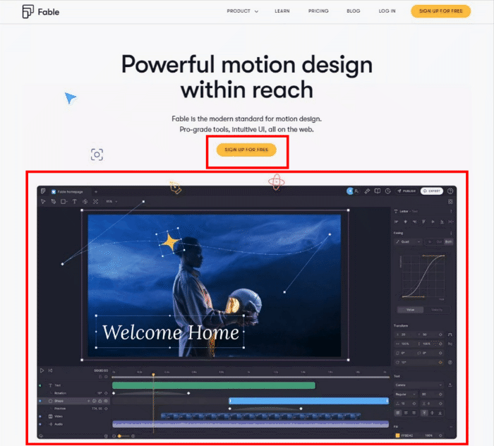
Liked Homepage Design Features:
- Minimal Color Scheme: Apart from the GIF Fable used, there are only 2 colors, one is darker shades and yellow, even inside the whole homepage design, they have used only 3 colors overall as a major palate.
- The Gif as Image: More than explaining what are the features and elements options they have in the user interface in the homepage design, they have used GIF to explain what the features do and what it gives the user to get more interested in how it functions.
- Button Option: Fable has provided only one single button to get started with, that too is "Sign up for Free" in the homepage design, this lets users give it a try other than trying out other options like "Check Price," which can let users bounce back from giving a try to the product.
- Simple Content Layout: They have used the best content layout for the homepage design with a lesser but informative content layout that is aligned accounting to the use case. This lets users understand the real use of the whole tool.
#2 Ready
Ready is a calendar application to create workspace scheduling, planning, and organizing for teams meetings better.
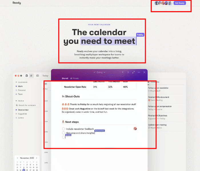
Liked Homepage Design Features:
- Muted Color Scheme: The whole homepage design looks more muted to make the users concentrate on highlighted and color-changed parts, which can improve user engagement higher.
- The Gif as Image: Instead of simply describing the available features and elements in the user interface of the homepage design. GIFs visually demonstrate how these features enhances user engagement and generate curiosity by showcasing the functionality.
- Too Much Minimal: What makes Ready's homepage design more interesting is this navigation bar, which they dont have. They have abstractedly removed the navigation bar and have creatively insisted on a "Get Ready" button.
ClearBit
Clearbit is a database website providing the most up-to-date data on integrations and business intelligence APIs.
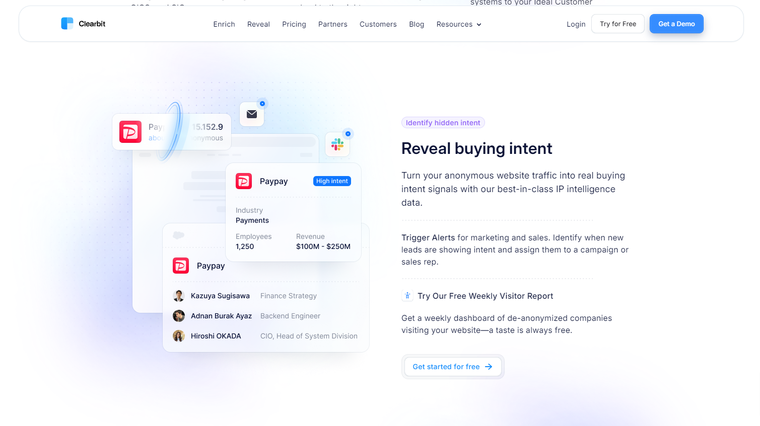
Liked Homepage Design Features:
- Gradient Background: The homepage design looks more like a glass background with a purple shade, making it more techy and stylish.
- Informative Content: The website copy of the Clearbit Homepage design is too descriptive and gives an elaborated idea of the company.
- Clear Navigation: The navigation bar is visible and clear for any user who likes to explore more into the experience, making the customer journey easier and unavoidable.
#3 Boards.Boldare
Boards.Boldare is an online collaboration tool for remote workers that provides a simple board where you can note things and stick some virtual sticky notes.
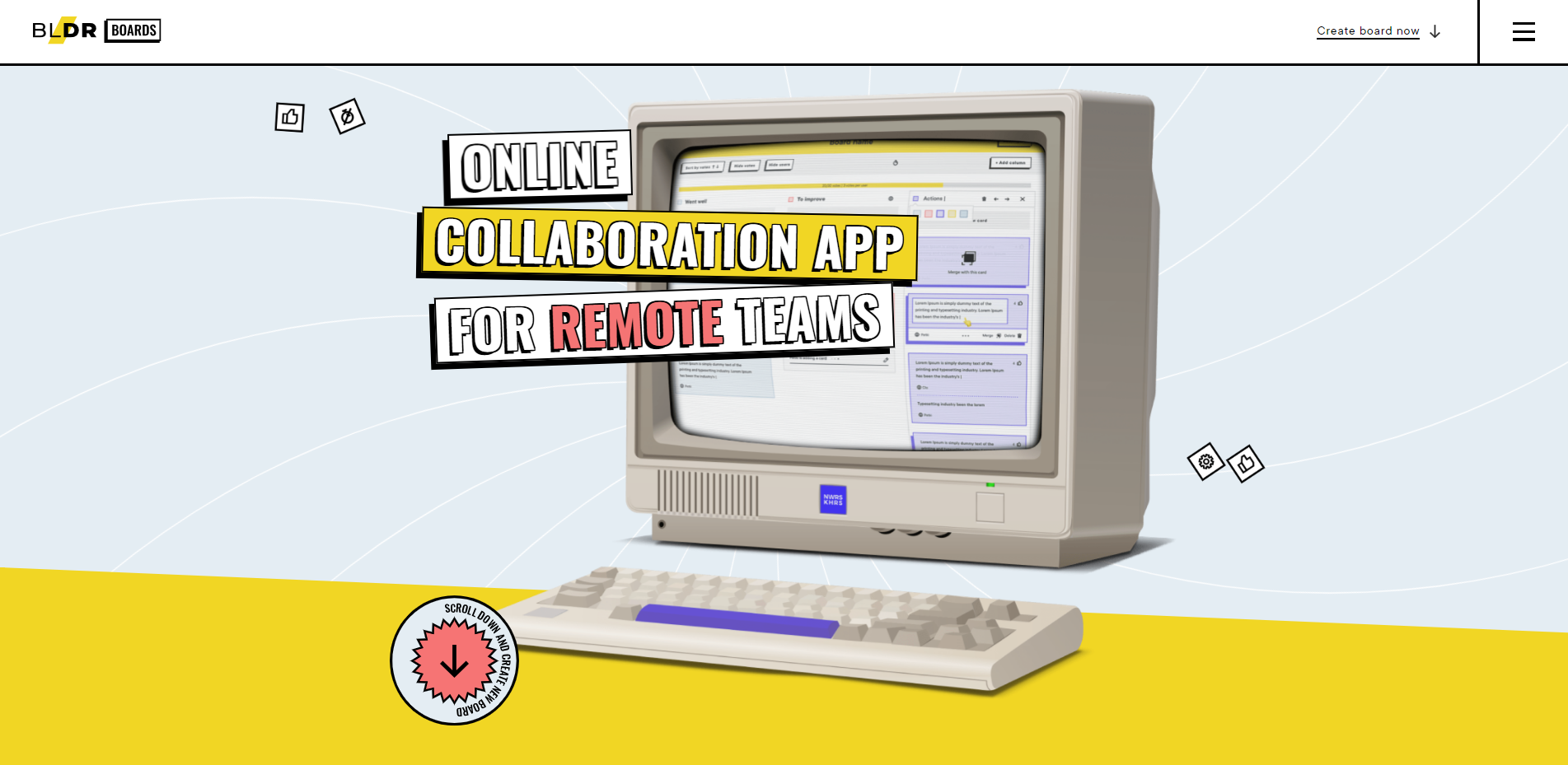
Liked Homepage Design Features:
- Vibrant Color Selection: The homepage design looks more like a funny and childish interface for anyone who can relax and engage. it doesn't have any professional white background to be more inflexible.
- Simple Navigation: The website has no other inner web pages to explore, but you can scroll through to understand the product.
- Retro UI: The UI looks more excited with the look, as it has retro-styled elements, images like the old-style computer, old styled cursor with thick black outlines.
It is always better to stick with one single style that needs to stick with color, elements, text font, images, and more.
#4 Winden
Winden is a financial banking tool's website that offers business checking, best-in-class rewards, invoicing, virtual cards, and more to run a business.
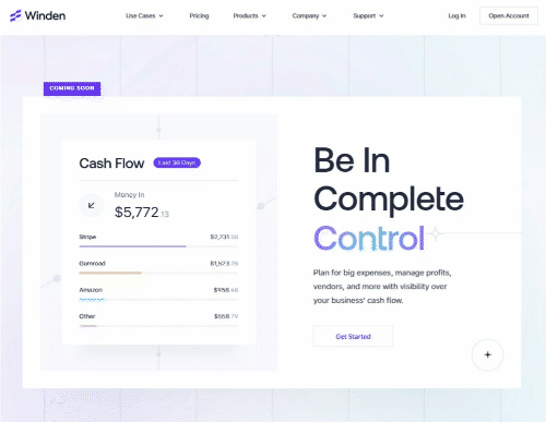
Liked Homepage Design Features:
- Gradient Background & Texts: The whole homepage design looks more like a glass background with a light purple and blue shade, making it more techy and stylish.
- Images as GIF: The movement of the UI turning from one analytics to another gives an explanatory visual to the homepage design.
- Used Memoji: As characters in the homepage design, they have used memoji, which gives it the look of a trusted product.
#5 Shopify
Shopify is an e-commerce website builder tool that offers users templates of websites that users can customize and doesn't have to rely on developers to develop a website.
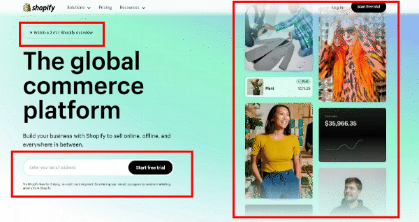
Liked Homepage Design Features:
- Video Context: In this homepage design, Shopify has provided a video demo for anyone to just check how the actual product work, this helps users to engage and understand the product.
- Input for Sign-up: Instead of any "sign-up" button or "buy now," Shopify has gone further with a straightaway give-a-try option with the "enter your email address" input box.
- Running Metrics: The running metrics on the homepage make users curious that Shopify's customers generate high revenue with the help of the product.
#6 Vectornator
Vectornator is a design tool that provides the best experience in creating complex and detailed paths with the next-generation pen tool.
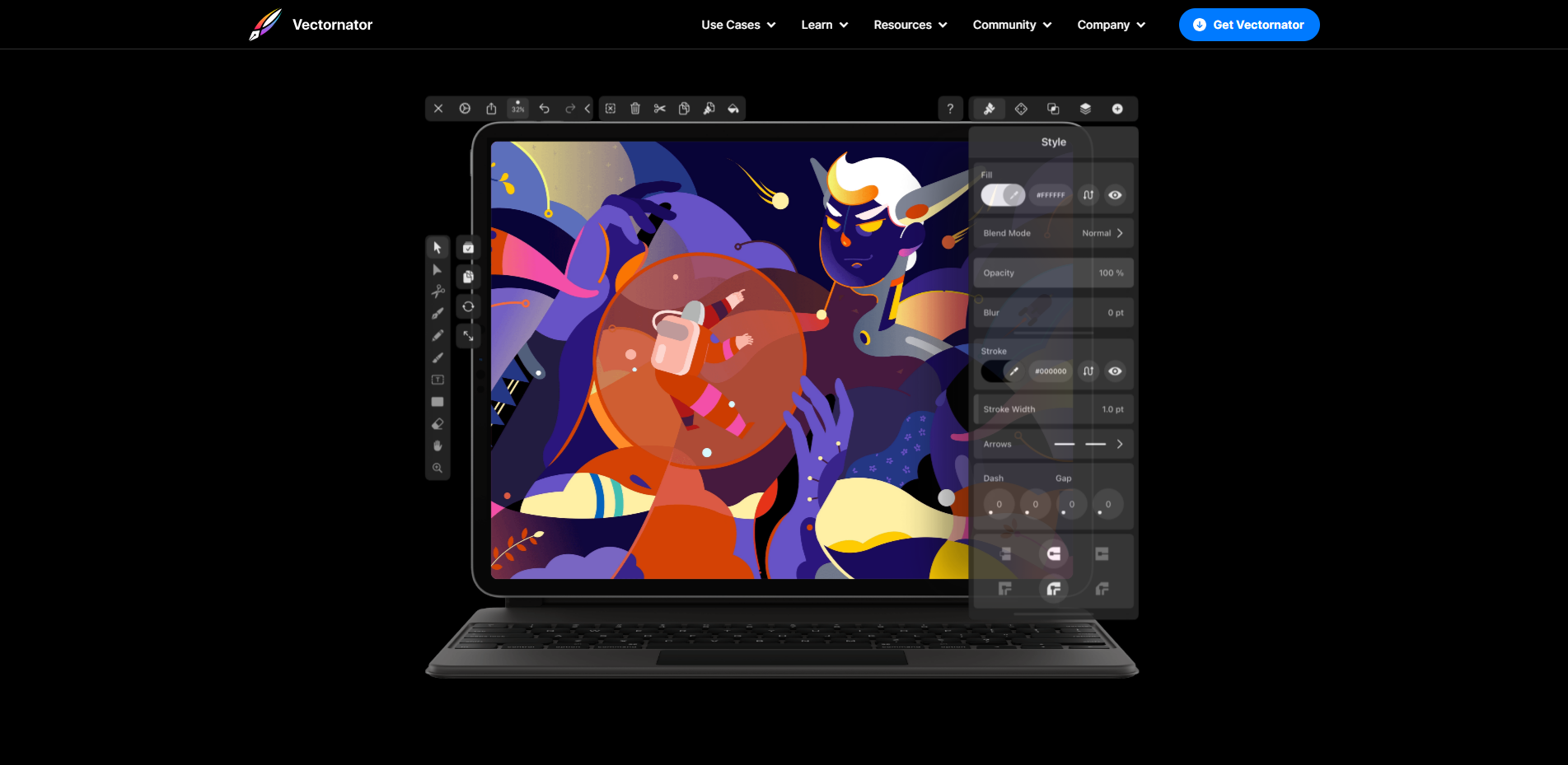
Liked Homepage Design Features:
- Flexing with Images: In Vectornator's homepage design, they have used image elements for their benefit to show off all their tool's maximum effect.
- Dark Background with Gradient: Dark background in the homepage design is a bold step to attract visitors as it is a drawback with older groups of people. But it has the benefit of attracting more younger people. Gradients in the background give the homepage design a space or galactic effect.
- Scrolling Effects: Scrolling the homepage design does not just move downwards like other websites but gives a visual like you are zooming into the UI.
Conclusion:
Creating an awesome homepage design is all about following the best practices and finding inspiration from the best examples.
With some creativity and design know-how, you can craft a homepage design that captures attention, tells your brand's story, and guides visitors to explore more.
Don't hesitate to look at the source link below to explore the whole homepage design.
Take inspiration from the pros who prioritize clean and clutter-free layouts, using stunning visuals to bring their brand to life. And don't forget about making navigation a breeze with menus that are clear and easy to follow.
ReplayBird - Dive Deeper into the UI Insights and Designs
ReplayBird is a digital experience analytics platform that offers comprehensive real-time insights beyond traditional web analytics's limitations with features such as customer journey analytics, session replay, error tracking, interaction & heatmaps, funnel, form, and path analysis.
With Replaybird, you can capture a complete picture of user behavior, understand their pain points, and improve the overall end-user experience. Interaction and heatmaps are our prominent features, comprehensively understanding the user's engagement and interactions.
The session replay feature allows you to watch user sessions in real-time, so you can understand their actions, identify issues and quickly take corrective actions. Error analysis feature helps you identify and resolve javascript errors as they occur, minimizing the negative impact on user experience.
With the customer journey analytics feature, you can get deeper insights into how users interact, explore your product, and identify improvement opportunities. Drive understanding, action, and trust, leading to improved customer experiences and driving business revenue growth.
Try ReplayBird 14-days free trial
Keep Reading about Website Designing:
 Uma
Uma Velantina
 Velantina