User Flow in UX Design - Have you ever wondered how your journey through an app or website feels so seamless and intuitive? Imagine using your favorite music streaming app—every step from opening the app to playing your favorite song is carefully crafted to make your experience enjoyable and hassle-free.
In this blog, we'll explore everything behind user flow by diving into real-life examples, like navigating through a website or an app, to understand how designers create pathways that guide users smoothly through digital interfaces.
- What is a User Flow?
- Types of User Flows
- Key Components of a User Flow
- What Makes a Good User Flow?
- Examples of User Flows for Different UX Designs
- How to Create a User Flow for Your UX Design?
It's all about mapping out every step users take, from the start to the finish line, making sure the whole experience is easy, enjoyable, and just right for what users want to achieve.
What is a User Flow?
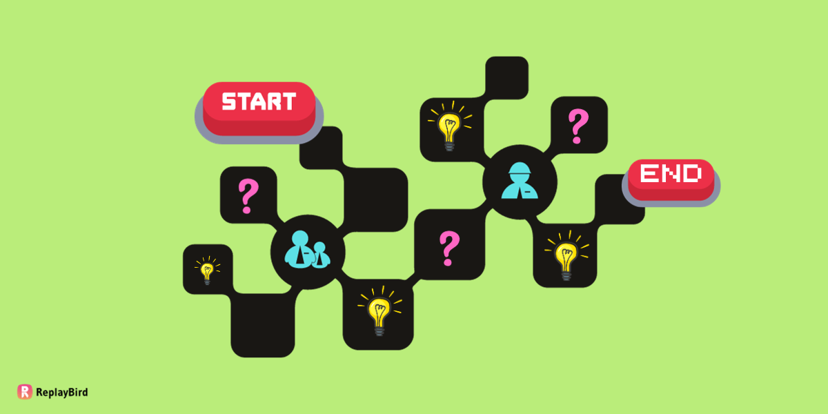
A user flow is a visual representation of the journey a user takes while interacting with a product, typically a website or an app. User Low gives an idea of all the options, paths, and steps a user might take to complete a specific task or goal within the system.
User flows in user experience (UX) design are like an important part of each other as they help product or website designers understand user behavior leading to a conversional or goal-achieving customer journey for efficiency and satisfaction.
Imagine starting at a point, like opening a website, and then following a bunch of paths—clicking buttons, filling out forms, or choosing options—until you get where you want, like completing a purchase or sending a message.
By mapping out these pathways, designers can make things easier for you! They figure out what might be confusing or tricky along the way and try to make it smoother. It's like they're drawing a treasure map so that using websites or apps feels super easy and fun for everyone.
Importance of User Flow in UX Design
User flows act as a visual communication tool that helps teams, including designers, developers, and stakeholders, align on the user journey.
- Improves User Experience: User flows are like the pivot for making apps and websites super easy to use. They help designers spot where things might get tricky and finding difficult to use. By fixing those spots, they make sure your experience is smooth and straightforward, making everything easier to navigate through websites.
- Making Usability and Navigation Easier: Mapping out user flows allows designers to create clear paths so you can easily find what you're looking for. By anticipating user actions and decision points, designers can arrange the user interface elements in a logical sequence, cutting out confusion and saving you time searching around.
- Spotting Pain Points: User flows help designers spot places where you might get stuck or confused. By identifying these spots, refining the interface, making sure you don't hit roadblocks and ensuring a frustration-free journey.
- Leading Users to Convert: For websites with conversion tasks like signing up, purchasing, or form completion, designers need to understand the user flow that leads to the conversion rather than letting users become distracted and forgetting the conversion process. Designers remove unnecessary steps, simplify forms, and improve call-to-action placements; they increase the chances you'll finish what you started hassle-free.
- Consistency Across Platforms: Whether you're using a phone or a computer, user flows help keep everything looking and working similarly. That way, no matter what gadget you're on—a mobile phone, tablet, or desktop—the experience feels smooth and familiar.
Types of User Flows
User flows are essential tools in UX design, guiding designers in understanding and optimizing user experiences. There are several types of user flows that cater to various stages and aspects of the user journey:
- Linear User Flows
- Non-linear or Branching User Flows
- Task Flows
- Site Flows
- Wireframe Flows
- Mobile/Desktop Flows
Knowing about these different types of user flows helps designers make things better in a friendly way!
1. Linear User Flows
Linear user flows are like a helpful roadmap outlining a user's journey through a task or process step by step, making it easy to follow along without any confusing twists or turns. They're straightforward and show a clear path from where you start to where you want to go without giving you too many choices along the way.
Imagine signing up for something online. A linear user flow would show you each step needed to create your account—starting with entering your basic details, then verifying your information, and finally reaching the confirmation page. Similarly, when you're checking out items online, it lays out the simple steps of adding things to your cart, entering your payment details, and completing the purchase.
Designers use linear flows because they're great at simplifying things and showing the exact sequence of actions required for a task. They make it easy for users to understand what to do next without getting caught up in complicated decision-making moments.
2. Non-linear or Branching User Flows
Non-linear or branching user flows are different from the linear-model because they offer users a bunch of options and different pathways based on what they decide. These flowcharts show lots of different routes or branches users can take, kind of like when you come to a fork in the road and get to pick which way to go.
For example, you're using an app that offers different subscription plans. A branching user flow would show how picking a plan—whether it's basic, standard, or premium—leads to different steps and features based on what you chose. Or, picture customizing a product online, where you can choose the color, size, or extra features. The flow would then show how each choice you make leads to different next steps.
Designers love using branching flows because they're perfect for showing complicated situations where your decisions matter. They let you explore and pick different options while understanding what happens next with each choice you make. This makes your experience feel more personal and special because it's all about what real users prefer.
3. Task Flows
Task flows act like detailed roadmaps that show every step a user takes to accomplish something specific in an app or service. These flows focus on a specific user goal, systematically mapping out the complete user journey from the initial action to finish.
Imagine booking a flight online. A task flow for this would cover everything—from entering your travel info and choosing dates to browsing flights, picking one, entering passenger details, paying, and finally getting your booking confirmed.
Designers use task flows to get a clear picture of what users do at each stage, showing where choices happen and what information is needed.
4. Site Flows
Site flows, also known as sitemap flows, are like getting a big-picture view of how a website or app is set up. They showcase how different elements relate to each other and how users can navigate through the entire digital environment.
Think of it as a blueprint that lays out how different pages link up, letting users move around smoothly from one area to another. These flows highlight the links, categories, and paths users can follow, giving a complete overview of how everything is structured.
Designers use site flows to make sure the navigation makes sense and is easy to follow. They use them to check and improve the structure, find any parts that might be repeated or missing, and make sure the whole browsing experience feels logical and friendly for users.
5. Wireframe Flows
Wireframe flows are like bringing together the draft outline of how pages or screens look (wireframes) with the paths users take as they move around (user flows). It's a way to get a full picture by combining both the design structure and the journey users will have within an interface.
When designers merge wireframes and user flows, they're not just showing how pages or screens will look but also how users will actually use them. These special diagrams help everyone see the big picture of how everything fits together—the way users move around, where things are placed, and the order of actions they might take on the interface.
Using wireframe flows helps everyone understand how users will go through the interface. It gives a visual of both the layout and how it all works, making it easier for designers and others involved to understand the complete customer experience and make smart choices about how the interface should look and work better.
6. Mobile/Desktop Flows
Mobile and desktop flows zoom in on the special experiences users have on either mobile or desktop screens. These flow charts is all about how users behave and move around when they're using apps or websites on different devices and screen sizes.
Mobile flows show things like swiping, tapping, and designs that work well on smaller screens, making it super easy to use with your fingers. On the flip side, desktop flows focus on using a mouse, having more space on the screen, and different ways of getting around that work better with a keyboard and cursor.
When designers concentrate on these mobile and desktop flows separately, they're able to make interfaces that suit each device perfectly. Understanding these differences helps create interfaces that feel smooth and perfect, whether you're using them on a smartphone, tablet, laptop, or desktop computer.
Key Components of a User Flow
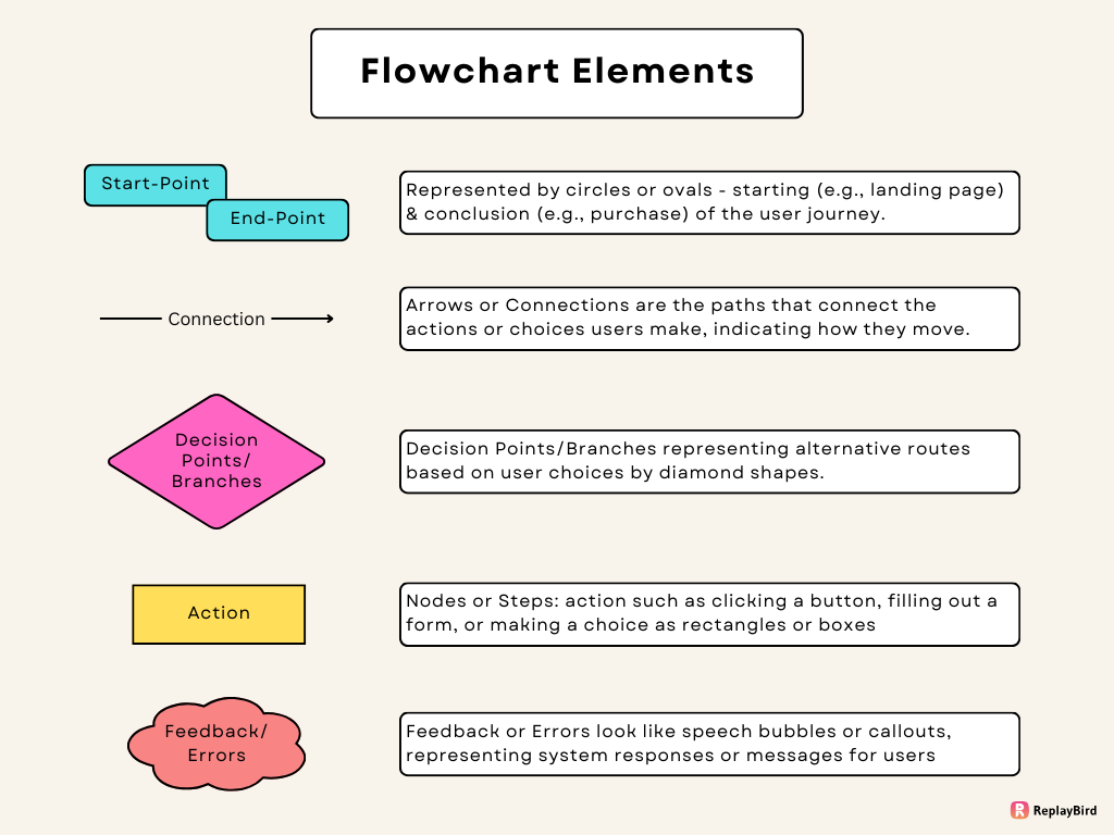
Key components of a user flow typically include the following elements, often represented in a diagrammatic form:
- Starting Point and Endpoint: The user flow diagram begins at a starting point, such as a landing page or entry screen, and ends at the endpoint, representing the completion of the user's task or goal within the system. Represented by circles or ovals, denoting the beginning (e.g., landing page) and conclusion (e.g., task completion) of the user journey.
- Nodes or Steps: These are the different things the user does along the way. Each step represents an action or decision, such as clicking a button, filling out a form, or making a choice. Picture them as rectangles or boxes showing the stages or actions the user takes.
- Arrows or Connections: These show the order of steps, guiding the user from one stage to the next. They're like paths that connect the actions or choices users make, indicating how they move through the process
- Decision Points/Branches: At these points, users decide what to do next, leading to different paths in the flow. They're like moments where the road splits, showing alternative routes based on user choices. They're usually represented by diamond shapes.
- Feedback or Errors: Sometimes, user flows include messages or notifications that pop up during the process. These could be analysing error messages, confirmations, or other feedback to guide users. They might look like speech bubbles or callouts, representing system responses or messages for users along the way.
What Makes a Good User Flow?
A good user flow is like a well-planned journey that feels natural and straightforward rather than giving restricted options, making it obvious that it is goal-framed. It's about making things easy for users while they're navigating through a website or an app.
Imagine it as a clear route with signposts that guide you exactly where you need to go without any confusion. It's not just about simplicity; it's also about understanding how people naturally interact with the system.
A good flow doesn't waste your time—it helps you achieve what you want to do with minimal effort. It's like a good conversation that adapts to your needs, offering a smooth experience that feels consistent and intuitive across different devices.
Ultimately, a great user flow is all about putting the user at the center, making their journey hassle-free and enjoyable, while also being open to improvements based on user feedback for ongoing improvement.
Elements that Contribute to a Positive User Experience
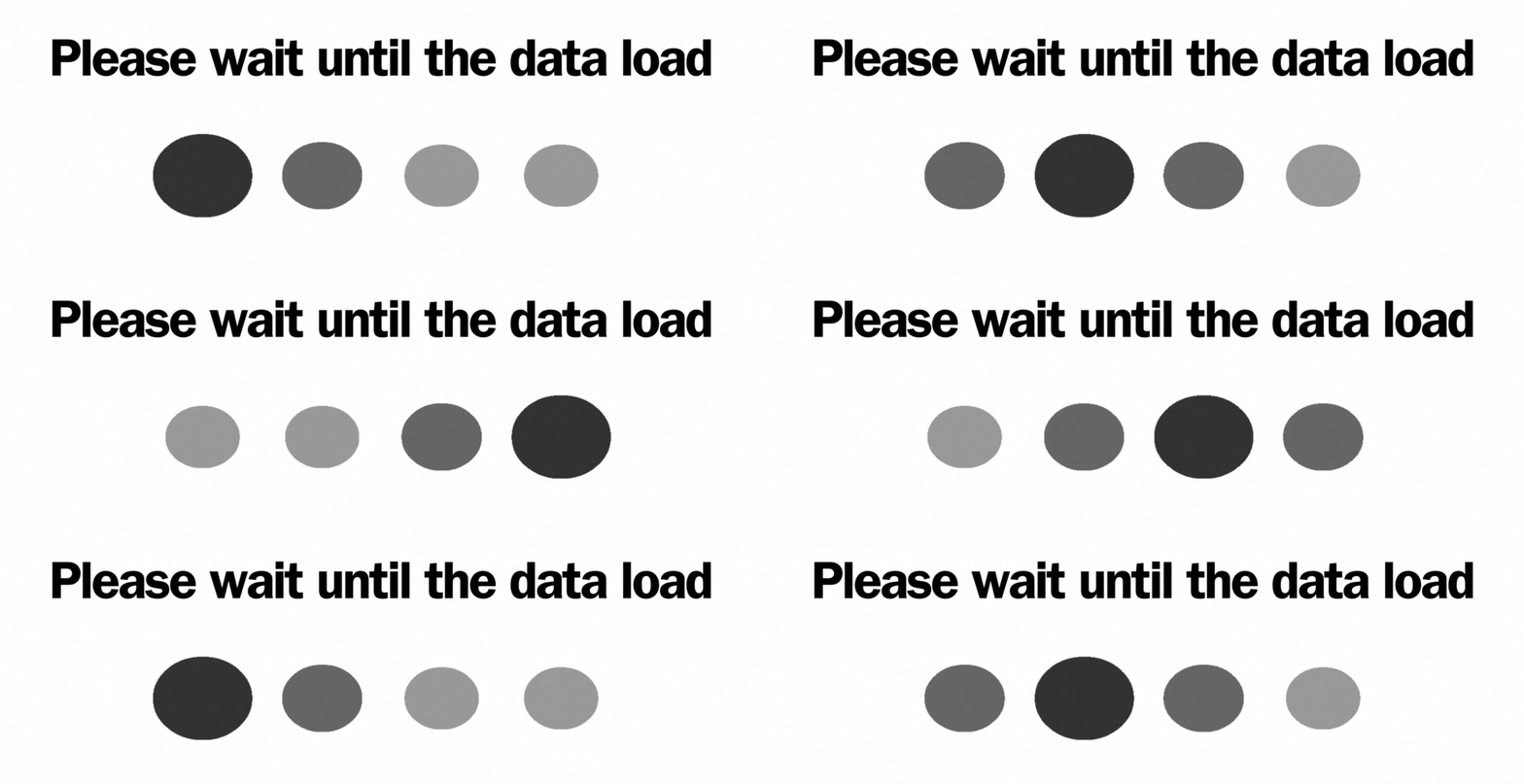
a) Progress Indicators: Visual cues such as progress bars or spinners indicate the status of ongoing processes, keeping users informed and reducing doubts.
b) Microinteractions: Small animations or interactive elements (like heart icons changing color when clicked) add can improve user engagement.

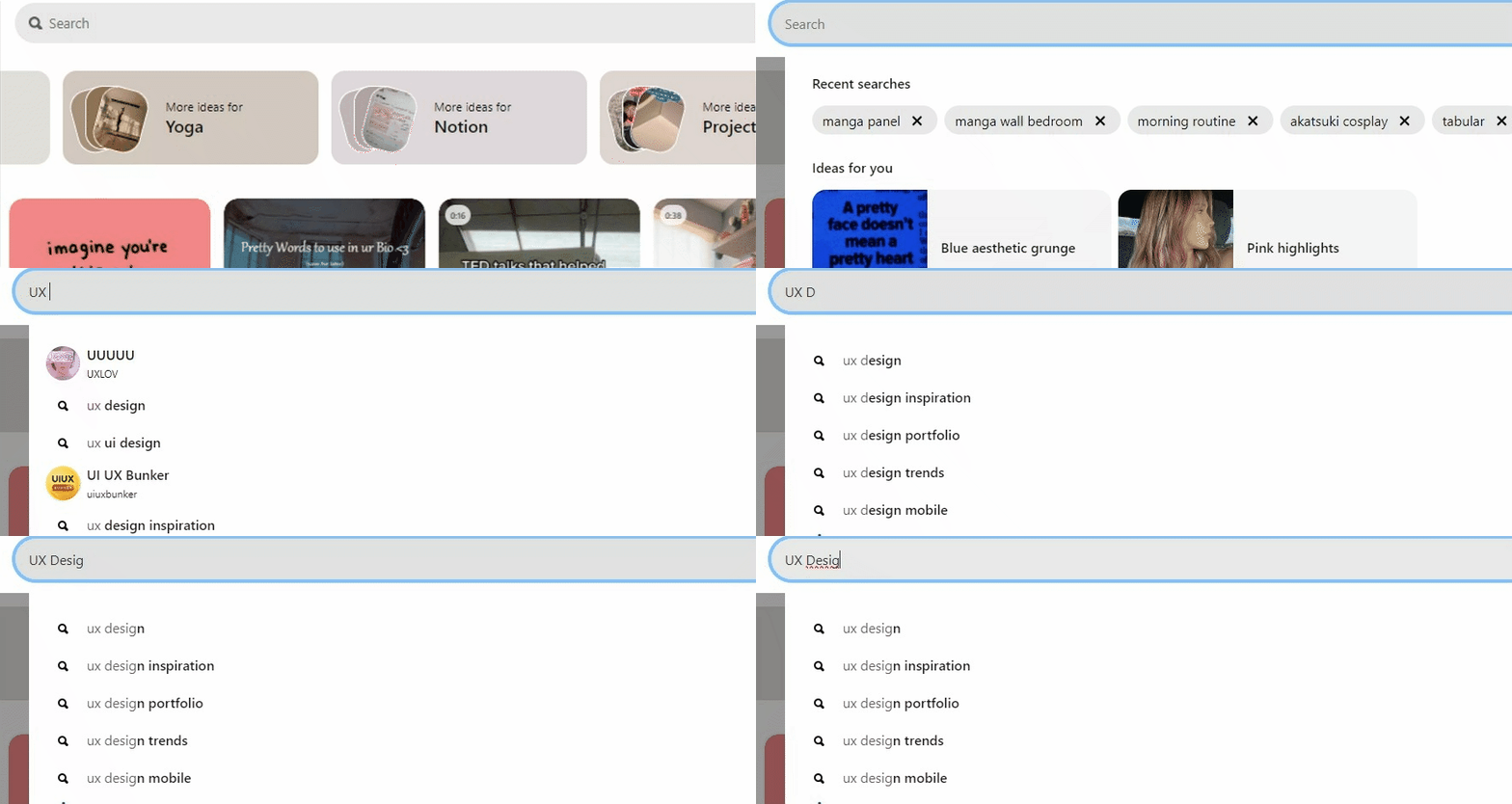
c) Search Functionality: A well-designed search bar with predictive text or filtering options let users in finding specific content quickly, improving usability.
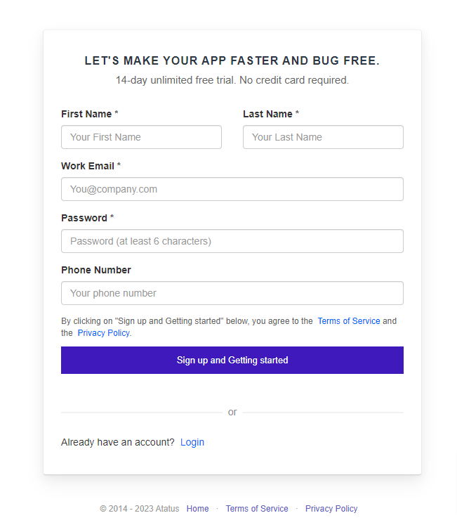
d) Form Design: Clear labels, input validation cues, and error messages within forms ensure a smooth data entry process and minimize user errors.
e) Personalization and Customization: Providing options for users to personalize their experience, such as themes, language preferences, or saved settings.
f) Whitespace and Layout: Thoughtful use of whitespace and a well-organized layout improves readability, reduces cognitive load, and creates a visually appealing interface. Rather than giving a bad UX design inbetween of the user flow.

g) Hover Effects: Subtle hover effects, like color changes or shadows, give users immediate visual feedback and encourage interaction with elements or your 3d buttons.
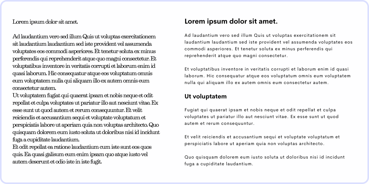
f) Readable Content: Legible fonts, appropriate text sizes, and proper spacing improve readability, making content easier to consume.
h) Clear Call-to-Actions (CTAs): Prominent and descriptive CTAs encourage users to take desired actions, guiding them through the interface.

i) Loading Time Optimization: Swift loading times prevent user frustration, ensuring a smooth and seamless interaction with speed analysis.
Tools to Build a Good User Flow
UX tools give designers detailed insights into how users behave and feel while using a website or app. They spot areas where users might get stuck or confused.
With these insights, designers can make informed changes and improvements to make the user journey smoother and easier.
Session Replay
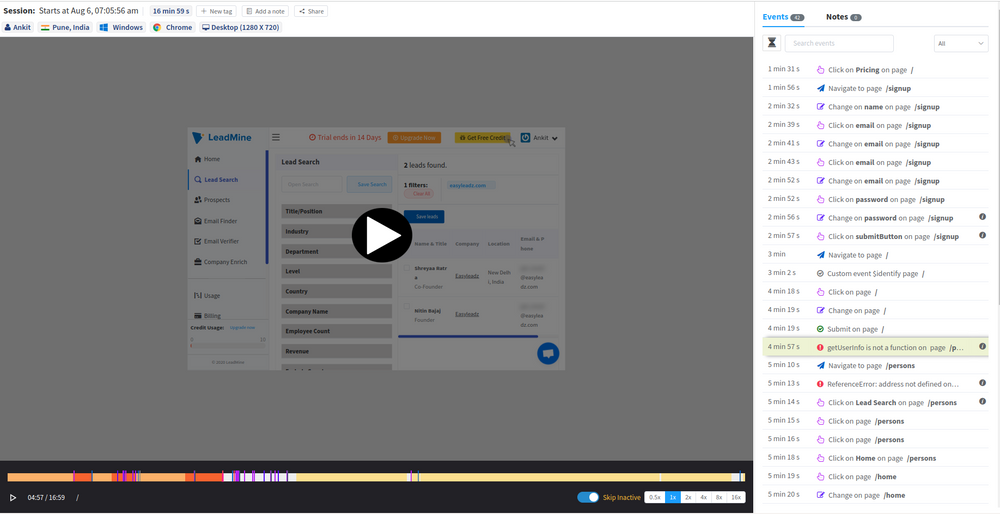
- Visual Insight: Session replay record and playback user interactions on a website or application, offering a visual representation of how users navigate and engage with the interface.
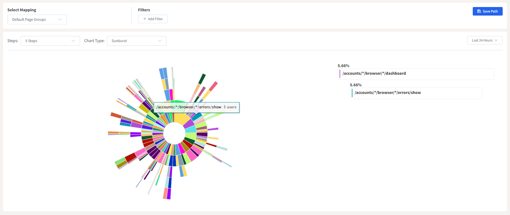
- Understanding User Behavior: By observing actual user sessions, designers gain deep insights into real-time user behavior, identifying pain points, hurdles, and areas of confusion within the flow.
- Identifying Patterns and Issues: Analyzing multiple sessions helps in recognizing common patterns, areas of drop-off, or instances where users struggle, allowing designers to pinpoint specific areas needing improvement.
- Validation and Iteration: Session replay validates hypotheses about user behavior and serves as a basis for iterative improvements, ensuring that changes made in the user flow are validated by real user interactions.
Customer Journey Analysis:
- Holistic View: Customer journey analysis tracks a user's interactions across multiple touchpoints, providing a holistic view of the user's entire experience.
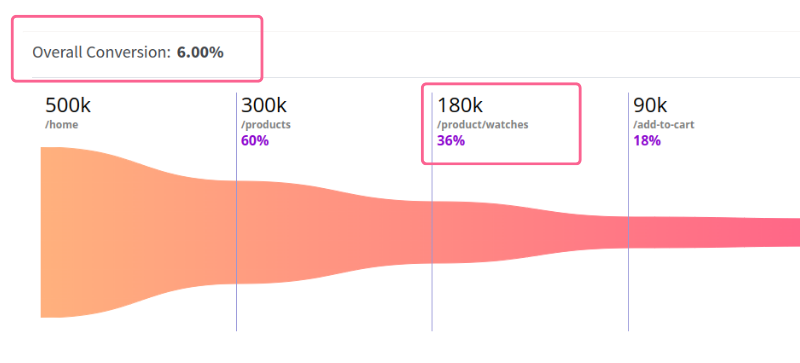
- Identifying Touchpoints: It helps in identifying touchpoints where users might switch channels or encounter friction, aiding in understanding the overall flow.
- Mapping Pain Points: Analyzing the journey highlights pain points or areas where users might face difficulties, enabling designers to streamline and optimize these segments.
- Improving Flow Continuity: Understanding the end-to-end journey assists in creating a seamless flow by connecting different stages cohesively, ensuring a continuous and pleasant user experience.
- Personalization Opportunities: Insights from the customer journey analysis can be used to personalize user experiences, tailoring the flow to individual user needs and preferences.

Examples of User Flows for Different UX Designs
User flows can vary based on the specific UX design to UX designers and the goals of the product or service. Here are a few examples of user flows for different UX designs:
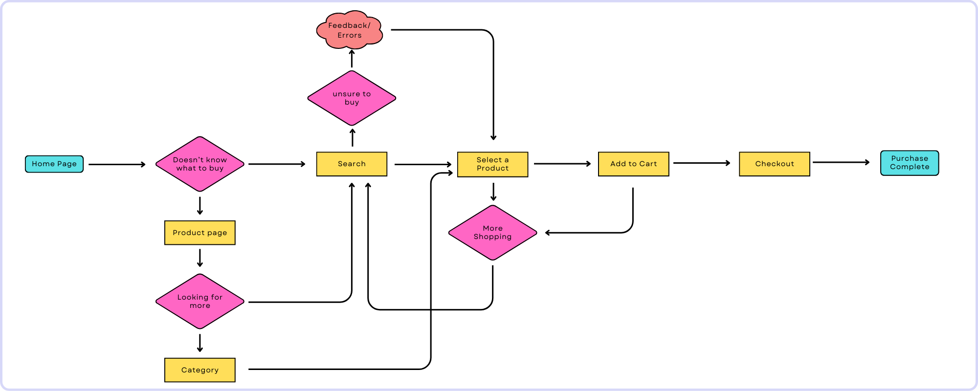
1. E-commerce Purchase Flow
A user navigates through product browsing, adds items to the cart, proceeds to checkout, enters shipping/payment details, and completes the purchase. Variations might include options for guest checkout, applying discount codes, or choosing shipping methods.
2. Signup/User Registration Flow
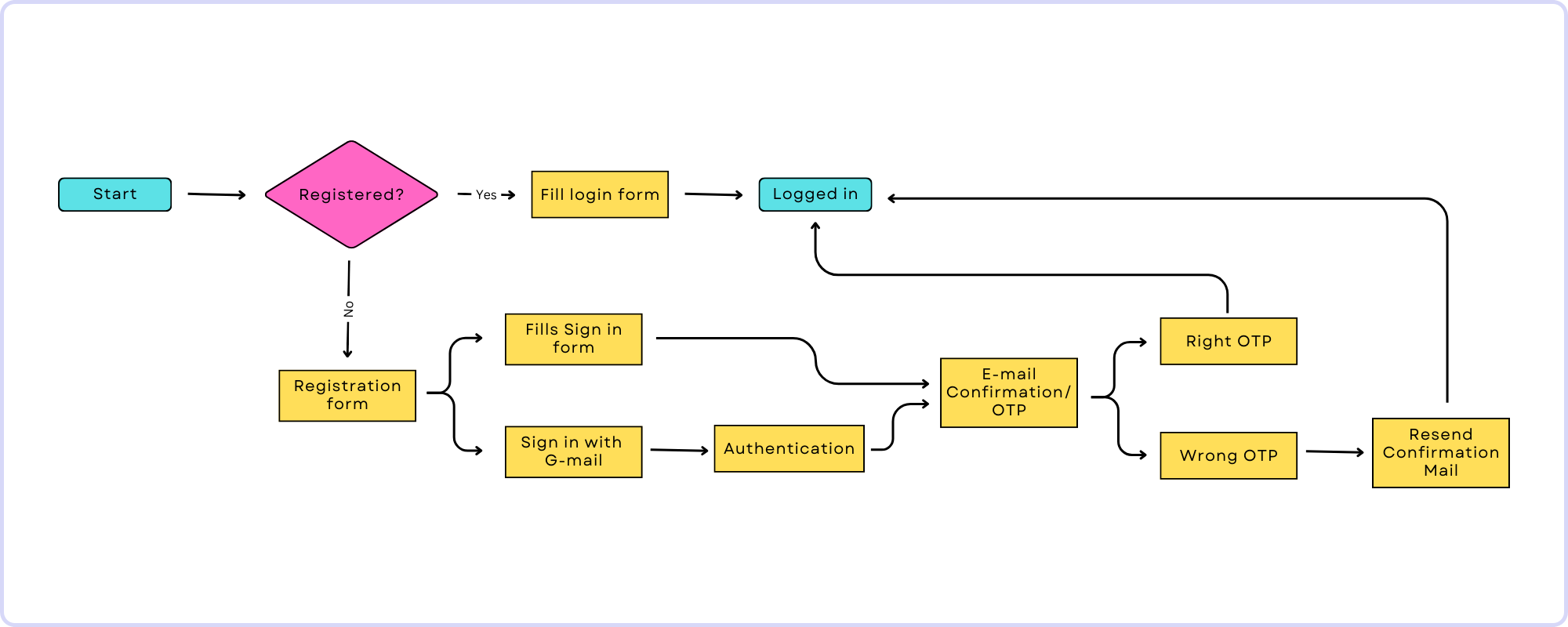
The flow includes steps such as entering personal details, verifying email/phone number, setting up a password, and completing the registration process. It may also involve optional steps like profile customization or subscription preferences.
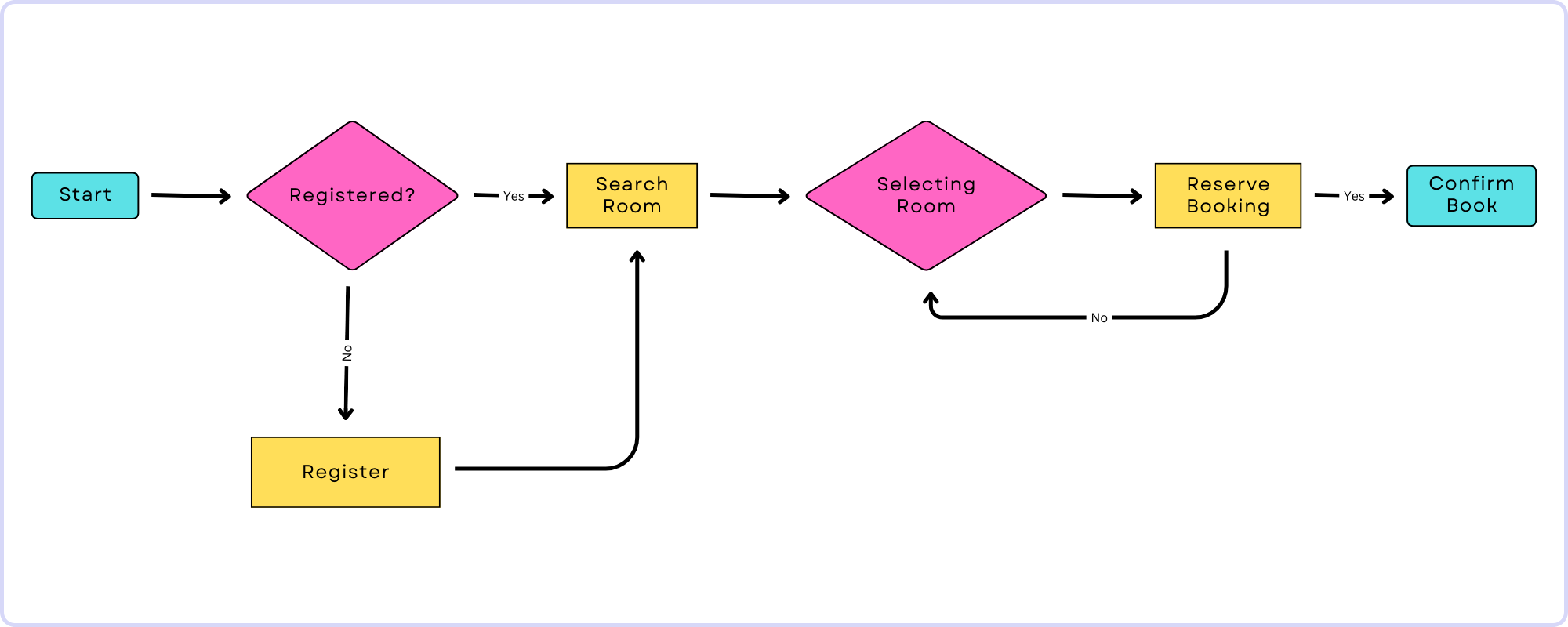
3. Booking/Reservation Flow
Users search for available dates or services, select options, enter booking details, review, confirm, and receive booking confirmation. This could apply to hotel reservations, restaurant bookings, or scheduling appointments.
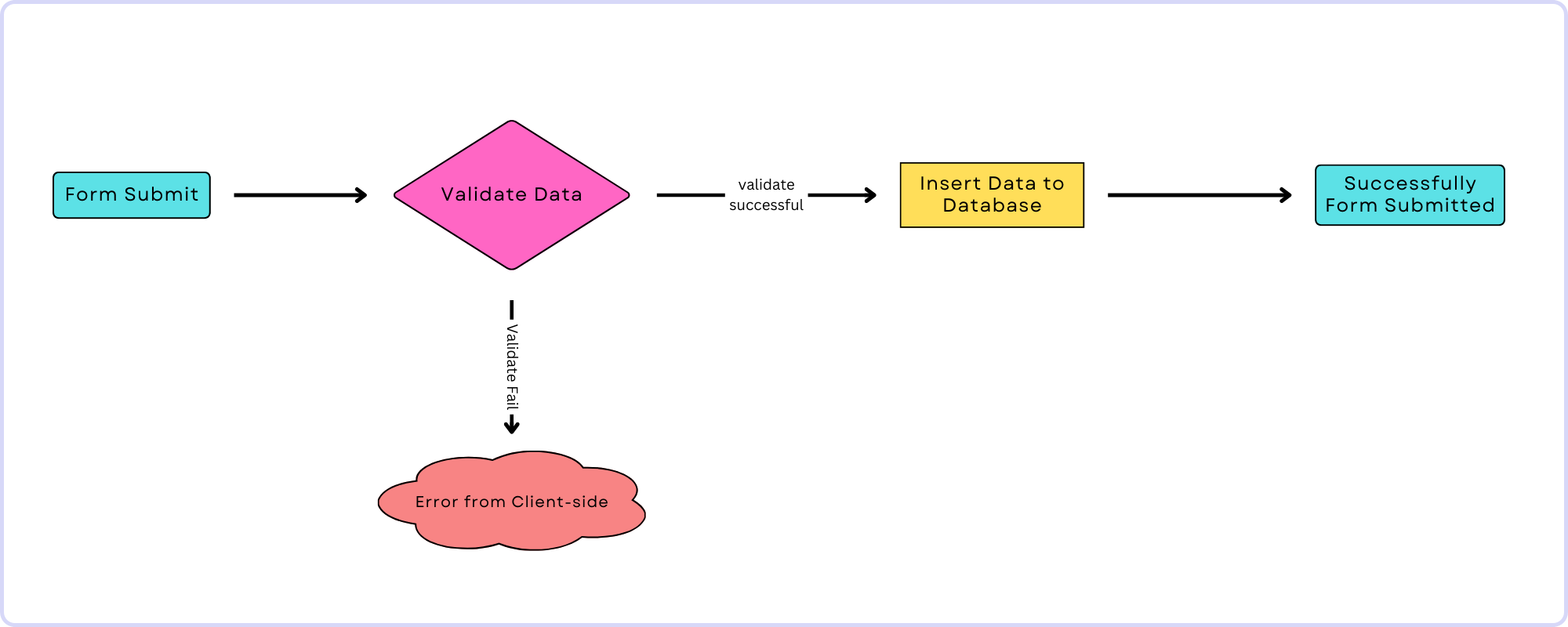
4. Task-oriented Flows
Specific task flows cater to user actions such as changing account settings, password reset, submitting forms, or upgrading subscriptions. These flows guide users through completing these tasks efficiently.
How to Create a User Flow for Your UX Design?
Creating a basic user flow for a UX design involves several steps to map out the user's journey. Here's a simplified guide in 5 steps:
- Understand What Users Want: First off, get to know what users really want to do. Figure out their main goals when they use your product or service. Think about different things they might want to do, like signing up, checkout purchasing, or just checking out your content.
- Break It Down: Now, let's break those goals into smaller, possible steps. For example, if they're signing up, what exactly do they need to do? Things like entering info, confirming an email, and setting up a profile might be the steps.
- Picture It: Time to draw it out! Make a visual representation of how users will move through these steps. Start from the beginning (like your homepage) and draw lines connecting each step, showing how users will get from one to the next. You can use shapes or symbols to show different stages or actions like explained above.
- Choices, Choices: Think about where users might have options. You know, those moments where they get to pick a path. Maybe in an online shop, they choose between different types of products. Make sure to show these choices in your drawing, so it's clear users have different ways they can go.
Conclusion:
Let's summarize the best practices to craft a user flow in UX design to end this blog. It involves understanding users via thorough research and persona creation sets the foundation.
Clear objectives help map the user journey, emphasizing simplicity and intuitive navigation. Consistency in design language and familiar patterns aids user understanding. Seeking iterative feedback and conducting tests refine the flow. Preparing for edge cases and error handling ensures resilience..
Collaboration and documentation foster shared understanding among team members. Flexibility for improvements based on evolving needs and technology is key. These practices collectively make sure an effective user flow that serve to user needs while delivering a satisfying experience.
Understand Exactly How Your Users Flow in Your website or app
ReplayBird, a digital user experience analytics platform designed specifically for Next.js developers with advanced insights to optimize your applications like a pro!
Unleash the power of behavioral insights with ReplayBird's intuitive heatmaps, session replays, and clickstream analysis allows you to visualize user behavior, identify popular elements, and detect pain points that might hinder user satisfaction.
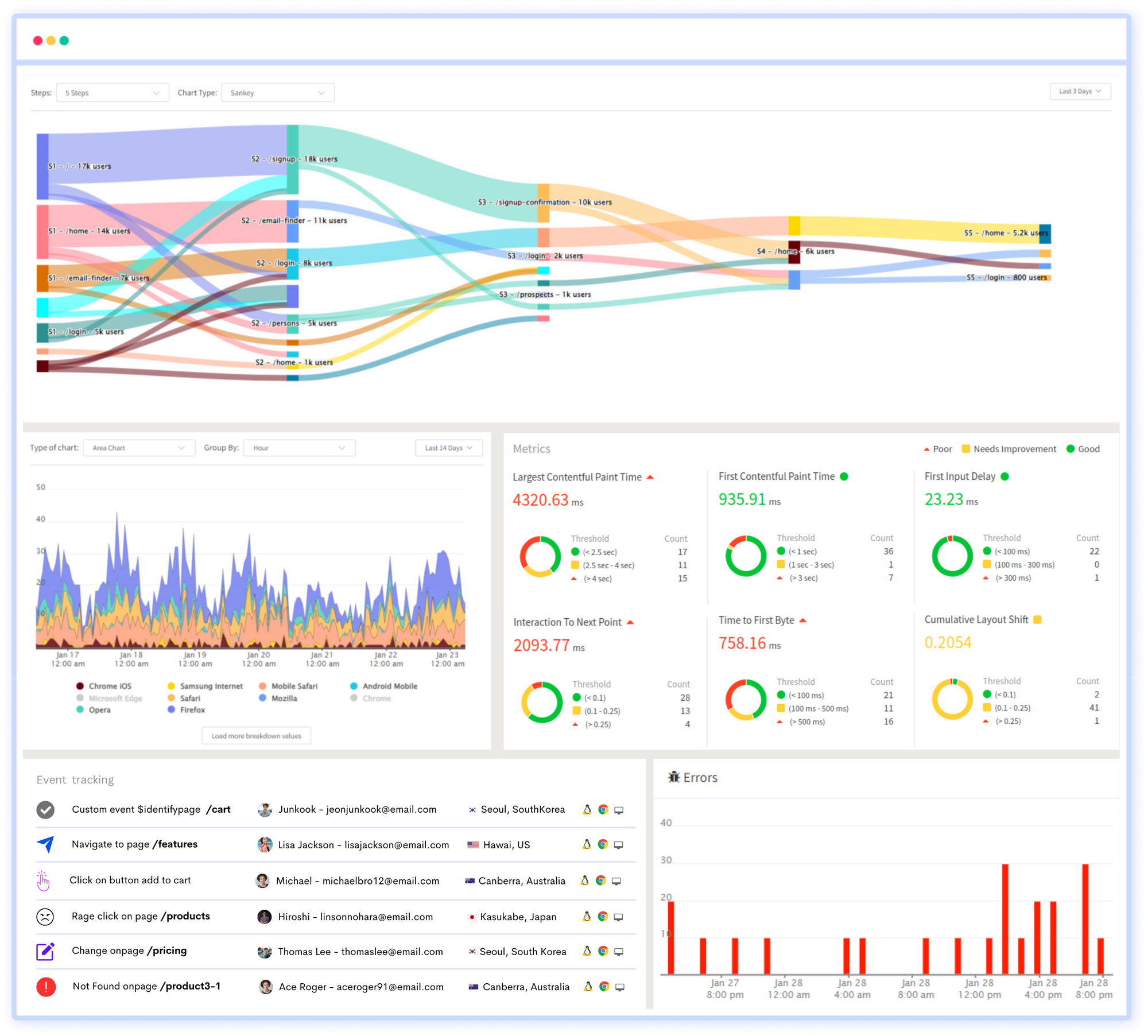
Customer journey analysis and conversion funnels of ReplayBird to analyze deeper into user journeys, identify where drop-offs occur, and uncover conversion blockers.
Troubleshooting is now simpler with ReplayBird's robust debugging features. Detect and diagnose UX issues quickly, ensuring a seamless user journey from start to finish.
With ReplayBird, you have the ultimate toolkit to elevate your projects to the next level. The platform empowers you to create high-performing, user-centric applications that leave a lasting impression.
Try ReplayBird 14-days free trial
Keep Reading More About UX:
