
Sign-Up forms are like an entry gate in your website that your users need to cross to obtain their desired action. As a website holder, Sign-up forms are the best way to collect information about the users. They are the basic elements that convert your users into your customers.
Sign-up forms are similar to Jackfruits - you have to put in efforts to get what you wish for. It is hard, time-consuming, and boring to peel off the outer layer of jackfruit, but you can eat the yummy fruit when you are done with it. In the same way, sign-up forms are frustrating, boring, and time-consuming, but once filled in, you will get what you desired.
Sign-up forms on websites are more like tickets for subscriptions or buying a product or service. But as said above, users might find filling up forms boring and frustrating. If your sign-up form is not user-friendly, then it might not yield you the desired conversion.
The best sign-up form that brings in high conversions should be user-friendly and customer-oriented. In this article, we’ll have listed the 10 best tips that will help you create a simple and user-friendly sign-up form that gets you more conversions.
How a Sign-up form should be?
Sign-up forms are simple web forms that request some basic information from a user who wants to opt into a particular action, such as registering, subscribing, or buying. The opt-in process must be simple and hassle-free for your users.
The following are the few tips you can use to build impactful sign-up forms that get you your desired results, such as more leads, more subscriptions, or more sales.
#1 - Keep it simple and short
Keep your form as simple and short as possible. If the form is complicated, people might avoid it. Same way longer the form, the less the users’ interest to fill it up. Keep only the most important and needed question.
A study shows that when a contact form with 11-fields was replaced with a 4 field form, it resulted in a 160% increased in form submission and a 120% increased in conversion rate.
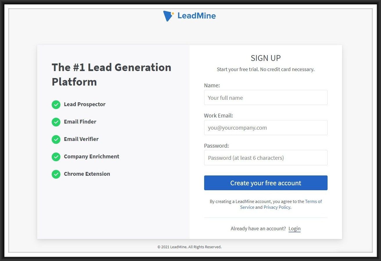
The main goal of your sign-up form is to lay a bridge between your business and the potential client. If it is possible to just ask for users’ names and email addresses in your case, you can definitely go with the two-question form. Once users become your customers, you will have better options and time to know them more.
#2 - Persuade with benefits
You can add the benefits that your customer will gain once the sign up is done. Listing up the benefits will persuade the users who may be still hesitant to sign-up. It will definitely increase the conversion rate.
You can also add information on what will happen immediately after signing up. People loved to be informed, and it builds trust. It will be better if the form submission button or CTA button says something interesting and engaging than just ‘submit.’ Always try to have a unique CTA button.
#3 - Form design matters the most
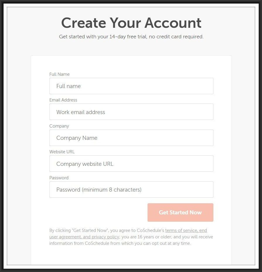
The design and layout of the form matter the most. It should be neat, user-friendly and intuitive. The form should give the user an easy experience. Always have single-column forms. Double column form may look confusing and cause misleading fields. Other than asking for First and Last name or address, a double-column should be avoided.
Also, make sure that your form is mobile-friendly. Your form should be flexible and adaptable across various browsers and devices.
#4 - Don’t repeat the same fields twice
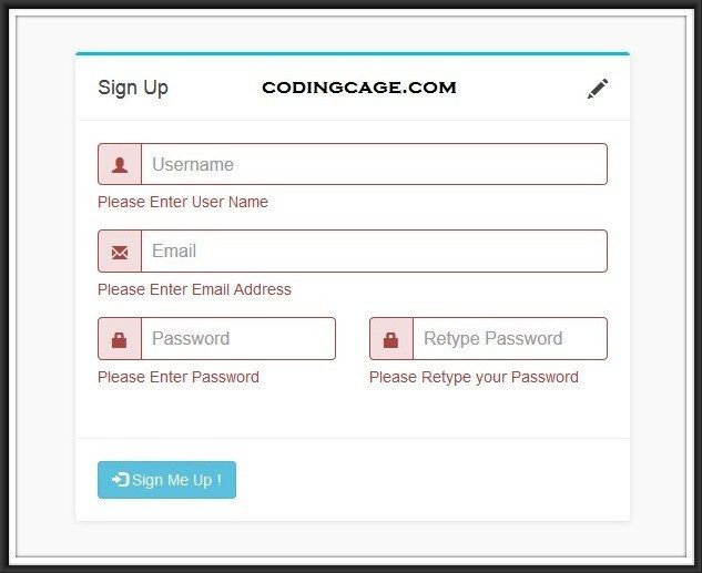
Many sign-up forms still ask the users to fill in the passwords twice. It might seem to ensure accuracy and validity on forms, but it may irk users too. You can go for other options to check the accuracy, such as unmasking the password before submitting the form.
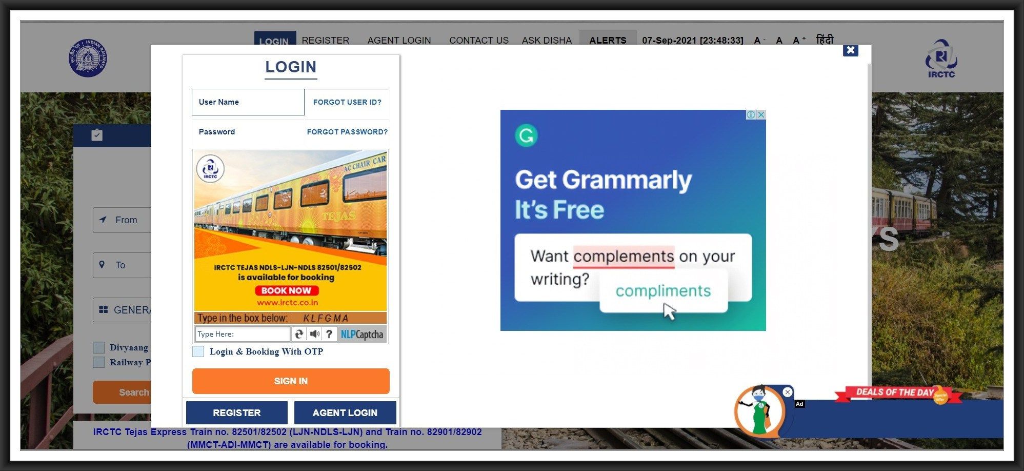
#5 - Avoid using captchas
It is crucial to check on spam issues, but anti-spam solutions should not be put on your users’ shoulders. Using captchas becomes a hassle and irritating most times, and that’s why it should be avoided. There are many other alternatives to captchas to prevent spam, be aware and start using them.
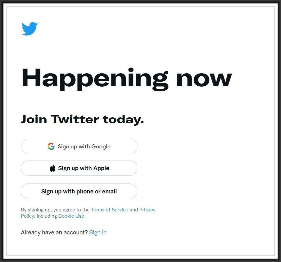
#6 - Allow for social sign-ups
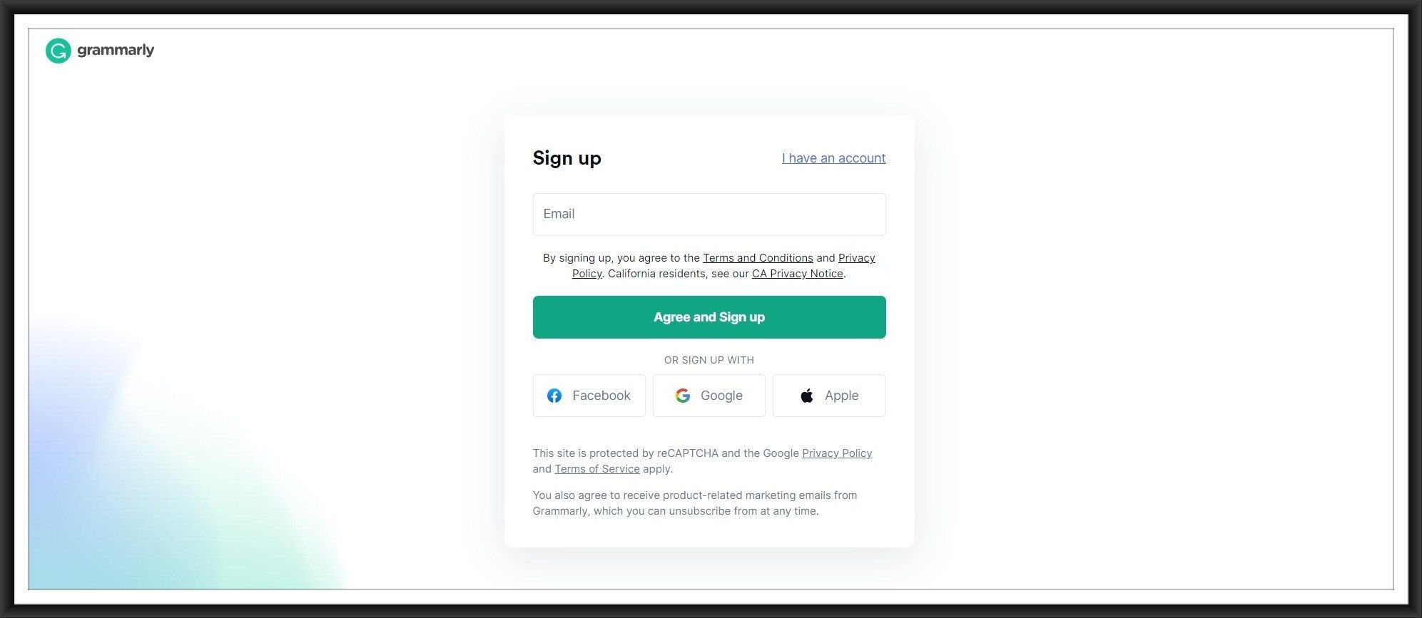
It will be a great time-saving option if you integrate your form with social sign-ups. It makes the users sign-up easily and quickly, which ultimately increases the conversion. Give them a choice as much as possible for logging such as Google, Facebook or Apple sign-ups.
#7 - Leverage some social proofs
Showing your users how your customers have benefited from your business is the best strategy to build trust. It enhances credibility and increases the conversion.
Social proof can be a testimonial quote, a product/service review or a critic. You can also list down your milestones, achievements, and public recognition you attain in the past.

#8 - Make CTAs visible
The opting for Sign-up forms must be quick and visible. Your users will not have the patience to first search for the form and then again to fill it in. If your prospect could not sign-up within few minutes, then just forget them. They might never come back.
Have the sign-up or CTA button in a bright and contrast colour. Placing it at the top of the webpage will help users recognise it easily, as most web pages have them there. The size of the sign-up button also matters. It should be the size enough to get attention. You can use small animations to grab attention too.

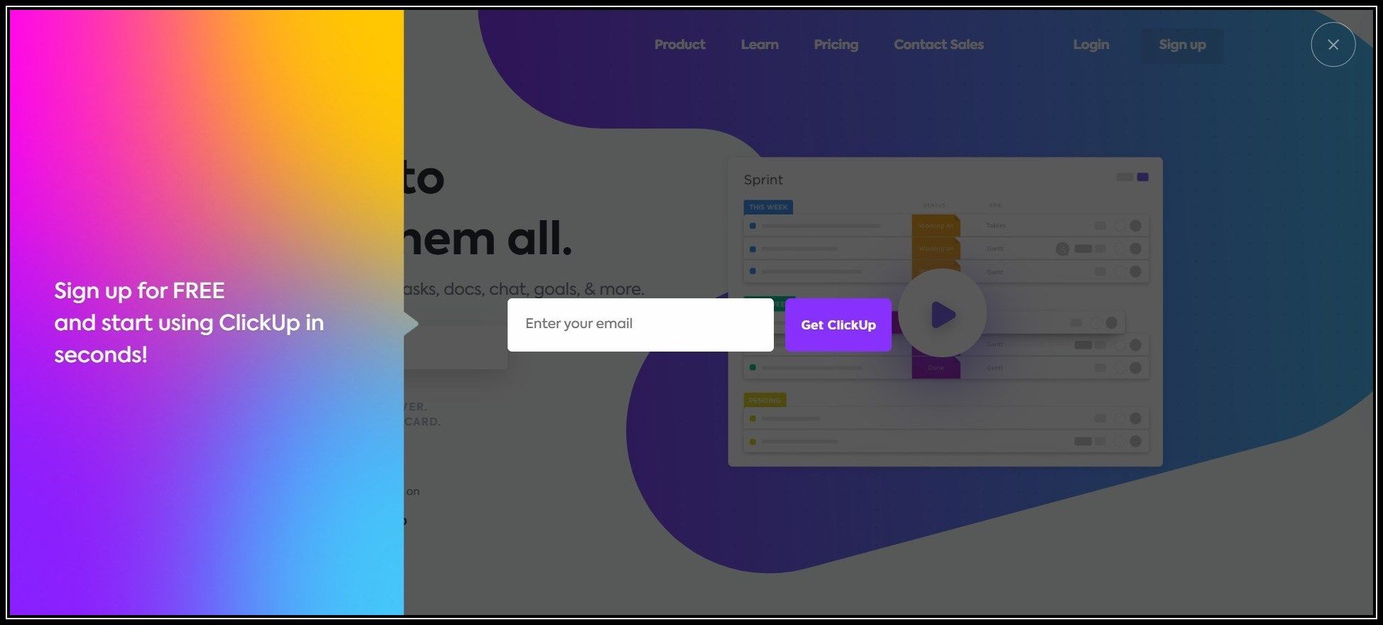
Sign-up forms can be designed with a modal window. They can be opened as a model page, dimming the homepage content. It enhances the site design.
#9 - Allow prefill and local storage
It is good to use local storage or session storage to store and prefill the user's data into relevant fields. Think of a situation - a user fills in data spending and clicks the submit button, but the site reloads and displays ‘error’ with all the data filled in lost. How frustrating it must be to the user to fill it again. So always have the prefill option on.
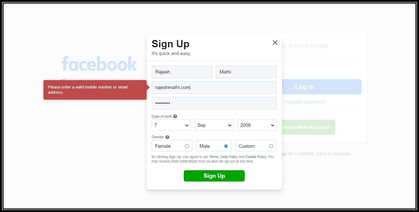
#10 - Error Validation
If an error occurs in filling the form, mention what went wrong to your users. Display the error messages and let the users fix them easily.
Conclusion
It is a fact that filling in forms is disliked by most users, but they are vital and unavoidable. So it is the website holder's duty to make the sign-up form user-friendly. The 10 things we listed above will help you create a sign-up form that gives users a hassle-free experience and increases your conversion rate.
ReplayBird - Driving Revenue and Growth through Actionable Product Insights
ReplayBird is a digital experience analytics platform that offers a comprehensive real-time insights which goes beyond the limitations of traditional web analytics with features such as product analytics, session replay, error analysis, funnel, and path analysis.
With Replaybird, you can capture a complete picture of user behavior, understand their pain points, and improve the overall end-user experience. Session replay feature allows you to watch user sessions in real-time, so you can understand their actions, identify issues and quickly take corrective actions. Error analysis feature helps you identify and resolve javascript errors as they occur, minimizing the negative impact on user experience.
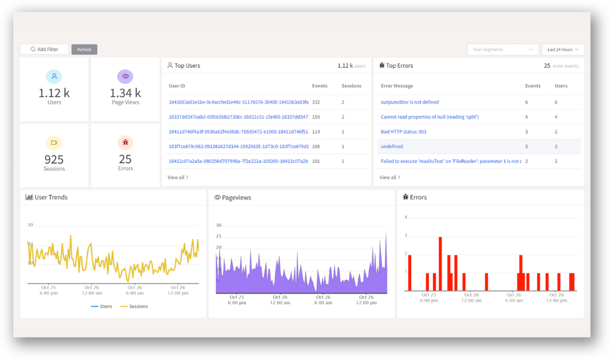
With product analytics feature, you can get deeper insights into how users are interacting with your product and identify opportunities to improve. Drive understanding, action, and trust, leading to improved customer experiences and driving business revenue growth.
Try ReplayBird 14-days free trial