When you type 'A' on your keyboard, your computer understands it as an ASCII character with a specific code. Now, HTML space entities are codes used to create spaces and special characters in web pages. For example, the non-breaking space entity in HTML is written as " ". It's efficient when you want to create space between words or prevent browsers from collapsing consecutive spaces into one.
Understanding ASCII characters and HTML space entities can be really helpful when you're working on web development or simply want to spice up your text online without CSS. Yet we will also see how to add spaces in HTML code also for the elements with CSS code.
Table of Content
- What are HTML Spaces?
- How to Add a Space in HTML?
- How to Control Spacing with CSS?
- Responsive Spacing with HTML and CSS
What are HTML Spaces?
In HTML, spaces are displayed by entities or the CSS property, as spaces matter in coding for formatting and readability. Excessive spaces impact and mess up the frontend by altering the layout and text rendering.
Using entities instead of multiple spaces controls spacing without messing up how your webpage looks. Using CSS for spacing or space character in HTML for better control over layout reduces the chances of anomalies caused by excessive or inconsistent spaces HTML.
Before jumping deep into the HTML spaces and how they work, first let us understand the HTML whitespace characters.
Whitespace characters in HTML are nothing but space, but as elements that work behind the presentation and structure of the content within your web pages.
How to Add a Space using HTML Entities?
HTML entities are special codes used to display characters that would otherwise they stand in for symbols, special characters, or those that have special meanings in HTML so that they render correctly. Let's say, '&' turns into '&' to avoid confusion with the HTML markup.
These white space character in HTML maintain consistency and accessibility in displaying text across various browsers and devices, avoiding conflicts between the actual content and HTML code interpretation.
1. Non-breaking Space
A non-breaking space is a character used in writing and typesetting that prevents an automatic line break or word wrap at its position. It goes by the Unicode character " " (U+00A0) or the HTML entity .
In text processing, a non-breaking space is particularly useful when you want to ensure that certain elements stay together without being separated by a line break. For example, in web development, it stops browsers from breaking up things like phone numbers or dates across different lines.

In this HTML snippet, the non-breaking space is used after the word "example". Instead of a regular white space, the browser might break the line between "an" and "example" sticks together, even if the text tries to wrap to a new line as there is only limited space. Anyhow, because of the non-breaking space, the browser will keep "an example" together and avoid splitting it between lines.
Also, in software like Microsoft Word or Google Docs, pressing Ctrl + Shift + Space or Option + Space inserts a non-breaking space instead of a regular space, serving the same purpose of preventing line breaks within specific content.
2. en Space
An en space is a typographic unit of white space equal to half the width of an em space. Picture it as the width of the letter "n" in a specific font. It's used to give that extra bit of space between characters or elements, making things look neat and organized. In the Unicode world, it's represented as " " (U+2002).
One common use of an en space is to create visual separation or to indicate a range between two elements without using a hyphen or a dash. In HTML, you can represent an en space using the appropriate HTML entity, which is   to insert an en space between elements or within text.
In this HTML snippet,   is used to represent an en space as it is separating the time indicators with an appropriate white space.

3. em Space
In HTML, you can represent an em space using the appropriate HTML entity   which can be used to insert an em space between elements or within text.
On the above image we have used   in the second line of code to check if they create a wider space compared to a regular space or a non-breaking space, equivalent to the width of the letter "m" in the particular font being used.
You can visually spot the difference, for spacing in HTML of the two paragraphs. That second paragraph, with its action, has a way more noticeable gap between "example" and "of" compared to the first paragraph using a regular non-breaking space.
Em spaces are especially useful in typography for creating clear and distinct separations between elements or sections of text, and they are often used for specific formatting purposes to achieve precise visual layouts in documents or web pages.
4. Thin Space
In HTML, we have got this entity called thin space   which give a subtle gap that is narrower than a regular space but wider than a hair space, typically used to provide a small amount of white space between characters or elements.

In the above HTML snippet,   is used to represent a thin space in HTML second paragraph. When you view it in a browser, you'll spot a small but noticeable gap between "example" and "of" compared to the first paragraph, using a regular non-breaking space.
Thin spaces are often employed in typography for various purposes, such as separating elements without making things too spacious or for those refined adjustments in formatting where just a tiny bit of white space is needed between characters or words for better readability and styling.
5. Standard Space
In HTML, the standard space, which is the regular space or spacebar character, doesn't require a specific HTML entity to represent it. When you add spaces within HTML code or text content, you can simply use the spacebar or the space character itself.

In the first paragraph, regular spaces are used between words, which are the default spaces created when you press the spacebar on your keyboard. These spaces are considered standard spaces.
In the second paragraph, (non-breaking space) entities are used between words, which create spaces that prevent line breaks between the words. These are non-breaking spaces and are different from the standard spaces.
Standard spaces (created by the spacebar) are the default spaces used in text and HTML. They separate words or elements without any specific markup and are automatically rendered as white spaces when the HTML content is displayed in a browser.
6. New Line Break
A new line break is also the <br> tag. This tag creates a line break in the text, moving the content that follows it to a new line.

In this example, the <br> tag is used after the sentence "This is another line of text." This causes the subsequent text ("This text is on a new line.") to start on a new line when rendered in the browser.
The <br> tag is an empty tag in HTML as it doesn't have a closing tag. Also, it only serves the purpose of creating a line break at that specific point in the content.
This tag is commonly used when you want to insert a line break within a paragraph or block of text, separating content onto a new line without creating a new paragraph.

Also you can add <br></br> to make the line to break and turn into a next paragraph, as a paragraph break.
7. Tab Character
In HTML spacing, the tab character doesn't work exactly as it does in those other spaces. Instead, when you use a tab in HTML, it just gets transformed into regular spaces when your web browser displays it.

In this example, a <div> element is used to contain a paragraph (<p>) element as the code line has moved a tab spacing of right. By adding space to the left side of the content within, <div> we can see the spacing exactly the way a tab might create white space in a text editor or document.
This HTML spacing method create an indentation effect akin to using a tab character. Yet, the actual tab character doesn't have a direct impact in HTML for creating indentation or spacing.
8. Zero-width Space
A zero-width space () is a non-printing character that doesn't have a visual representation but can be used to indicate a break in a line without adding any visible space.
It's particularly useful in situations where you want to control line breaks in a way that doesn't introduce visible spaces. This character is represented by its Unicode code point, U+200B.
In HTML spacing, you can use the HTML entity ​ to represent the zero-width space.
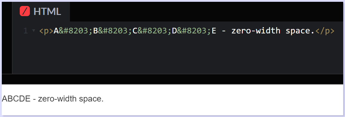
In this HTML snippet, ​ is inserted between "A", "B", "C", "D" and "E" without creating any visible white space. When displayed in a browser, the text appears continuous without any obvious gaps, but the zero-width space is there, indicating a point where a line break can occur if necessary, without introducing a visible space character.
Zero-width HTML spaces are often used in various text-processing scenarios, especially in languages with complex scripts or in cases where you want to control line breaks without affecting the visible layout or appearance of the text. They're also used for specific text-processing tasks, such as in search engine optimization or text wrapping in constrained layouts.
9. Hair Space
A hair space is a very narrow space, even smaller than a thin space, used for fine adjustments in text layout. The hair space is represented by the HTML entity   and is used to provide a minimal amount of white space between characters or elements.
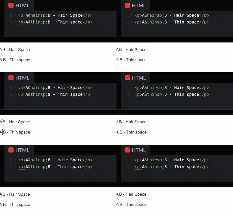
In the above HTML snippet,   is used to represent a hair space between "example" and "of". When rendered in a browser, the space created by the hair space entity is extremely narrow, almost unnoticeable compared to regular spaces or other types of spaces.
Hair spaces are typically used in typography and typesetting for very fine adjustments in spacing between characters or elements where an extremely small amount of space is needed. They are especially useful in cases where precise layout control is required, such as in high-quality typesetting, print design, or when dealing with complex typographic layouts.
10. Figure Space
In HTML spacing, a figure space is a space that has the same width as a digit in a particular font, as it is used to align numbers in typography or typesetting contexts. The figure space is represented by the HTML entity  .
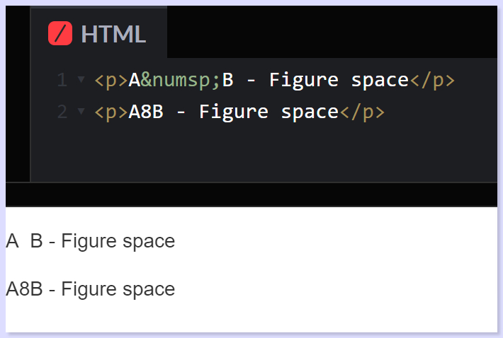
In this HTML snippet,   shows up the figure space between "example" and "of". Now, when your browser displays it, this figure space entity makes a white space just as wide as a digit ASCII character for a space, allowing for consistent alignment when working with numerical data or aligning columns of numbers in typography or tables.
Figure HTML spaces are particularly useful in the places where numeric characters need to be aligned neatly, such as in tables or columns of figures so that you can have a visually consistent layout in numerical data presentations.
| HTML Entities Characters | HTML Entities Code | Explanation |
|---|---|---|
| Non-breaking space: | | Stops browsers from squishing multiple spaces into one. Great for keeping specific spaces intact, like between words or elements. |
| en space |   | Picture a space as wide as the letter "n" in the current font. It's wider than a regular space character. |
| em space |   | Now imagine a space as wide as the letter "m" in the current font. It's even wider than an en space and much wider than a regular space character. |
| Thin space |   | A slim space, thinner than your usual space character. |
| Standard space |   | Represents a space using its character code, like —just your typical space character. |
| New Line Break | | Carriage returns in HTML, making a new line. |
| Tab Character | 	 | Represents a tab character in HTML just like the tab key on your keyboard. |
| Zero-width space | ‌ or ‍ | Invisible characters (‌ and ‍) that control line breaks or join characters in certain scripts. |
| Hair space |   | Narrow space, even thinner than a thin space ( ). It's helpful in typography for precise adjustments. |
| Figure space |   | Equals the width of a digit in the current font. Like an en space ( ), it helps align numerical content. |
CSS within HTML Spacing
In CSS within HTML, spacing becomes an important aspect of defining how elements are positioned and the gaps between them.
CSS essentially becomes the tool that shapes the layout and visual presentation of the coding space of HTML elements on a webpage, giving advanced control over the spacing between different elements.
1. Margin and Padding
Control the HTML spacing around an element and its content, affecting its placement and appearance within a layout.
- Margin helps in creating space between an element's border and surrounding elements.
margin-top,margin-right,margin-bottom, andmargin-leftare individual properties used to set the margin on specific sides of an element. Shorthand property:margin: 10px 20px 15px 5px;
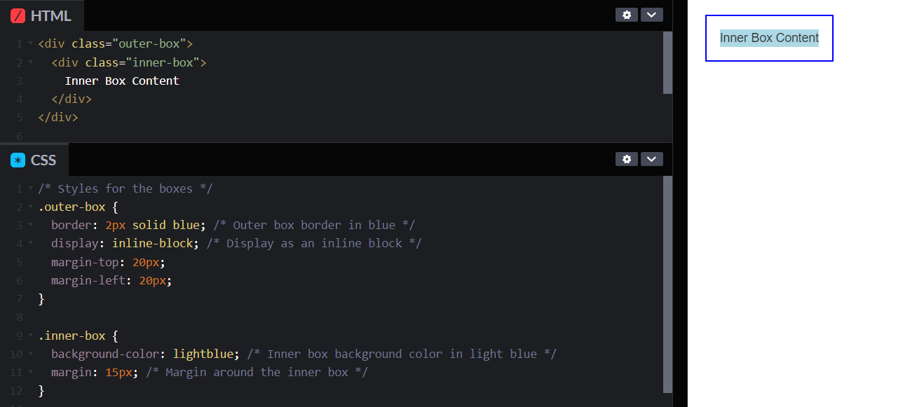
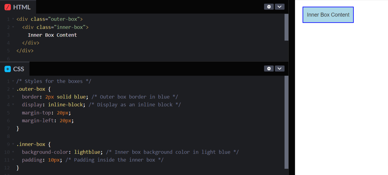
- Padding, on the other hand, is the space between an element's content and its border as it creates internal space within the element. Similarly to margins,
padding-top,padding-right,padding-bottom, andpadding-leftare used to set padding on specific sides, while the padding also does have the shorthand property.
2. Spacing and Alignment
Define the size, dimensions, and behavior of your elements within your HTML web layout.
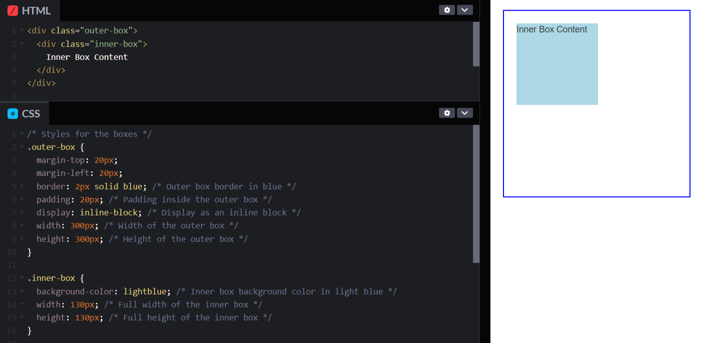
- Width and Height properties control how big or small an element appears on a webpage. Think of them like the size buttons for an object. With width,
min-width, andmax-width, developers can decide how wide something should be, its smallest allowable width, and its largest possible width. Similarly, height,min-height, andmax-heightdo the same thing but for the element's height.
- Box-sizing property is like setting the rules for measuring the size of an element. By default, it's like measuring a box starting from the very inside edge. But with
border-box, it counts not just the inside but also any padding and border, making it easier to plan the space an element will take up.
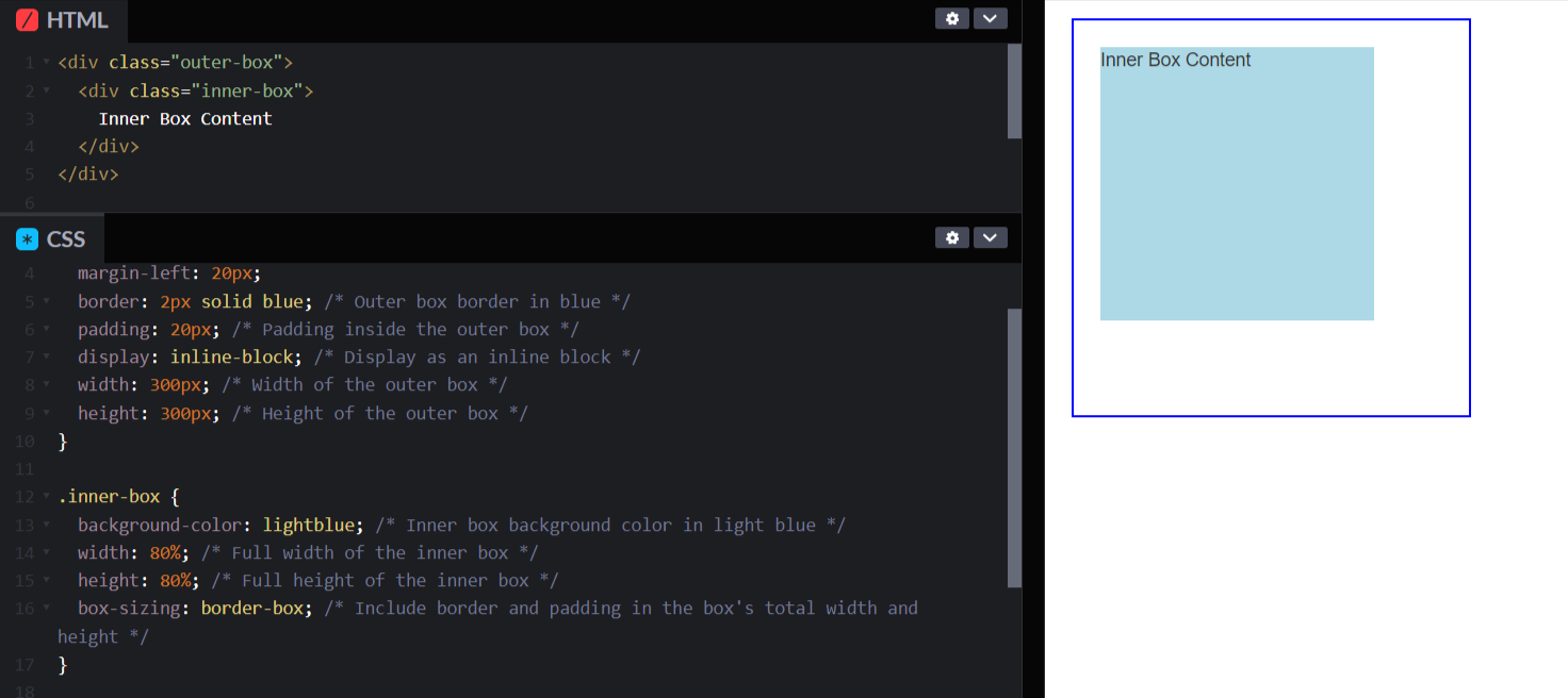
- Display property is like telling an element how to behave in a group. It's like saying if it should stand out on its own like a big block, blend in like part of a sentence, or even organize its friends neatly in a row or a grid. Choosing these settings helps elements work together, making your webpage look just the way you want it to!
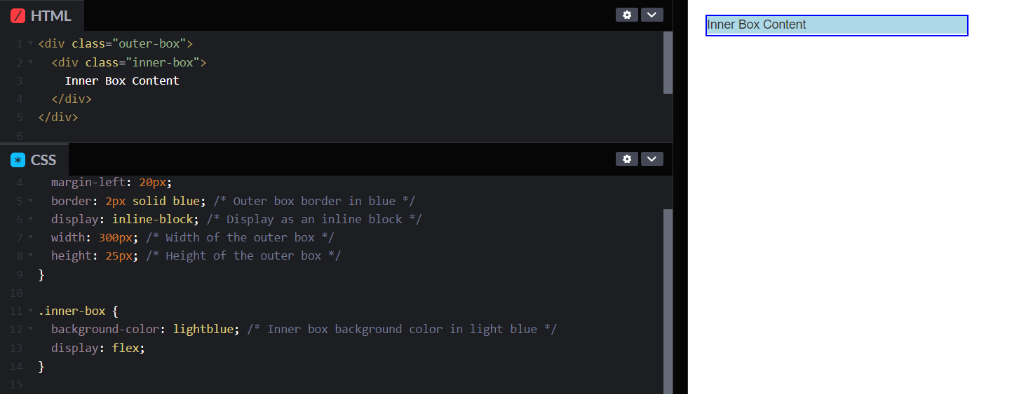
3. Flexbox and Grid
Making HTML spacing with CSS layout easier to make the way web developers create responsive and structured designs.
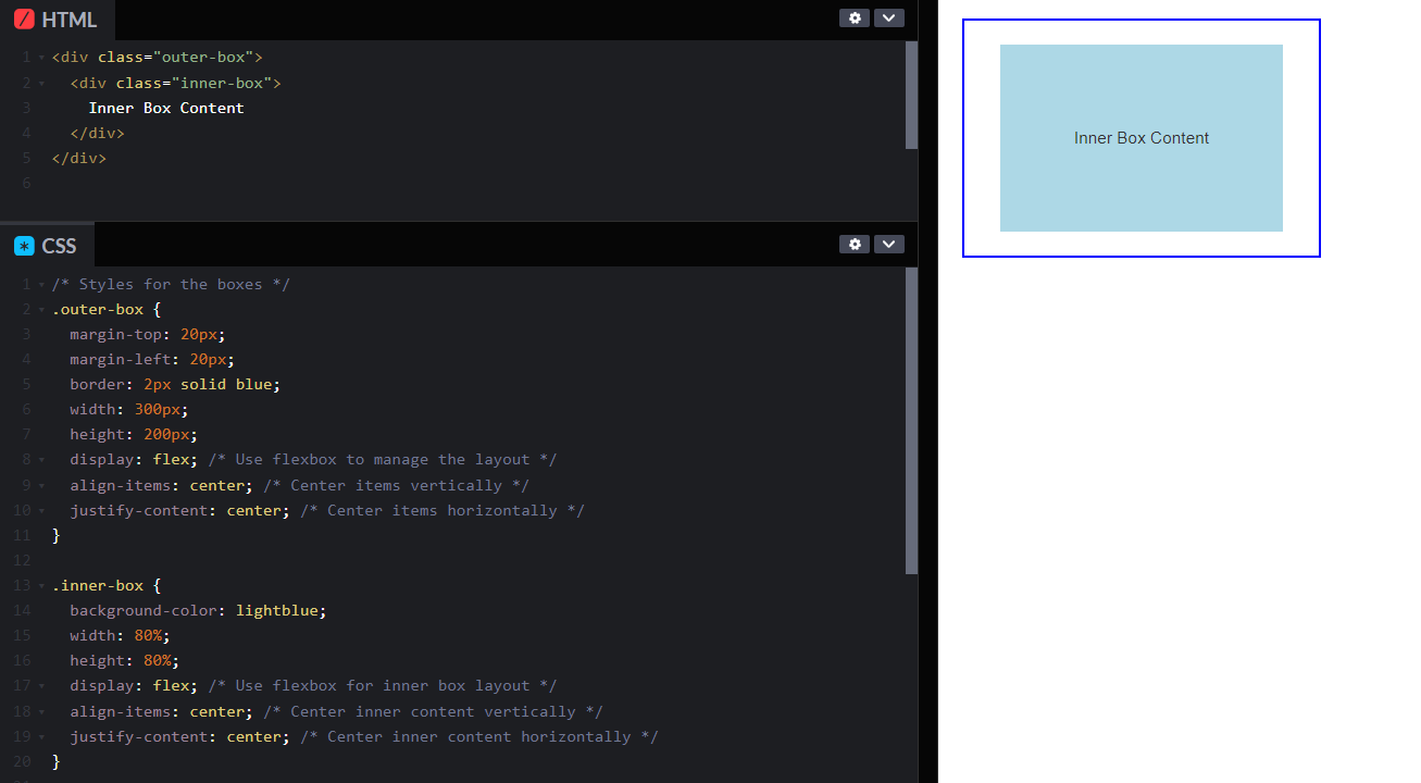
- Flexbox helps line up and organize elements in a flexible way along a single line as when the elements are different sizes or keep changing. With CSS flex-box properties
flex-direction,justify-content,align-items, andflex-wrap, you can easily control how things line up, how much space they take, and even how they wrap around, making your designs adaptable.
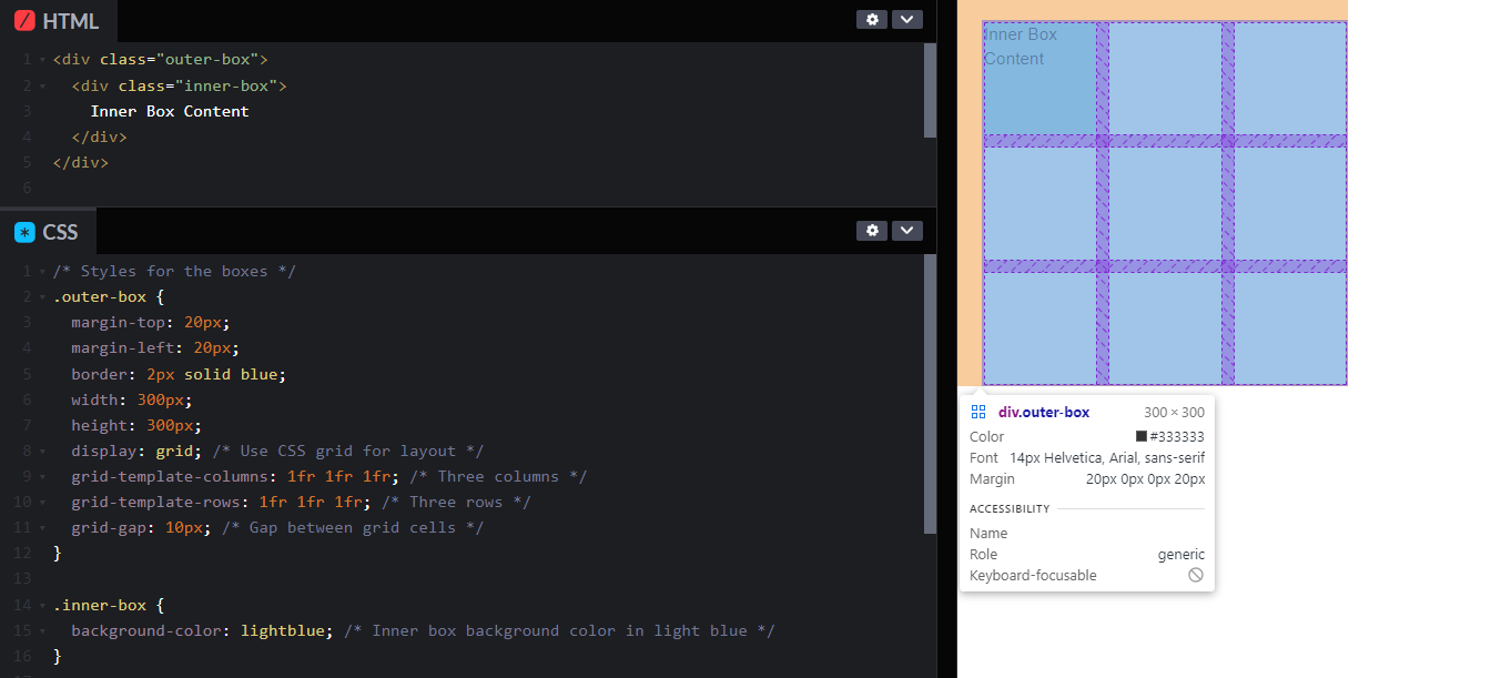
- Grid is for arranging elements in both rows and columns inside a box. It's fantastic for organizing elements neatly. With the properties of
grid-template-columns,grid-template-rows, andgrid-gap, you can position elements in your layout and give them a certain fixed position or grouping.
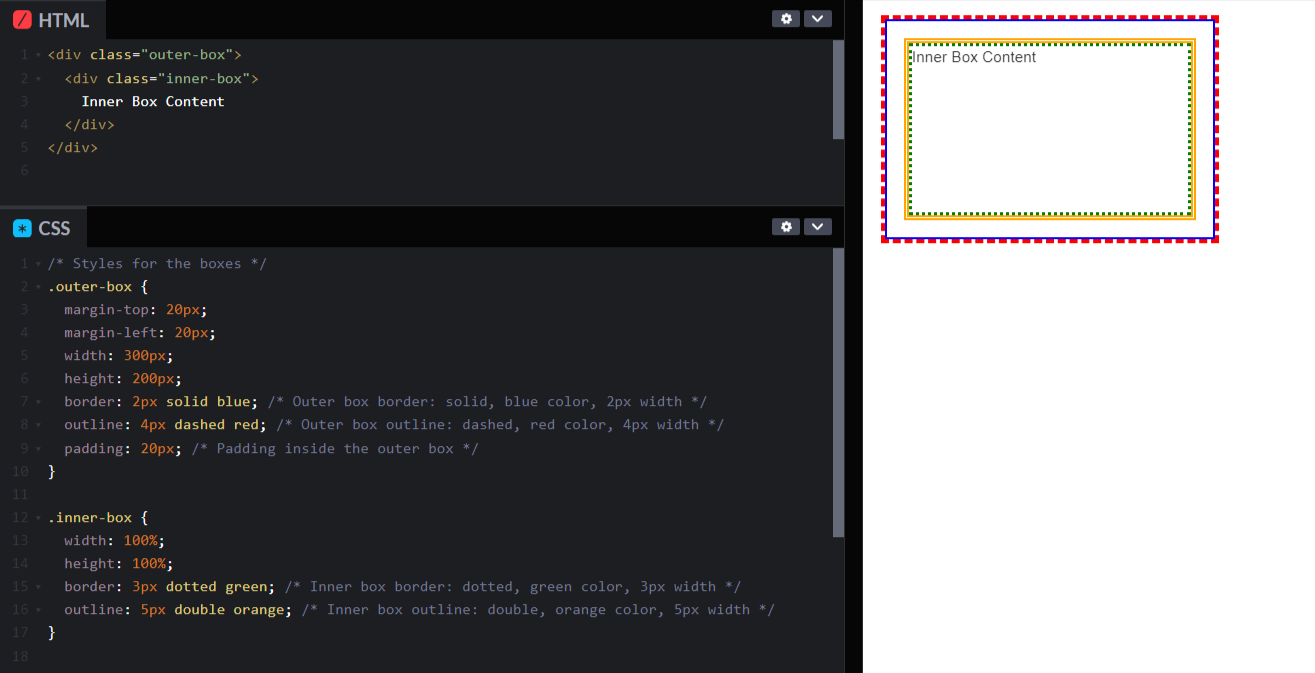
4. Borders and Outline
Define the visual boundaries of your elements while making your HTML code in spaces more simpler by coding with elements
- Border properties (border-width, border-style, border-color) creates borders around elements by picking the width, style (solid, dashed, dotted).
- Outline properties (outline-width, outline-style, outline-color) don’t mess with how things are laid out, but they're great for drawing attention. You can highlight links or form fields—outlines to help users see what they're focusing on without changing the size or position of elements.
5. Text spacing
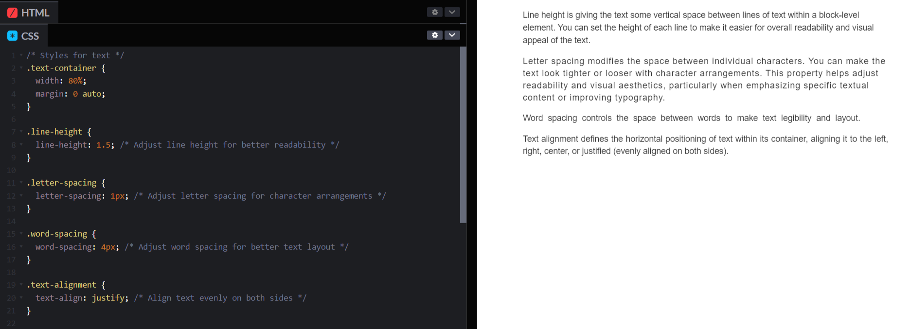
Fine-tun HTML space capabilities to handle the appearance and arrangement of text elements on your webpage.
- Line height is giving the text some vertical space between lines of text within a block-level element. you can set the height of each line to make it easier for overall readability and visual appeal of the text.
- Letter spacing modifies the space between individual characters You can make the text look more tighter or looser with character arrangements. This property helps adjust readability and visual aesthetics, particularly when emphasizing specific textual content or improving typography.
- Word spacing controls the space between words to make text legibility and layout.
- Text alignment defines the horizontal positioning of text within its container, aligning it to the left, right, center, or justified (evenly aligned on both sides).
Responsive Spacing with HTML and CSS
Responsive HTML spacing is all about handling and adjusting spaces (such as margins, padding, and other layout properties) within your web page's content so that it adapts to different screen sizes and devices of the users.
It involves using techniques and strategies in HTML and CSS to create layouts that look good and maintain readability and usability across various devices, including desktops, laptops, tablets, and mobile phones.
i) Media Queries:
You can apply different styles based on what a device's like, especially its screen width. You can adjust things to make them perfect for smaller screens, larger screens, or anything in between! It's all about making your website or app look great and work smoothly on every device.
/* Example of a media query */
@media screen and (max-width: 768px) {
    .element {
        padding: 10px;
        margin: 5px;
    }
}
ii) Relative Units:
When you use relative units like percentages (%) or viewport units (vw, vh) for your spacing, you're basically creating layouts that can flex and adapt across various screen sizes.
Instead of locking your spacing into fixed numbers that might look great on one screen but not so much on another, relative units let your layout breathe and adjust. So, whether it's a huge desktop monitor or a tiny phone screen, your spacing stays, making your design look sleek and flexible on every device.
/* Example of using relative units */
.container {
    padding: 5%; /* 5% padding relative to the container's width */
}

.element {
    margin: 2vw; /* 2% of the viewport width */
}
iii) Flexbox and Grid Layouts:
CSS Flexbox and Grid layout systems give you control over how elements are arranged and aligned inside a container, adjusting to the space available.
/* Example using Flexbox */
.flex-container {
    display: flex;
    justify-content: space-between;
}

/* Example using Grid */
.grid-container {
    display: grid;
    grid-template-columns: repeat(auto-fit, minmax(200px, 1fr));
    gap: 20px;
}
iv) Fluid Layouts:
Designing layouts that use fluid percentages for widths and flexible containers instead of fixed pixel values allows content to expand or contract based on the available screen space.
/* Example of fluid layout */
.container {
    width: 90%; /* Takes up 90% of its parent container's width */
    max-width: 1200px; /* But not exceeding 1200px */
    margin: 0 auto; /* Center the container */
}
Conclusion:
As concluding I would like to explain you the differnece between ASCII and HTML space entities.
ASCII (American Standard Code for Information Interchange) is a character encoding standard used in computers and electronic communication. It's a way of giving each letter, number, punctuation mark, and special symbol a specific number code. For example, uppercase 'A' is code 65, 'B' is 66, and it keeps going like that. These codes are fundamental for computers to interpret and display text.
Now, HTML space entities are specific codes used in HTML (Hypertext Markup Language) to make spaces or show special characters that you can't just type directly from your keyboard.
So, both ASCII and HTML space entities might sound a bit technical, but they're actually pretty cool once you get to work with them.
Understand Exactly Where Your UI need Improvement
ReplayBird, a digital user experience analytics platform designed specifically for developers with advanced insights to optimize your website frontend, by watching session replay of your users struggling and getting frustrated.
Unleash the power of behavioral insights with ReplayBird's intuitive heatmaps, session replays, and clickstream analysis allows you to visualize user behavior, identify popular elements, and detect pain points that might hinder user satisfaction.
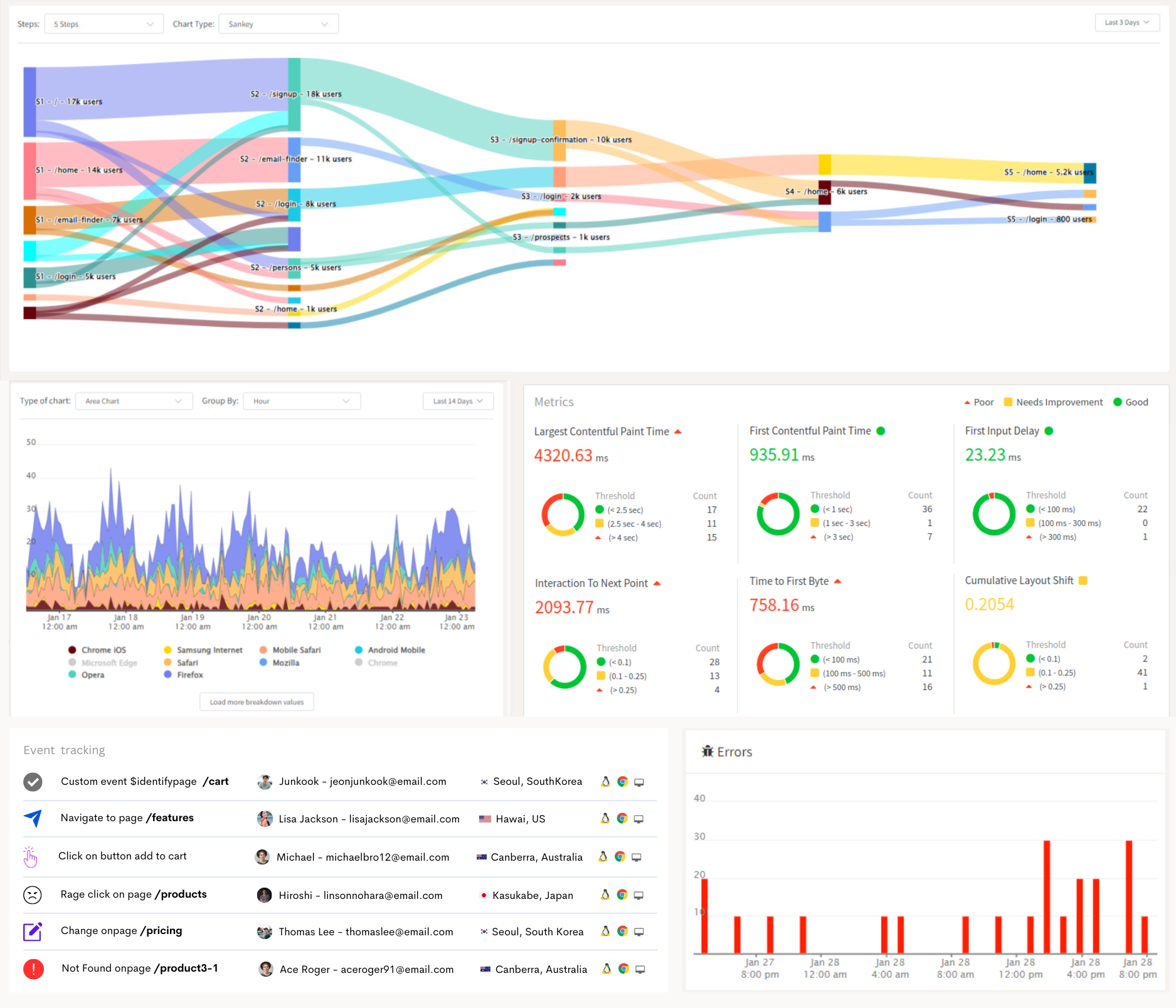
Customer journey analysis and conversion funnels of ReplayBird to analyze deeper into user journeys, identify where drop-offs occur, and uncover conversion blockers.
Troubleshooting is now simpler with ReplayBird's robust debugging features. Detect and diagnose UX issues quickly, ensuring a seamless user journey from start to finish.
With ReplayBird, you have the ultimate toolkit to elevate your websites to the next level. ReplayBird empowers you to create high-performing, user-centric applications that leave a lasting impression.
Try ReplayBird 14-days free trial
Read More on HTML and CSS
