UX Design strategies for E-commerce surround a range of decisive elements designed at creating a seamless and engaging online shopping experience. Firstly, when it comes to online shopping, having a smooth and enjoyable user experience is super important.
It's not just about clicking buttons, it's about creating a space where you can easily find what you want and check out hassle-free.
We're going to dig into the nitty-gritty of making e-commerce websites user-friendly. We'll chat about stuff like making sure it looks good on your phone, and how to build trust with customers.
Table of Content:
- What is Ecommerce User Experience?
- Role of UX Design in E-Commerce Websites
- User Journey Stage for UX Designing Priciples in E-commerce Websites
- Best 7 UX Design Strategies for E-commerce
What is Ecommerce User Experience?
Ecommerce User Experience, often abbreviated as e-commerce UX, which is the overall experience a customer has while interacting with an online store or website to make a purchase.
It include various elements and aspects of a website that influence how easy, intuitive, and enjoyable it is for users to navigate, find products, and complete a transaction.
A seamless e-commerce UX involves a user-friendly interface, fast loading times, clear product descriptions, and many other processes which are crucial for converting visitors into customers. Responsive customer support and easy returns further improve the overall experience.
Businesses can develop trust, boost customer satisfaction, and ultimately drive sales. Constantly analyzing user behavior and feedback will help refining the e-commerce UX for a competitive edge in the ever-evolving online market.
Role of UX Design in E-Commerce Websites:
UX design determines how easily a visitor can navigate, find desired items, and ultimately make a purchase. This involves intuitive menu layouts, effective search functionality, and clear product pages. It's about ensuring each step in the user journey is seamless and enjoyable.
Furthermore, UX design extends to the shopping cart, checkout process, and post-purchase experience. An optimized shopping cart allows users to review and modify their selections effortlessly. A user-friendly checkout process minimizes steps and offers guest checkout for convenience. Post-purchase, a well-crafted confirmation page and encouragement for feedback enhance the overall experience.
In e-commerce, UX design is the linchpin that transforms casual visitors into satisfied customers. It's the difference between a user abandoning their cart in frustration and smoothly completing a purchase. A thoughtfully designed user experience builds trust, encourages repeat business, and generates positive reviews and referrals.
User Journey Stage for UX Designing in E-commerce Websites
Understanding the concept of User Journey Stages is key in UX design. It guides decisions regarding layout, content placement, and calls-to-action, for users to seamlessly advance through the buying process.
1. Landing / Finding the Website:
This is where they figure out how to get in and find what they're after, this is phase is literally right after your marketing works.
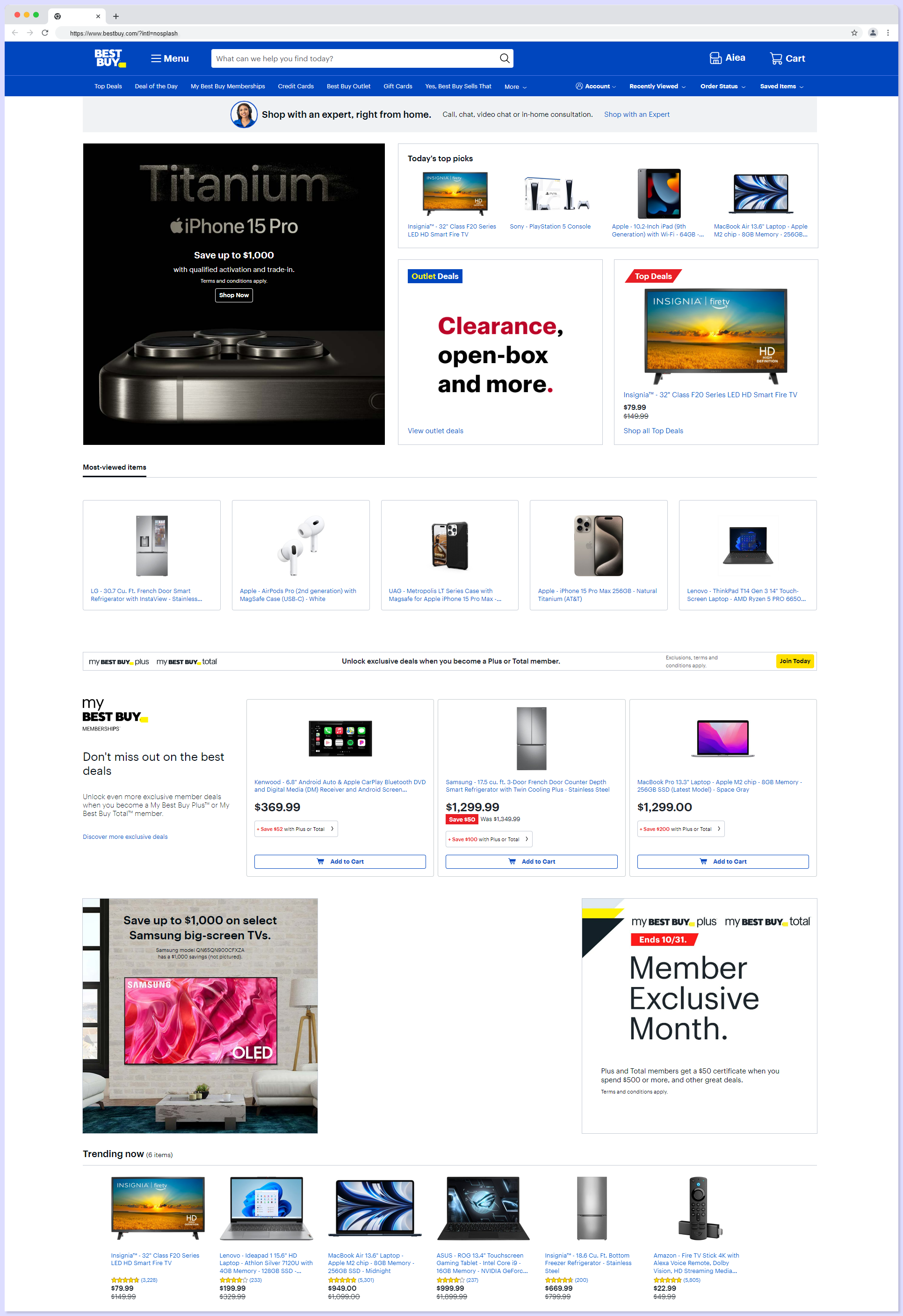
Let's say you have a well-crafted homepage with smooth navigation. Think of a clothing store's homepage; it showcases the star collections and lays out clear paths to different sections.
Throw in a sturdy search bar and some well-placed call-to-action buttons, and this is what is the first step to impress your website visitor with clearly showing off what your website is.
2. Product Search and Browse:
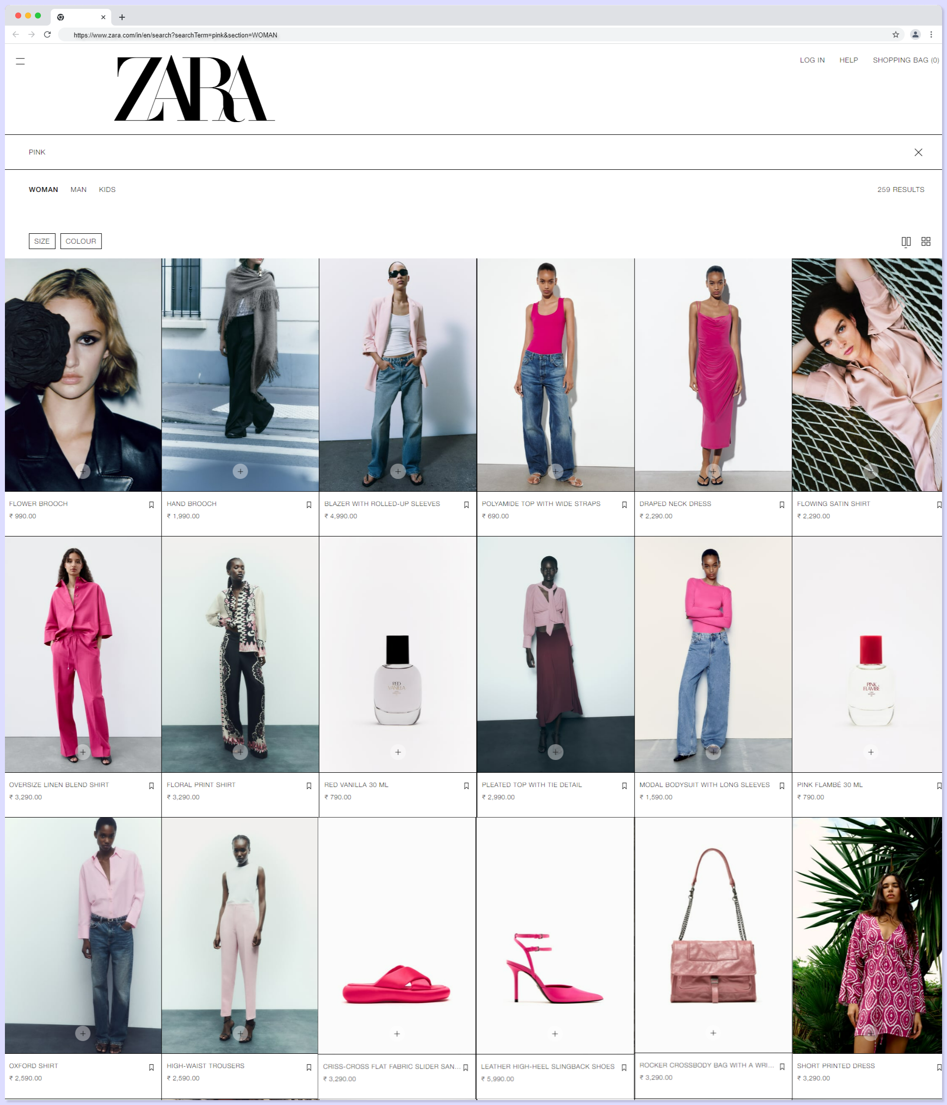
This section is all about letting users dive into our website pages. Imagine an e-commerce joint and you're after a specific type of dress, but you're not entirely sure where to start. That's where the search bar comes in.
You type in "pink." The system helps you out with autocomplete suggestions. You click on "pink" and, boom, you're hit with a results page showcasing a range of options, each with crisp images, prices, and handy filters for size, color, and price range.
From there, you can refine your search further, maybe choosing "pink shoes" and "under $50". This sort down the selection, giving you a tailored set of choices. You find a winner, click for more details, and smoothly proceed to checkout.
3. Product Page:
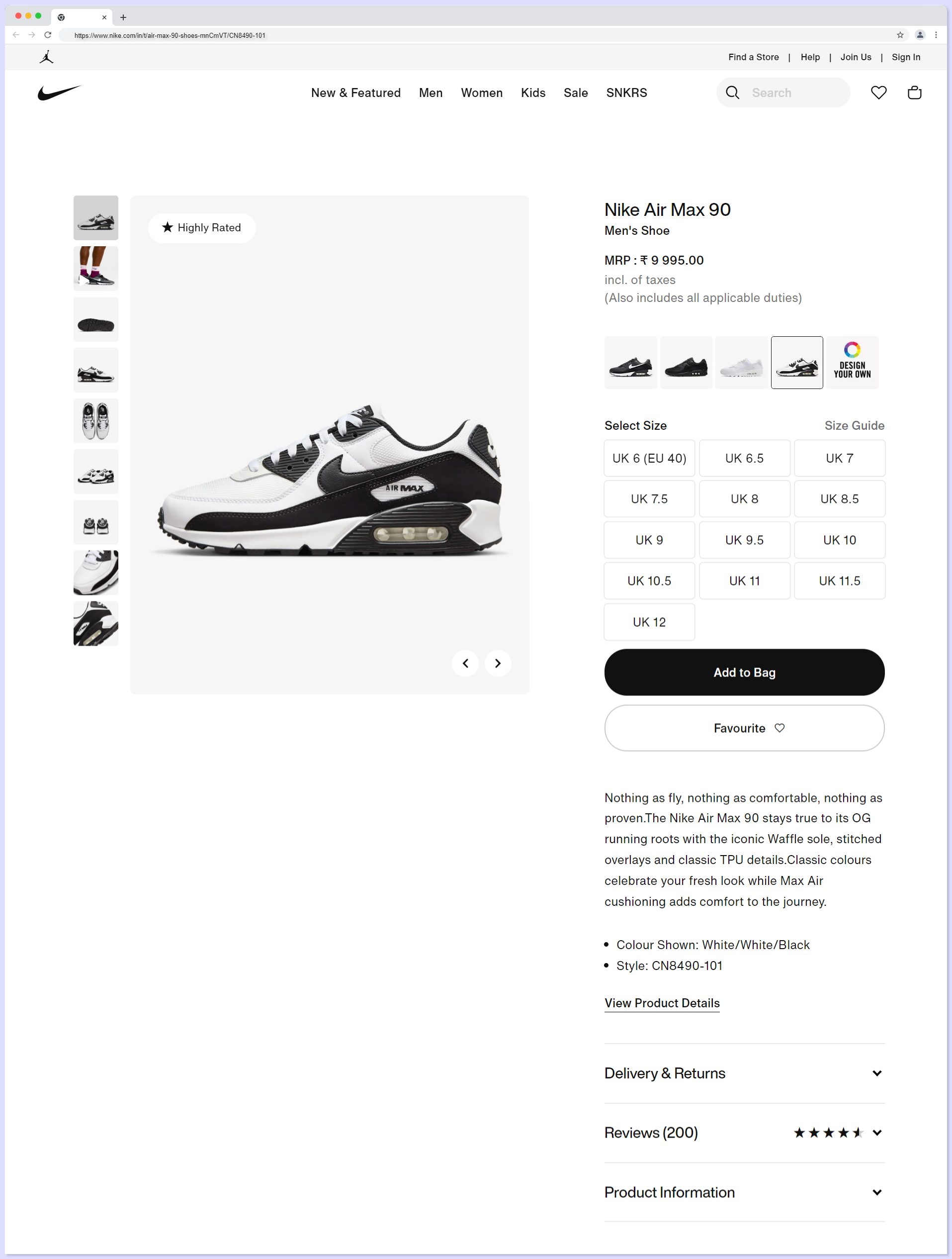
A well-crafted Product Page is like a salesman who knows their stuff as it should showcase high-quality images, detailed product descriptions, and clear pricing.
Must haves in your product page for a seamless UX design:
- Avoid overcrowding with unnecessary elements for a clear layout.
- Consider including lifestyle images to give users a sense of how the product looks in real life with high-quality imagery.
- Use bullet points or short paragraphs for easy readable concise product descriptions .
- A clear path back to the category or search results which provides a user-friendly navigation.
- Page layout must adapt seamlessly to different devices and screen sizes for responsive design
- Easy way for users to seek assistance if they have questions or need help with a live chat or support options.
The goal is to make the user's journey on the product page as intuitive, informative, and hassle-free as possible with unavoidable UX design elements for e-commerce.
4. Checkout:
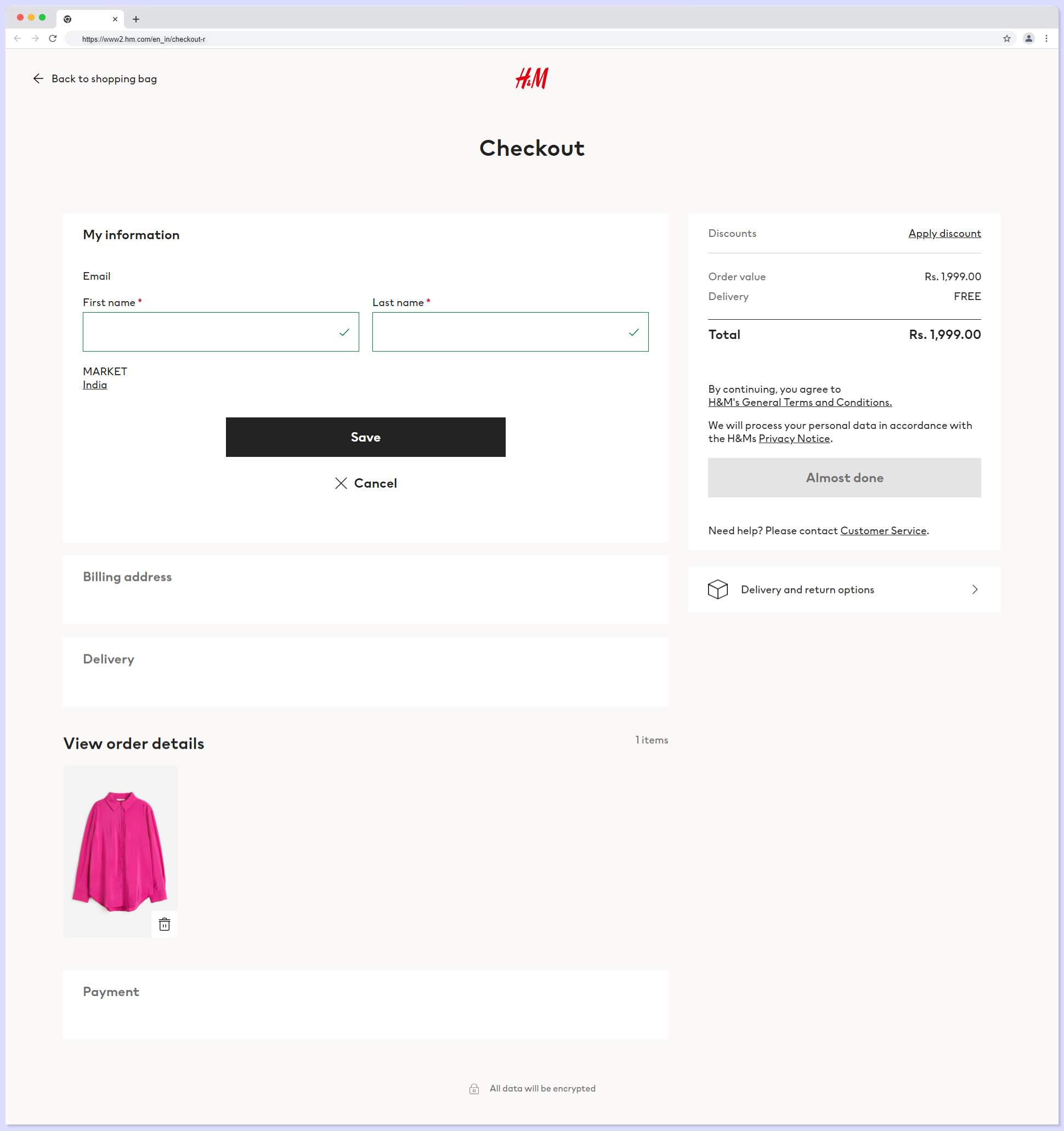
Imagine you've found that perfect pair of shoes, added them to your cart, and now it's time to pay and get your shoes out shipping, this process is the major converting process which plays with revenue that need to deal with a lot of perfection in the user experience, design and specifically speed.
The Checkout Page should be a smooth, step-by-step process. It should clearly display the selected items, allow for easy modification, and provide a transparent breakdown of costs. Think visible shipping options, secure payment methods, and a prominent "Place Order" button.
5. Order Confirmation:
The Order Confirmation Page has to be the grand finale in the UX design of e-commerce where you can make your selection, enter your details, and click that final button.
Now, the Order Confirmation Page should be a clear as it reaffirms the purchase, detailing what's been bought, along with shipping and billing information.
A concise summary, a reassuring message, and a visible order number are all key.
Throw in an estimated delivery date for that extra touch. Remember, this page should instill confidence and excitement, leaving the customer eagerly awaiting their delivery.
Best 7 UX Design Strategies for E-commerce
Implementing UX design strategies in E-commerce is the primary for user satisfaction with a seamless and enjoyable shopping experience which leads to higher customer retention rates and increased loyalty.
1. Clear and Intuitive Navigation
A well-structured menu, with categories neatly organized, so that users can swiftly locate what they're after.
Breadcrumbs are the best handy trails at the top, you can display the user's current position, making it easy to backtrack or explore related categories and more.
For example, let's say a clothing website has a menu that could be segmented into Women, Men, and Kids, further divided into categories like Apparel, Footwear, and Accessories. If a user clicks on "Women" and then selects "Footwear," breadcrumbs would show "Home > Women > Footwear," providing a clear path back if needed. This keeps the journey smooth and frustration-free, a hallmark of effective UX design.

It's always about anticipating the user's needs, making their journey as seamless as possible as these navigation can serve as signposts to always know where they are and how to get to where they want to go.
2. High-Quality Imagery and Videos:
As users strolling through a virtual aisle the images and videos they encounter play a significant role to be sharp, vivid, and provide a comprehensive view of the product from different perspectives. It has to be similar to checking an item in a physical store, but with even greater detail.
UX design for E-commerce business must consider a high-end camera retailer for their each product listing include high-resolution images, allowing users to scrutinize every tricky detail.
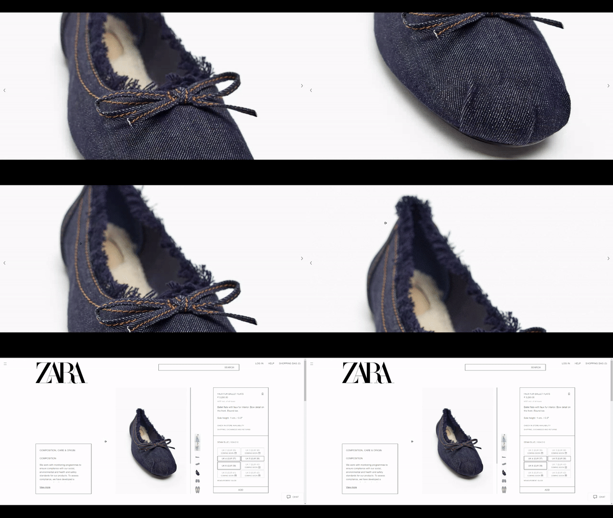
Additionally, a zoom feature lets users get up close, inspecting the fine craftsmanship. In some cases, a video demonstration showcases the camera's capabilities with an even deeper understanding.
This experience has higher chance of giving customers confidence in their purchase, replicating the real experience of in-person shopping.
Remember, in the digital realm, visuals are everything. They bridge the gap between the physical and virtual worlds with top-notch imagery and video presentation providing an experience that's as close to an in-person visit as possible.
3. Mobile Responsiveness:
An increasing number of users are shopping on their smartphones. It's imperative that your website adapts seamlessly to these smaller screens as every element, from product listings to checkout, is not only functional but also aesthetically pleasing on mobile devices too.
Your online e-commerce website's UX design has a mobile-optimized version which would feature large, easily tappable buttons for navigation, and images that resize gracefully. Text would be legible without excessive zooming regardless of the device.
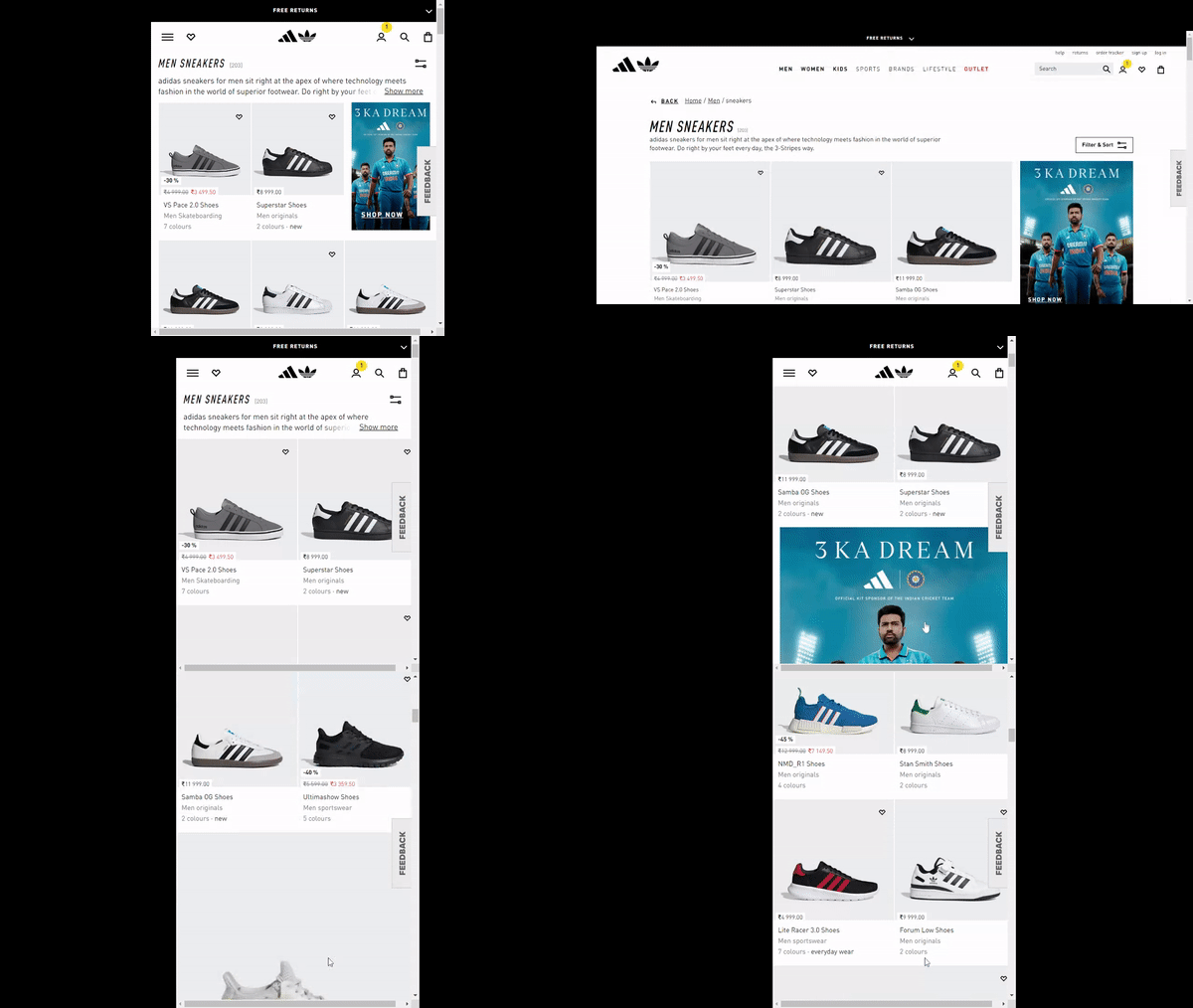
Not overlooking mobile optimization can lead to a significant loss of potential customers. By investing in a mobile-responsive design, you're not just accommodating a growing user base that every visitor has a seamless shopping experience, regardless of the device they use leading to an effective e-commerce UX design.
3. Simple Checkout
Firstly, it's crucial to keep the UX design of your e-commerce checkout steps minimal. A concise series of checkout steps in your e-commerce UX design may keeps your users to be going restless.
Next, offer the option for guest checkout. This means customers can swiftly complete their purchase without the need to create an account which is a hassle-free express checkout for those who prefer not to linger.
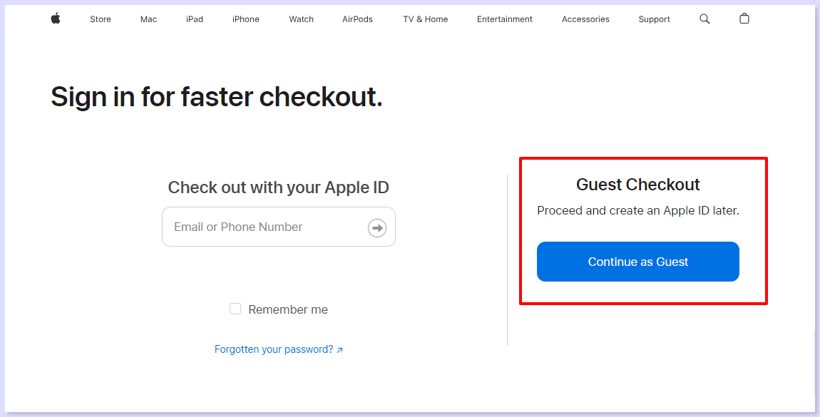
For instance, consider an online electronics store. The checkout process would involve just a few steps:
- Review Cart
- Input Shipping Information
- Select Payment Method
- Finally Confirm the Order.
And for those in a hurry or averse to creating accounts, the option for guest checkout is prominently displayed.
In the world of e-commerce, a simple checkout process is a game-changer where you are handle your user to checkout before thinking of in-hand long processes.
It minimizes friction, reduces the likelihood of cart abandonment, and ultimately leads to higher conversion rates with a process that is smooth as possible so that your keeps customers coming back for more.
4. Trust and Security Features:
Your potential e-commerce customer need assurance that their information is safe and their transaction is secure. This is where trust badges, secure payment icons, and transparent privacy policies come into play.
As you browse, you spot familiar trust badges from reputable security providers. Secure payment icons like those of major credit cards instill confidence.
Furthermore, clear and accessible privacy policies communicate that their information is treated with the utmost care. Here in this below example PS5 have even given a video explanation on their online security, which is time-saving and more convenient.
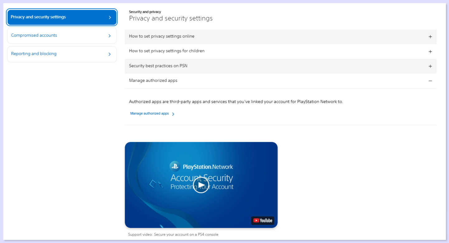
Your e-commerce customers need to feel confident that their personal and financial information is safeguarded with your UX design prominently displaying trust badges, secure payment icons, and clear privacy policies.
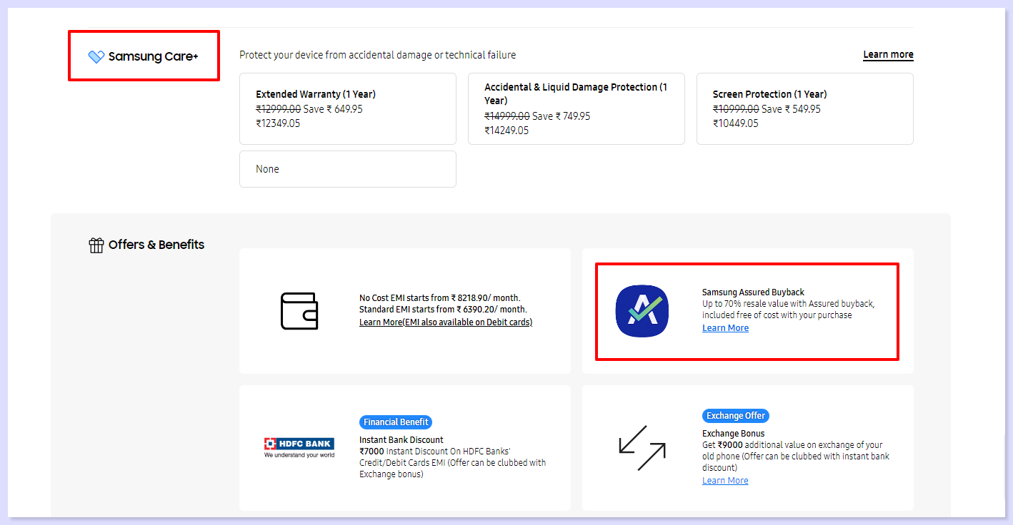
These elements act as visual reassurances, demonstrating your commitment to their safety and security of your e-commerce UX design especially in building meaningful customer relationships.
5. Shopping Cart Optimization:
Let's say you're at a physical store with a cart full of items. Before you head to the checkout, you'd want to review your selections, possibly remove or add items, and see the total cost. The same principle applies online, and it's crucial for a seamless shopping experience.
Consider an online bookstore. After selecting a few titles, the user navigates to the shopping cart. Here, they can easily adjust quantities, remove items, or even continue shopping without losing track of their choices. Additionally, clear pricing details are a must.
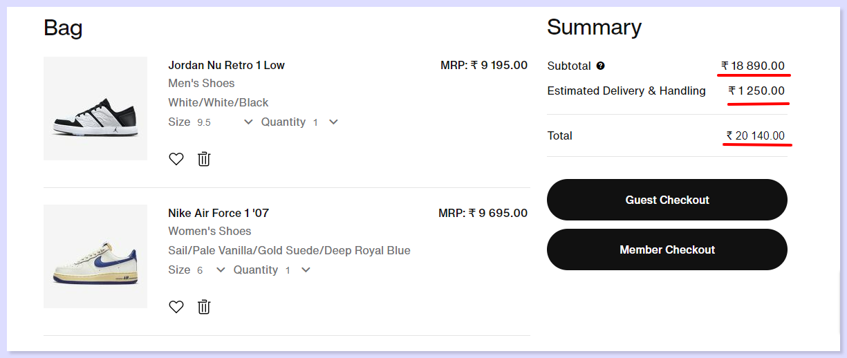
Users should see a transparent breakdown, including taxes and shipping costs, so there are no surprises at checkout.
Shopping cart optimization to have a full control over their purchases as it can prevent frustration upto 70% and allow for informed decisions before finalizing the transaction.
By displaying all costs upfront, you build trust and transparency with your customers. This is a cornerstone of effective e-commerce UX design with a smooth journey from selection to checkout.
6. Post-Purchase Confirmation
After a user makes a purchase, they're directed to an order confirmation page. This page should be crystal clear, detailing what they've bought, the total cost, and an estimated delivery date. A genuine thank-you message reinforces appreciation for their business.
But the journey doesn't end here, encouraging customers to leave reviews and provide feedback is equally important.
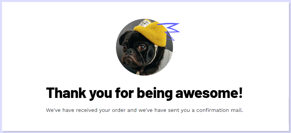
This two-way communication not only shows that their opinions matter but also provides valuable insights for your business.
Post-purchase confirmation and feedback play a significant role in customer retention the confirmation page and a gentle nudge for feedback show that you value their business beyond the transaction.
7. Analyse Your Website Performance
Use digital user experience analytics platform designed specifically for e-commerce websites to understand UX design by offering comprehensive analytics and insights.
It provides detailed visual representations of user interactions, pinpointing areas of engagement and potential bottlenecks. This data-driven approach let e-commerce businesses to identify and rectify UX design issues, resulting in a more intuitive and seamless customer journey.
Customer journey analysis and conversion funnels of ReplayBird to analyze deeper into user journeys, identify where drop-offs occur, and uncover conversion blockers.
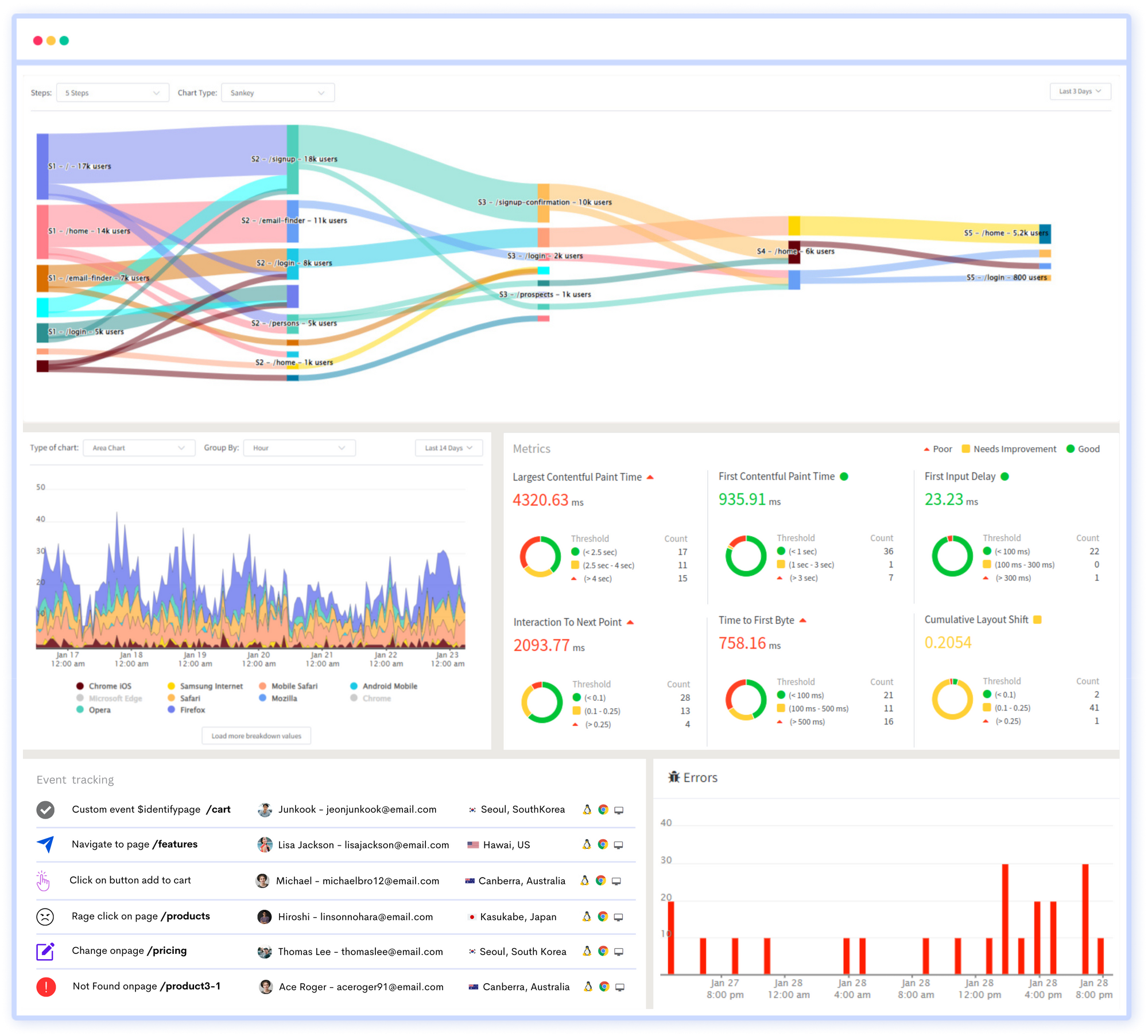
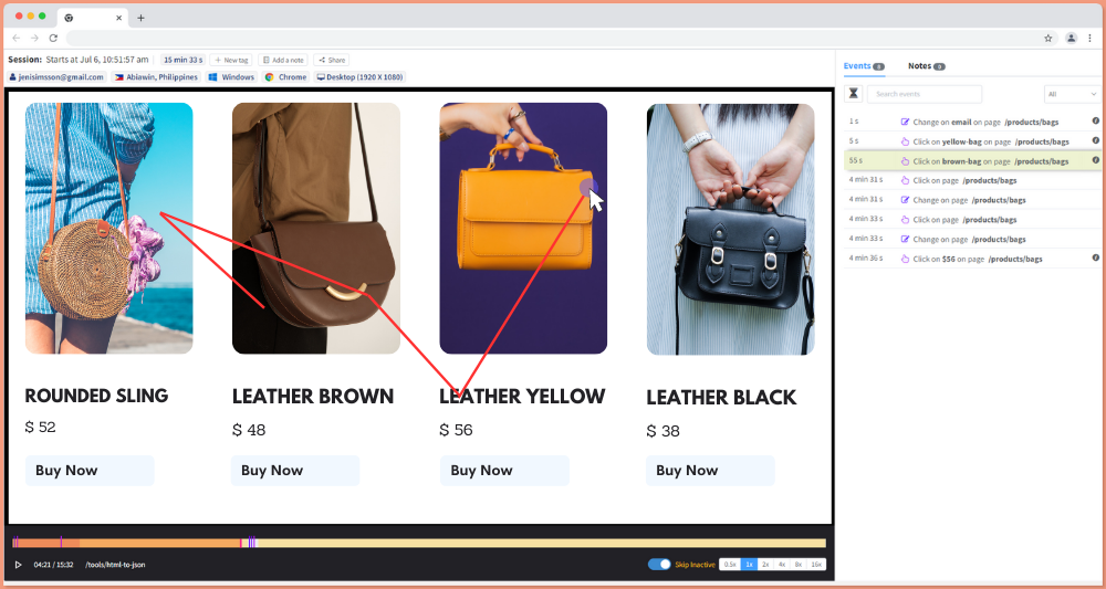
With features like session replays, heatmaps, and conversion funnels, ReplayBird offers a deep understanding of user behavior to fine-tune their e-commerce UX designs, optimizing elements such as layout, navigation, and content placement which leads to improved conversion rates, higher customer satisfaction, and ultimately, increased revenue.
Conclusion:
In every ecommerce brands, a user-friendly, visually appealing website is essential for serving your customers effectively which extends beyond the confines of your website itself. To achieve a remarkable ecommerce User Experience (UX), it's imperative to adopt a comprehensive and strategic approach aimed at simplifying the end-user experience.
Remember, each product and target audience is unique, so thorough research and ongoing tracking are significant to identifying what best suits your specific situation.
Emerging trends and opportunities can also seamlessly integrate into your strategy. It's about discerning what UX design strategies are effective without compromising your current revenue stream.
By maintaining a commitment to continuous improvement, you'll not only strengthen your UX but also drive sustained business growth
Understand Exactly How Your Users Interact in Your Website
ReplayBird, a digital user experience analytics platform designed specifically for developers with advanced insights to optimize your applications like a pro!
Unleash the power of behavioral insights with ReplayBird's intuitive heatmaps, session replays, and clickstream analysis allows you to visualize user behavior, identify popular elements, and detect pain points that might hinder user satisfaction.
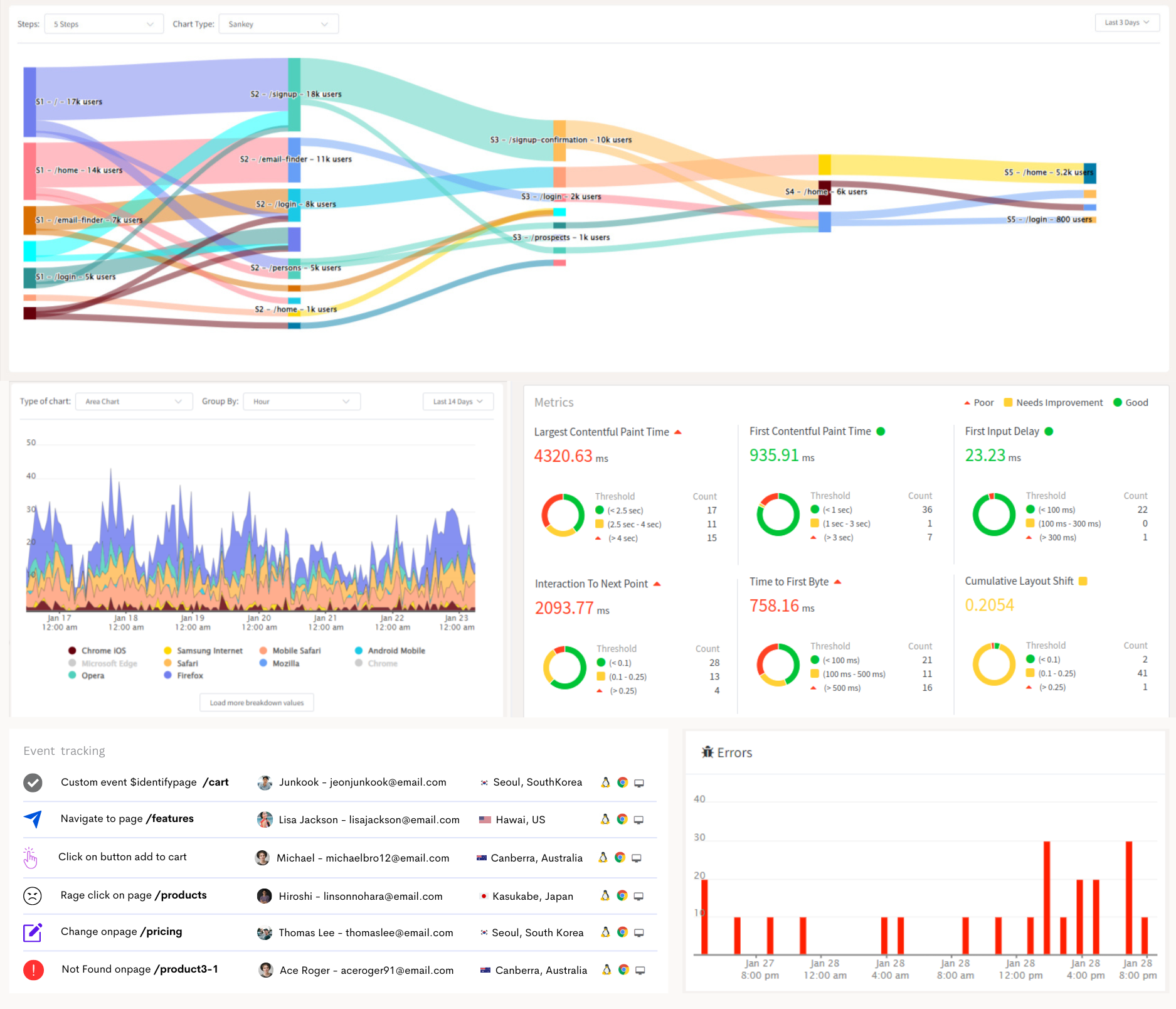
Customer journey analysis and conversion funnels of ReplayBird to analyze deeper into user journeys, identify where drop-offs occur, and uncover conversion blockers.
Troubleshooting is now simpler with ReplayBird's robust debugging features. Detect and diagnose UX issues quickly, ensuring a seamless user journey from start to finish.
With ReplayBird, you have the ultimate toolkit to elevate your projects to the next level. The platform empowers you to create high-performing, user-centric applications that leave a lasting impression.
Try ReplayBird 14-days free trial
Keep Reading more about UX Designing:
